Month: November 2007

Biomass Utilization Potential

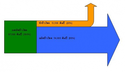
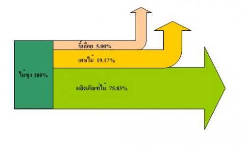
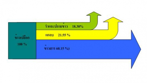
The first Sankey diagrams in Lao language I have come across are from a management summary on “Alternative Energy and Energy Conservation in ACMECS countries”. It shows how much biomass from wood industry, rice mills and other sources is available in the People’s Democratic Republic of Laos as rejects, and could potentially be used for generating energy. All values in tons per year for 2004 or 2005, extrapolated to the whole country from 4 to 6 samples.


Wood Industry: pink arrow is for sawdust, dark yellow arrow for woodbits, summing up to roughly 25%


Rice Mills: green arrow is for rice bran, yellow arrow for husks, summing up to 40%


Corncobs: orange arrow (20%) is corncob reject that could potentially be used for energy generation.

Even though I don’t read or write Thai, I love those letters. For those of you who wish to read the summary in English (with only 2 Sankey diagrams), a translation is available. Update Nov 2008: Unfortunately the website http://www.dede-acmecs.com has gone offline
Greenhouse Effect Explained with Sankey Diagram

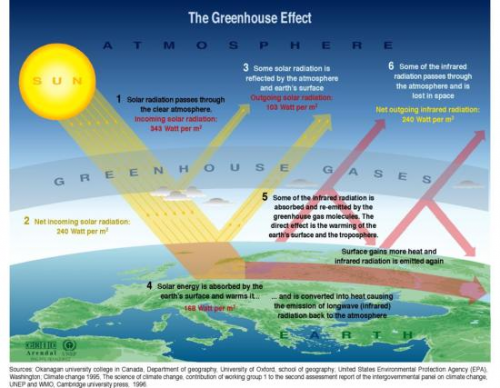
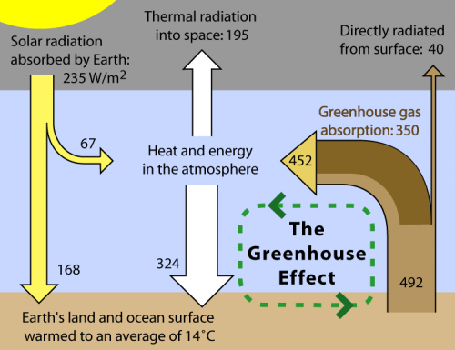
Doing a Google image search on ‘greenhouse effect’ brings up numerous versions of a diagram, that shows solar radiation partially being filtered by the atmosphere, partially hitting earth’s surface. This energy heats the earth, a part is being reflected as infrared radiation, where it is not able to escape fully due to greenhouse gas molecules from man-made emissions’ accumulated in the atmosphere.

While some of these greenhouse effect diagrams use simple arrows, some of them show the energy levels with Sankey-like arrows.

Wikipedia has one of these as an illustration for the article on the greenhouse effect. Originally designed for Global Warming Art it is also available in the Wikimedia Commons in Finnish and in Japanese.

Many of the “normal” diagrams are very appealing, and I especially like the one’s that target at kids or students. However, the diagram using Sankey arrows conveys more information. Check for yourself by comparing the two examples above.

Sankey Chart or Sankey Graph?

User ‘taqua’ at jfree.org comments on another topic:

there is a fundamental difference between a *chart* and a *graph* or diagram.

A chart is a map of some data (like a city map, but for mass-data). It is a graphical visualization of tabular data. Charts are used for statistical purposes. Charts may be helpful to make mass data more understandable.

A graph is a graphical representation of a relationship between some objects or concepts. (In other words: A graph is a drawing that explains how something works or behaves.)

It is a common property of human languages, that terms get mixed, so you will find the word ‘chart’ in classical graph types, like ‘flow-chart’. Nonetheless, by sticking to the definitions above, it is easy to see that a flowchart is no chart at all – its a graph.

Taking this into consideration, a Sankey diagram can be considered both, a Sankey chart and a Sankey diagram. The quantities represented by the magnitude of the flow could also be shown as tabular data, the direction of the flow, given by the arrow orientation between two processes indicates a ‘from-to’-relationship.