Some of you might have noticed that I tend to get somewhat excited when I discover Sankey diagrams in other languages.
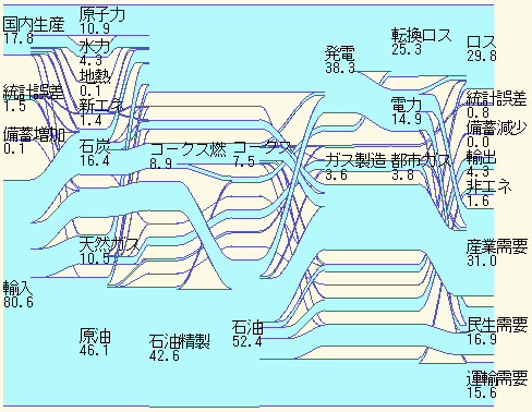
Here is one I dug out on this webpage of the Tsuji Labs at Osaka University in Japan, and it has the honor to be the first one presented on this blog in Japanese!
The diagram shows the “energy flows” (エネルギーフロー) as relative values for the year 1993 only. On the left side we can see that more than 80% of the energy consumed in Japan were produced from imported fuels (輸入), while only 17.8% came from domestic production (国内生産). The quantities are broken down into the different types of fuels, such as crude oil (原油, 46,1%) , natural gas (天然ガス, 10,5%) or hard coal (石炭, 16,4%). The right side of the diagram shows the consumption sectors, with industry (31%), residential (16,9%) and transport (15,6%).
Losses are at 29% which seems relatively low, if you compare to similar Sankey diagrams from the U.S. But then I am not sure if they accounted for the losses in the same way for this diagram.
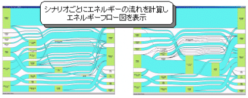
There are these two other similar Sankey diagram thumbnails on that site, and my guess is that they represent different energy scenarios, considering renewable energy sources, as an option to reduce dependency from imports. Maybe someone who can read and understand more Japanese than I do wants to comment?


