Month: May 2010

Trefis: Sankey-Style Stock Price Modeling

I recently discovered Trefis and their Sankey-style diagrams as a visualization. Trefis models are used to determine the target stock price for companies, by looking at their product portfolios and playing around with the expected growth rates and market shares. Well, there is a whole model behind these interactive graphics, but the interesting part is that the share of the companies turnover is broken down by products, and is shown with proportional Sankey-like arrow magnitudes.

At the tip of the joint arrow head you can see the target share price, which is calculated as “the result of mathematically combining all of our forecasts for a company into a single number representing the per share value of the company.” When playing around with the parameters, this value will adapt accordingly.

Here are some examples:


Forbes, techCrunch and the New York Times all reported about what the latter calls “America’s Next Top Stock Model”, but none of the mentioned Sankey diagrams though.

Have fun playing around with the models … they have fancy Web2.0-silverlightish animations too. But don’t blame me if the share doesn’t reach the forecasted price 😉

Biochar Slow Pyrolyis Process

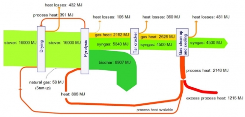
This one is from a presentation (download) by Roberts et.al. from Cornell University titled “Life cycle assessment of biochar production from corn stover, yard waste, and switchgrass” held in in Boulder, CO in August 2009.

I admit it is all new to me and I had to lookup stover and biochar on Wikipedia to understand what it is all about. So, apparently the slow pyrolysis process has several advantages: It works with waste biomass (waste management), it produces biochar that can improve soil, it produces energy (syngas) and it captures carbon.

The Sankey diagram in the presentation shows the energy flows: 16,000 MJ of energy is contained in a tonne of stover; more than a fourth of it can be approved of as syngas from the pyrolysis process. The main objective however seems to be carbon dioxide capture, and biochar presents a viable alternative to other (more energy intensive) carbon sequestration technologies.

The diagram has a slight downwardish slope and some of the arrows have superfluous bends. Heat flows and heat recovery are in orange, losses in yellow, the feedstock and syngas in green.

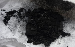
Edit: I received a sample of biochar from a friend. Looks like small pieces of coal indeed. After taking the photo I disposed of the biochar in one of the flower pots on my balcony…

A sample of biochar