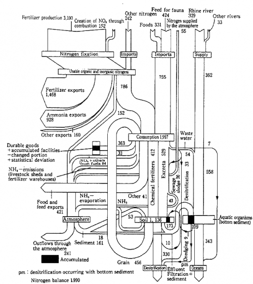
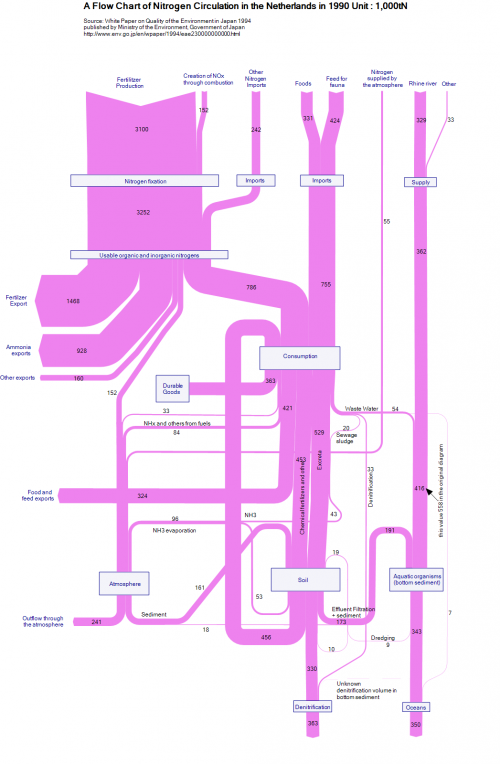
Below is an example of a Sankey diagram showing a nitrogen metabolism. The original diagram is from a Japanese publication (‘White Paper on Quality of the Environment in Japan 1994’), even though the diagram represents nitrogen loads (in 1000 tons N) in the Netherlands in 1990.
A pimped version of this diagram can be found in the e!Sankey download gallery. I don’t like the color very much, but the overall aspect of the diagram is much better than in the b/w version, I think.
They seemed to have struggled with inconsistencies in the original diagram, as an annotation suggests. Also the denitrification due to accumulation in the bottom sediment, or nitrogen ending up in durable goods (shown in black in the original) are not represented in the remake. For the rest it pretty much sticks to the original.
Thinking about a new tag “pimp my Sankey”…


