I am aware that I was kind of ‘Sankey diagram bashing’ with my post on Spain energy flow diagram last December. Now here is another one from the Iberian penninsula that fully makes up for the first one. It is by Observatorio sobre Energía y Desarrollo Sostenible (Observatory of Energy and Sustainability in Spain) at the Universidad Pontifícia Comillas in Madrid. I find it noteworthy that the observatory is part of a BP financed chair at the Escuela Técnica Superior de Ingeniería (ICAI).
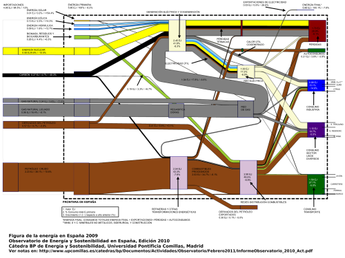
The annual report 2010 includes three Sankey diagrams, two of which are shown below. The first Sankey diagram (p. 16 of the report) has the typical pattern of a ‘national energy consumption, conversion and use’ diagram, similar to the ones presented here on the blog several times already for other countries.
The flows from the left show energy sources, the nodes on the right are the use sectors. A nice feature here is that the node heights are adapted to the magnitude of the Sankey arrow, so that the largest energy consumption can immediately be seen. Flows are in in Exajoule (1 EJ = 1000 Petajoule = 10E18 J). The total primary energy consumption in Spain in 2009 was 5.86 EJ (4.95 EJ of which are from imported fuels). Also shown next to the absolute quantities is the relative share of each flow in percent, and the change in comparison to the previous year.
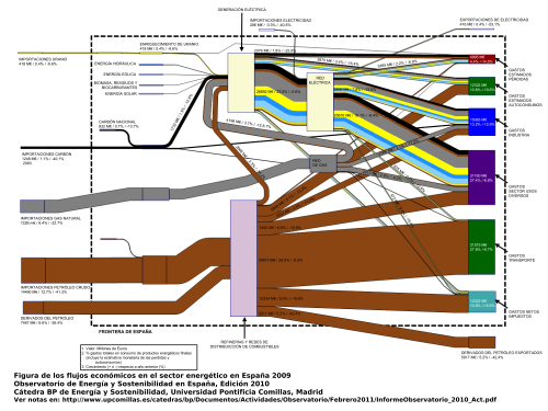
The second Sankey diagram (p.22) is what I would call a value stream Sankey diagram.
This is interesting as the market price for the fuels, as well as for converted energy is used as a weighting factor, so that each Sankey arrow shows the value of the energy flow in millions of Euro. At some nodes you can see that a smaller arrow enters, and a wider arrow leaves: These are the conversion processes where value is added (or energy gets more expensive). This is a compelling concept for a Sankey diagram (another similar example is here), one that somehow could make Sankey diagrams more interesting for economists or controllers, rather than considering them exclusively in the engineering domain.
The third diagram (not shown here, p. 19 in the report) shows the embodied carbon or the greenhouse gas emissions related to the different fuels, broken down by fuel and sector of energy consumption. The embodied carbon in the energy carriers were roughly 285 Mtons in 2009. The Sankey arrows for renewable energy sources as well as for Uranium are not present in the third diagram.
Me gustan mucho estas tres diagramas de Sankey! Merecen elogío.


