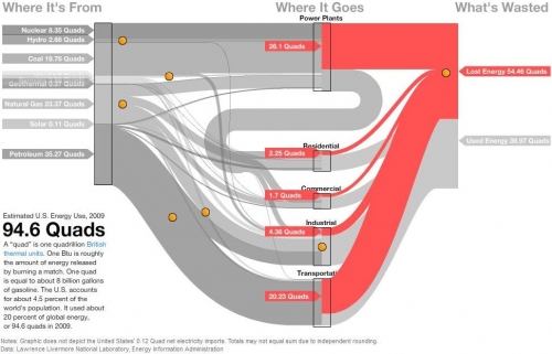
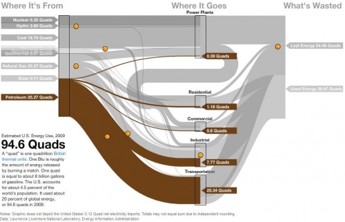
David Yanofsky from the Bloomberg Newsroom advised me of a Sankey Diagram he did on U.S. Energy Flows. The diagram is based on the well-known Lawrence Livermore National Laboratory (LLNL) diagrams and shows the 94.6 quads (1 quad = 1 quadrillion BTUs) estimated energy use in the United States in 2009.
The Sankey diagram has a nice mouse over effect, that let’s the user explore the stream as they are highlighted in different colors. The nodes show the contribution from different carriers. Additional information is available when positioning the mouse over the orange bullets. This makes the diagram fun to explore…
In this image the lost energy is highlighted in red.
In the above screenshot the energy flows based on petroleum are shown in brown color, all other flows in light grey.
These are only two static screenshots, please go over to the Bloomberg site to see more.


