Month: October 2012

Sankey Diagram in Energy Management

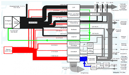
From a presentation on energy management held by Thomas Keller of Ecowin (available at the KNUT Hessen website) comes the following Sankey diagram.

The diagram is in German, but I get the main point: Energy and heat consumption in a company in MJ per hour. Fuels are natural gas (black streams) and electricity (red streams). The white boxes are the processes consuming the energy. Grey flows are transformed energy or losses.
Data seems to come from a energy management software with measuring devices installed along the production line. The company is about to obtain ISO 50001 certification.

I have recently noticed an increased use of Sankey diagrams in ISO 50001 case studies. Hope to see more of them coming.
Coffee Sankey Diagram

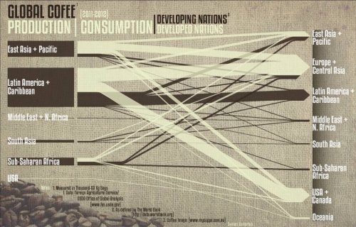
After all these Sankey diagrams for energy flows, flows of carbon, phosphorus, and the like here is a special one for all those of you, who are coffee addicts – like me. Saman Zomorodi on his blog ‘Saman’s System, Sites and Buildings’ features a coffee flow Sankey diagram in this post.

This is an infographic for global coffee production. Producers are on the left side, coffee consumers are on the right. The dark brown flows are for developing nations, while the milk coffee color ones are for developed nations. No quantities given in the diagram, so we don’t learn the actual absolute figures.

However, “this allows the reader to actually see where coffee is being made and how far it actually travels to another world region. As evident in the diagram, almost all coffee is produced in the developing nations, while the majority of it is consumed in the developed nations. This relationship underscores the unproportional amount the developed world consumes, while the developing nations have to pay many hidden costs.”

The original image is 2MB and I had to resize it with a loss in quality. Visit Saman’s blog to download a highres version of the diagram.…

Sankey for Energy Mass Balance

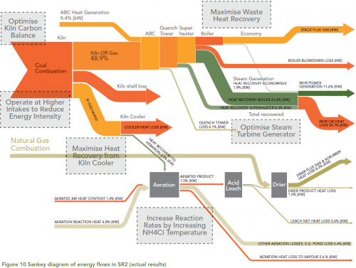
From a collection of case studies on Energy Efficiency found on the website of the Australian Department of Resources, Energy and Tourism (RET) comes the following Sankey diagram.

This is from a synthetic rutile plant of Iluka Resources Ltd. in Western Australia.

Iluka used the output from the energy and mass flows model to generate a Sankey diagram to represent the results in a visually effective and concise manner. The Sankey diagram illustrates where energy is supplied to the process, how it is transformed and where it leaves the process. … The width of the arrows is in proportion to the amount of energy associated with each part of the process. The Sankey diagram is an effective and intuitive way to communicate the energy flows at the plant. The diagram was used extensively during Iluka’s opportunity workshops. The diagram assisted the staff at the workshop to focus their attention on where the largest energy flows exist and identify where the main areas for improvement lie.

Flows are in percent of the energy input. Possible improvement measures are given in the grey boxes.

Full case study here (PDF).