Month: May 2014

Coffee, tea, cocoa

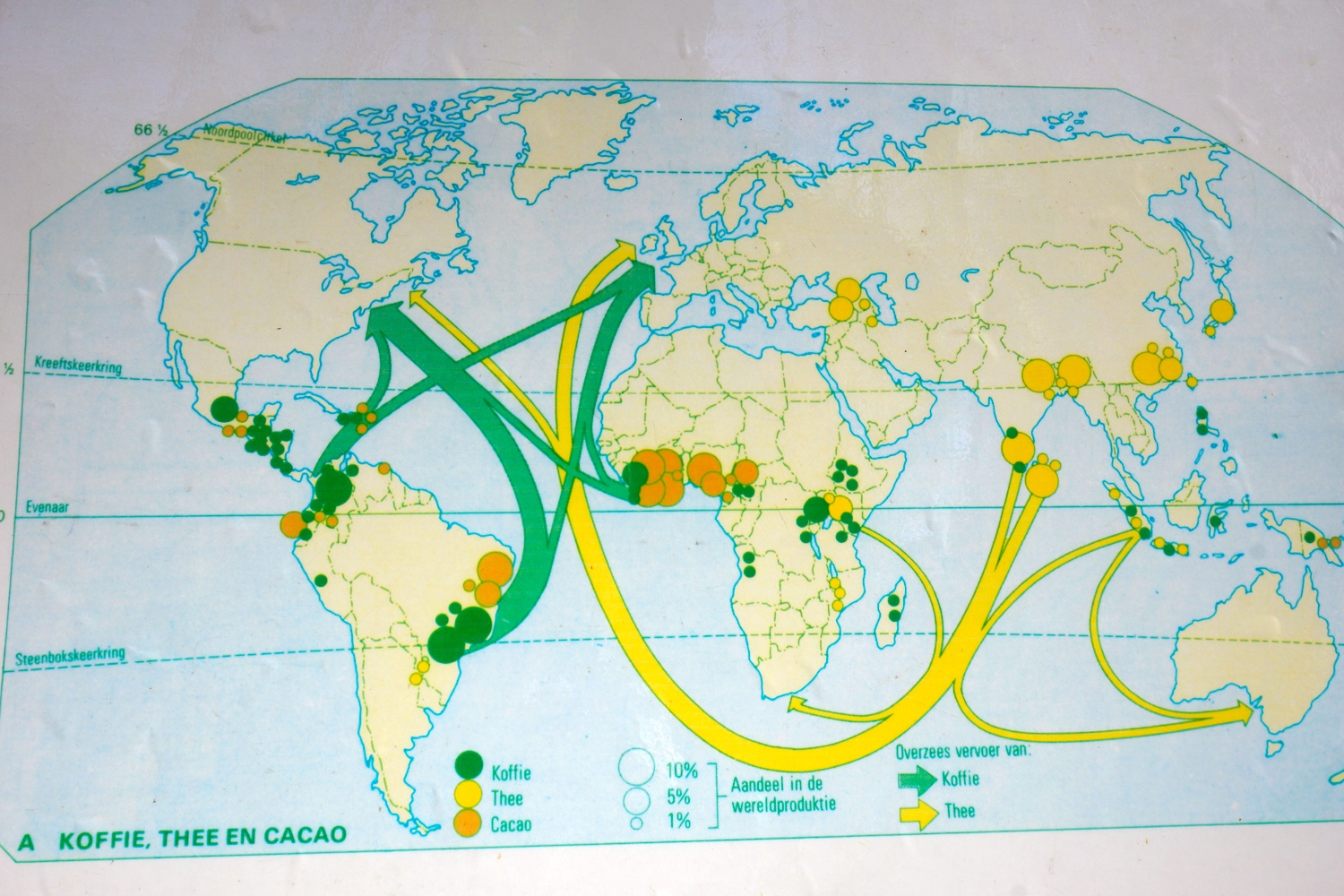
Blog reader Panalion sent me a photo taken in Amsterdam’s Botanical Garden. It is of a map showing coffee and tea flows from producing countries to mainly Europe and North America. Panalion writes “I thought you might like this Sankey map I found attached to a cable between two palm trees. There were chairs set up to accomodate school classes”.

This map is for didactic purposes and features no absolute figures and no year. In addition to the export flows of coffee and tea shown as arrows the map also has circles of three different sizes representing percentage of world production of coffee, tea and cocoa in the originating country.

Infographers might have better ways of showing this information. But in this case I think it is sufficient to get the message across to the target audience, the school kids.
Color Gradient in Sankey Diagram

Following yesterday’s post on d3.js with Sankey library used to allowing online creation of Sankey diagrams I went to update myself on developments around d3.js/Sankey.

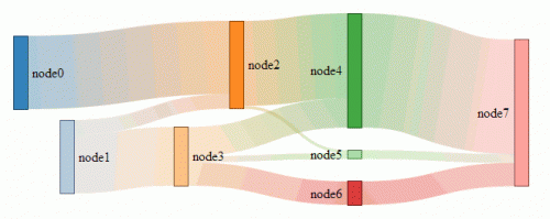
Found this discussion on color gradients in Sankey diagrams at Stackoverflow quite interesting. User Amelia BR has created this example:

AmeliaBR points out that this solution “will only work because the paths are almost straight lines, so a linear gradient will look half-decent — setting a path stroke to a gradient does not make the gradient curve with the path!”.

I remembered that e!Sankey had color gradients too and checked how the software handles this. Here are two different versions I quickly did:

The first one shows the nodes (starting point/destination point of an arrow) and confirmed my guess that the definition of the too/from colors of the gradient must be based on the fill color of the node. In fact you have the option too choose “Gradient from Source” and/or “Gradient to Destination” flags separately.

When dragging the nodes around the arrow colors do show some artifacts and the images refreshes when the action is terminated. I then did an improved version of the diagram by hiding the nodes (left only node B for comparison) and setting a negative undercut at the node. This moves the spear arrow head closer to the foot of the following arrow which gives a nice effect, I think.

Finally, I also learned it is probably wiser to limit oneself to a range of harmonizing colors rather than using too many different colors (as I did).

Simple Diagrams with SankeyMATIC

Steve Bogart has released a website for autoMATICally creating simple horizontal distribution diagrams. No need to install a tool, just go to sankeymatic.com and enter your values. On each line define source node, quantity in square brackets, destination node (e.g. “Budget [450] Housing” or “Budget [300] Food”). Columns and bands will be created automatically.

A number of options can be set, such as colors, spacing and labels. Finally, when you have created your diagram you can download it directly (three sizes/resolutions available).

This simple online tool is based on the open source tool D3.js and its Sankey library.

Try it out yourself!

I have added SankeyMATIC to the list of software tools for Sankey diagrams (seriously thinking about creating an own group for d3.js-based products).

Energy Flows in Building Sector

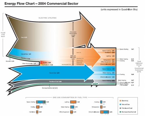
An energy flow chart for energy use in the residential building sector is shown on the Autodesk Sustainability Workshop page ‘Measuring Building Energy Use’. There is also a similar Sankey diagram for energy sources consumption in the commercial building sector.

Both are taken from a Pacific Northwest National Laboratory (PNNL) report from 2006 prepared for Department of Energy (DOE) titled ‘Energy End-Use Flow Maps for the Buildings Sector by D.B. Belzer (PNNL-16263).

Residential building sector energy flow chart:

Commercial building sector energy flow chart:

Both Sankey diagrams are built up the same way. The top part of each diagram shows electricity generation, the bottom part the energy flows for heating. Significant conversion and transmission losses can be identified by the arrow branching out at the top. Flows from the left represent the energy sources: coal (brown), natural gas (blue), biomass/solar (green). To the right the flows are broken down to the individual consumption, such as heating, cooling, lighting, other electric appliances, etc.

All units are in quadrillion BTUs for the U.S in 2004.