Month: October 2014

Participatory Urban Metabolism Information System

Interesting project described in the blog article ‘Understanding your city by understanding its flow: towards Participatory Urban Metabolism Information Systems’ by Sven Eberlein of the Ecocitizen Worldmap Project.

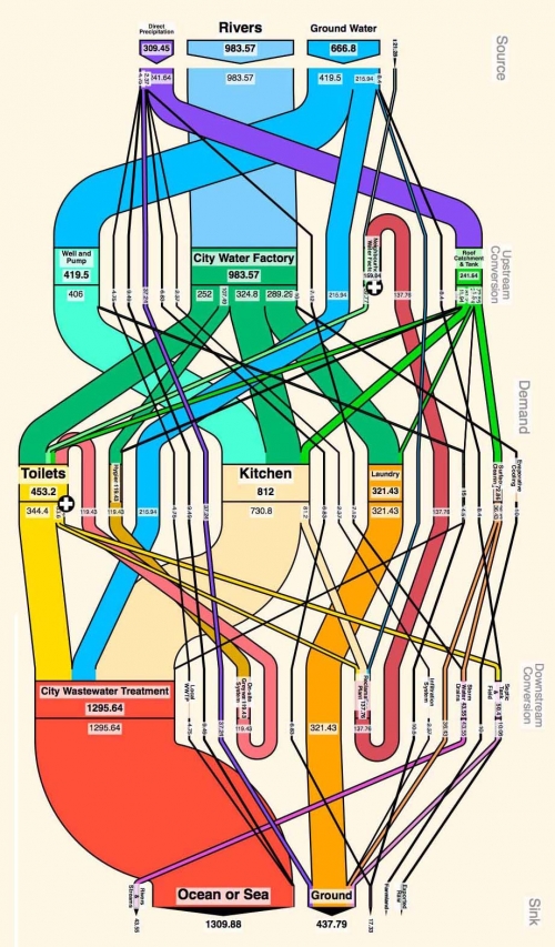
This is a participatory approach where young citizens track the water flows in their city in a crowd-mapping approach. The data is visualized as Sankey diagram (here called MetaFlow diagram). Pilots were carried out in Casablanca and Cairo.

This project is somehow linked to Sebastian Moffat’s activities I have featured in a blog post back in 2008.

This seems to be the result from either the Casablanca or the Cairo field work. Great colorful Sankey flow diagrams. Judging from the photos in the blog post, working with the local community seems to have been fun. The participatory approach is emphasized (Sven calls this a ‘Participatory Urban Metabolism Information System (PUMIS)’).

More Sankey diagrams can be seen in the original blog post.
Energy Sankey Diagram for Nickel Production

The below diagram is shown in a short paper ‘A Sankey Diagram for Nickel Production’ by M. Levesque (School of Engineering, Laurentailn University, Sudbury, ON, Canada) and D. Millar (MINARCO, Sudbury, ON, Canada). The paper was presented at the ‘1000 Island Energy Research Forum (TIERF) 2011. It also appears on a poster on the same topic available on the MIRARCO website (large PDF!).

The diagram shows energy production, transformation and consumption in the Nickel production. This not only includes dryers, kilns and furnaces, but also supporting activities such as port handling and transportation.

No absolute values given in the diagram, and even the fuels are not specified (although you can identify what is probably hard coal, lignite, natural gas). Most likely a question of confidentiality. A left-to-right orientation of the diagram is presumed, and no arrow heads are shown. This could lead to an interpretation issue for the green band that leaves the power stations PS1 and PS2 vertically.

The paper concludes “The Sankey diagram highlights the areas in the process where focus is required for subsequent energy management effort.”

Non Process Energy Flow Diagrams

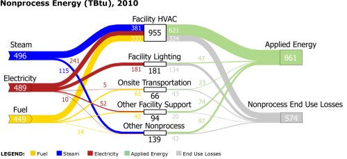
The U.S. Department of Energy (DOE), Office of Energy Efficiency & Renewable Energy publishes Sankey diagrams on non process energy on this webiste.

What is non-process energy you might ask. According to DOE, non process energy is “energy used for purposes other than converting raw material into manufactured product. MECS-specified categories of nonprocess energy include facility HVAC, facility lighting, onsite transportation, other facility support (e.g., cooking, water heating), and other nonprocess use.”

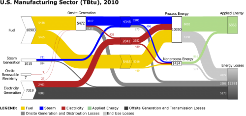
You can access the energy flow Sankey diagram for the full U.S. manufacturing sector. Data is from 2010 and flows are in TBtu (Trillion British Thermal Units) per year.

Detailed diagrams on on-site generation, process energy and non-process energy (the three ‘transforming nodes’ in the middle of the full sector) are also presented.

Grey and black arrows show losses. Good work from the Office of Energy Efficiency & Renewable Energy.