Month: December 2015

2016 Wishes Sankey Diagram

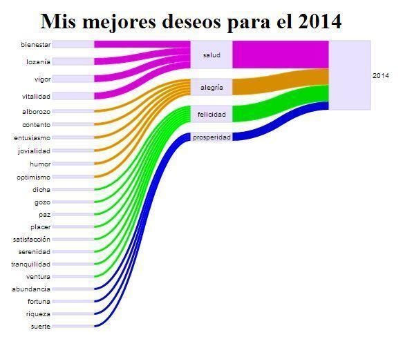
OK, this doesn’t claim to be scientific at all. Credits for this idea go to Mariluz Congosto who did such a New Year’s Wishes Sankey Diagram in Spanish two years ago.

This time I refrain from criticism of the Sankey diagram. I could say that there are no units given for the flow quanities. Also, weight of the contributions to the four categories will in most personal cases not be equal. Love must certainly have a much fatter arrow. For some, prosperity might have more importance. Are the categories weighted properly amongst each other? Are the colors chosen appropriately? 😉

Best wishes to all readers of the blog. Have a very happy new year 2016 full of health, happiness, luck and prosperity! For a recipe use the Sankey diagram above.

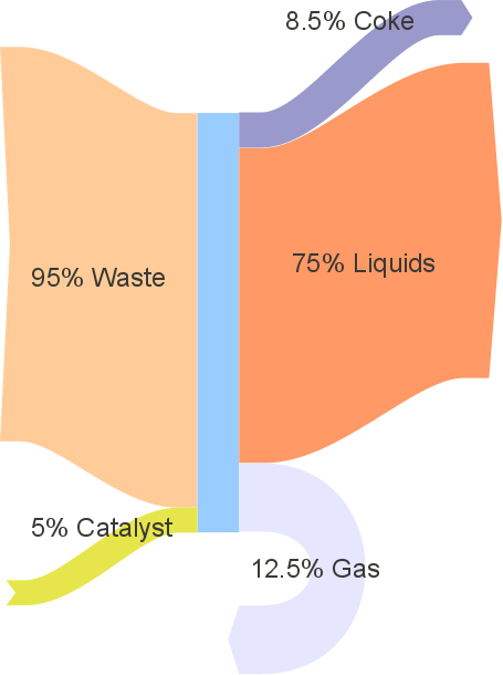
Original Sankey diagram for 2014 by Mariluz Congosto with whom I share an afición:

CHP in Hospital, e!Sankey 4 Sample

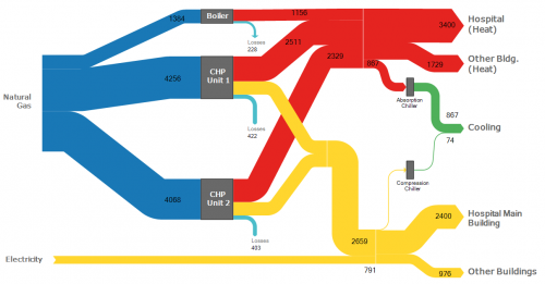
Closing my blogging activities for this year with a simple, clear, colorful Sankey diagram. This one is shipped with the demo version of e!Sankey 4 as a sample diagram.

This is for energy flows (heat and electricity) in a hospital. Flows are in MWh per year. Natural gas is used to fire a steam boiler and two cogeneration (CHP) units. Heat is used directly for heating in hospital buildings (red arrows). Power from CHP and electricity from the grid shown as yellow arrows.

Fuel Cell Technology Sankey Diagram

As you are aware I am constantly looking for samples of Sankey diagrams, be they good, mediocre, or … fair.

This 2009 report on fuel cell technology (‘Natural Gas – Fueled Distributed Generation Solid Oxide Fuel Cell Systems. Projection of Performance and Cost of Electricity’ prepared by J.Thijssen LLC for US Department of Energy, National Energy Technology Laboratory, and RDS under contract number 41817M2846) has two Sankey diagrams I would like to share with you. The report assesses energy efficiency, water use and CO2 emissions of the fuel cell system.

I confess I am no expert in fuel cell technology (Wikipedia basics), and I assume the technology has evolved quite a bit over the last years. So I limit myself to a description of the Sankey diagrams presented.

On page 9 figure 3-4 shows the energy balance “Sankey Diagram of the Baseline NG DG SOFC System” (NG = natural gas, DG = distributed generation, SOFC = solid oxide fuel cell). With an energy content of the natural gas input of 9.1 MW (based on the higher heating value) and an output of 5.2 MW electric energy the system has an efficiency of 57%.
We can identify three loopbacks: syngas is recovered and fed back into the process, and heat is recovered “by thermal recuperation (by preheating the cathode air and raising and superheating steam) and chemical recuperation (by reforming part of the hydrocarbons, mainly methane, in the fuel)” (p. 8). These are the red arrows.
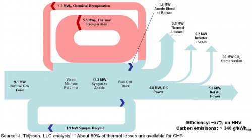
Now here is what I don’t like about the Sankey diagram: While most of the arrows seem to be to scale, some aren’t. Losses branching out to the top are graphically exaggerated. The arrow representing thermal losses (2.5 MW) should be about half as wide as the one for 5.2 MW ‘Net Power AC’.
The heavy spikes at the head of the arrow for inverter losses and energy used for CO2 compression overemphasize the comparatively small quantities of 0.2 MW and 0.3 MW (?!). The latter arrow seems to be labeled incorrectly (30 MW instead of 0.3 MW).

The Sankey diagram for water use of the fuel cell system on page 22 also has some obvious technical flaws:

In this diagram we are looking at water flow rates in kg/s. It seems as if most of the water is in a closed loop (0.52 kg/s) in the syngas recovery. The report on page 21 explains that “[w]hile the water demand for the NGDG system is considerable, net water use for the NGDG system is minor (only about 0.15 gal/kWh or 790 gal/day […]). The steam reformer has a steam demand more than 10 times this amount (about 0.55 kg/s)”. The label of the feed arrow at the top left has a wrong label and refers to 790 gal/hour(!).

The magnitude (width of arrow) of the main loop representing a flow rate of 0.52 kg/s water in syngas recycle is not maintained especially in the curves.
The main problem however is that it is not clear at which process step water comes in or flows out. I have come to the conclusion that the arrows for inflows (increase of arrow width) and outflows/losses (decrease of arrow width) are actually missing. So if you imagine an outward arrow to the label “0.12 kg/s water consumption at SMR” and two inward arrows from “0.44 kg/s water production in stack” and “0.06 kg/s water production in burner” the Sankey diagram starts to make sense.

Will try to draw my own version of the Sankey diagram and present it here. Note that ‘SMR’ is for steam methane reforming, abbreviation not explained in the report.
Refurbishment of Thermal Power Plants

The conference paper ‘Repowering: An option for refurbishment of old thermal power plants in Latin-American countries’ (in: Proceedings of ASME Turbo Expo 2010: Power for Land, Sea and Air GT2010 (June 14-18, 2010, Glasgow, UK). DOI: 10.1115/GT2010-23058) by Irrazabal Bohorquez et al. of the Universidade Federal de Itajubá (UNIFEI) in Brazil has several Sankey diagrams to visualize energy flows in repowered thermal power plants.

Flows are im MWe. The base situation (A) in the power plant built in the 1970ies is shown in this Sankey diagram:

And the situation in one of the six refurbishment scenarios (B to G) for the power plant:

In the refurbishment scenario gas turbines (GT) are being installed. Exhaust gas is recovered and used in a heat recovery steam generation (HRSG).

For each scenatio the cost for generated electricity is assessed as well as the CO2 emissions associated with energy generation.
Check out the paper @ Researchgate for more Sankey diagrams.

Energy Efficiency made in Hesse

An English-language publication ‘A Practical Guide to Energy Efficiency in Production Processes’ published by the Ministry of Economics, Energy, Transport, Urban and Regional Development of the federal German state Hesse (PDF here) describes a structured approach and methodological toolbox to increase energy efficiency in large manufacturing companies. It also contains practical recommendations.

The below Sankey diagrams are based on data from a pilot implementation (“model project”) at a plastics manufacturer.

This is the Sankey diagram for the energy consumption (electricity and gas) in the existing (baseline) scenario

… and for one of the alternatives assessed in the project:

In this alternative scenario, heat is produced from natural gas rather than from electricity, thus reducing transformation losses. Heat recovery measures are also implemented. Flow values are in MWh per year for a given average production volume.

A second alternative scenario with trigeneration is also evaluated (see pp. 43-45 in the report) and potential cost savings and payback time are discussed.

From a design perspective the Sankey diagrams are quite okay, well structured. Some flaws can be noted in arrow segments that run diagonally, where the width of the arrow is not maintained. Overall energy supply and consumption are not shown in the diagram, but only individual values.

Water Use in Coal Power Plant

This presentation on ‘Water Management for Fossil Energy Systems’ by Susan M. Maley, Technology Manager for Crosscutting Research at the U.S. Department of Energy (DOE) / National Energy Technology Laboratory (NETL) gives an overview of the activities and research into ‘Current Activities in Water Management Research and Development’.

On page 9 it features these two Sankey digrams showing water usage in a 500 MW pulverized coal plant.

On the left the situation without CO2 capture, on the right with CO2 capture. Water withdrawal almost doubles (524 gal/MWh to 1049 gal/MWh) when implementing CO2 capture.

Mind that the left and the right Sankey diagram can not be compared directly as they use a different scaling factor.