Month: July 2016

Flow of Resources in Large Organizations

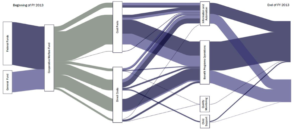
A group of people from Idaho’s Office of Performance Evaluations, an independent agency of the state, have contributed a post to the AEA365 blog – A Tip-a-Day by and for Evaluators back in June 2014.

Rakesh Mohan, Lance McCleve, Tony Grange, Bryon Welch, and Margaret Campbell recommend Sankey diagrams as “A Cool Tool for Explaining the Complex Flow of Resources in Large Organizations”

“Communicating the flow of dollars was the trickiest piece of the study. We considered narratives, tables, and traditional flowcharts. Ultimately, we used Sankey diagrams that helped stakeholders visualize funds moving through the department making them the most useful features of our report.”

The Sankey diagram depicted shows Idaho state funds in FY2013. Although the absolute figures or the total sum are not shown in this figure, the diagram is most likely based on real budget data.
China Energy Flows 1971 and 2010

The article ‘Understanding China’s past and future energy demand: An exergy efficiency and decomposition analysis’ by Paul E. Brockway, Julia K. Steinberger, John R. Barrett, and Timothy J. Foxon (all of Sustainability Research Institute, School of Earth and Environment, University of Leeds, UK) appeared in Applied Energy 155:892-903 in October 2015 and features a comparison of China’s energy use in 1971 and 2010. These Sankey diagrams were drawn up to show “the overall flow of exergy to end useful work, and the exergy losses that occur during the various conversion processes”.

China’s energy usage is roughly tenfold in 2010 compared to 40 years ago (37 Mtoe up to 355 Mtoe). Not sure whether both diagrams are setup on the same scale but judging from e.g. the black coal flow (140 Mtoe in 1971, 577 Mtoe in 2010) that is about 4 times wider, I would say they are.

Another interesting detail in these diagrams is that the authors have included food and feed as energy source. This is the first time I see this in a national energy flow map. Given that the energy content of this “fuel” is higher than both combustible renewables and renewables together, it seems justified to include it. The efficiency of turning food and feed energy into muscle work, however, is very low (approx. 3%).

I invite you to read the full article (open access) and to comment on the Sankey diagrams shown in Appendix B.

University of Maryland, CHHP system

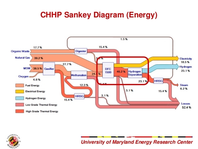
This Sankey diagram is from a presentation by a student team of University of Maryland. They participated in a Hydrogen Student Design Contest in 2011/2012 sponsored by the Department of Energy

The Sankey diagram is for a combined heat, hydrogen, and power (CHHP) system for the UoMD campus.

Flows don’t depict absolute values, but rather how the fuel input (municipal solid waste, organic waste, natural gas) is split into energy outputs (electricity, hydrogen, and steam). Losses (52.4%) at each process stage are shown as red arrows.