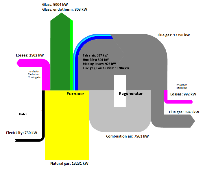
Glass Service s.a., a consulting firm from Czech Republic offers energy audits for companies from the glass industry. This is a Sankey diagram from their website. Flows in kWh for a sample furnace, with energy recovery from flue gas.
Pakistan Energy Flow Diagram
Published on the ‘The Efficient Appliances Blog’ is Pakistan’s First Energy Flow Diagram by Nida Rizwan Farid. The Sankey diagram is a piece of work for Pakistan’s Integrated Energy Plan and covers energy data for 2012/2013.
A more detailed explanation of the energy situation is given on this page. The author observes that “[o]ut of the 40.2 MTOE of final energy that trickles down the consumers, 72.7% of it is lost by the usage of inefficient appliances, motor vehicles and industrial processes. Only 10.96 MTOE of useful energy is received.”
Mapping Scottish IndyRef Votes
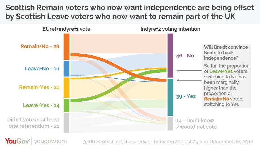
Good use for a distribution diagram shown in the January 2017 Guardian op-ed ‘Why hasn’t Scotland changed its mind on independence?’. It shows Scottish voter behaviour in the first pre-Brexit vote independence referendum (‘IndyRef1’) and intended vote in the second independence referendum (‘IndyRef2’), based on a poll among some 3,200 Scots in Nov/Dec 2016.
(via Coffee Spoons blog, originally from The Guardian, using YouGov data)
The left columns has two categories (Brexit Leave/Remain and first independence vote ‘Aye’/’Nae’), the second only one category. Both columns have the undecided voters fraction in light grey.
The changeovers from one camp to the other are shown emphasized in strong colors. One can see that the ones who voted “No” in the first referendum and that would now vote “Yes” for Scottish independence are compensated by voters who said “Yes” in the first vote, and who would now probably go for a “No”.
There seem to be less undecided voters (down from 21% to 14%), but the overall outcome would at present be the same: 46% No, 39% Yes (Indyref1: 44% No, 35% Yes). Of course a lot has happened since the poll in Nov/Dec 2016 and there is still a long way to go up to IndyRef2.

