Month: April 2018

Minerals Exports from Latin America

Another Sankey diagram from the article ‘Exergoecology Assessment of Mineral Exports from Latin America: Beyond a Tonnage Perspective’ by Jose-Luis Palacios I discussed in this recent post.

Non-fuel minerals exported in 2013 from Latin America to other continents. Flows are in Mtoe (for the reason why these flows are measured with a typical energy unit and to learn about the ERC approach read the article). Due to the scale, some minerals can not be seen as individual flows in the Sankey diagram and are thus grouped as ‘Rest of Minerals’ (black stream).

Handling Different Scales in one Diagram

Those of you who have already created Sankey diagrams might have come across the issue: As long as the flow data you are about to visualize is more or less in the same value range everything is fine, and there should be no problem in coming up with an nice Sankey diagram. However, sometimes we have very small flow quantities, while at the same time there are some large flows dominating the picture.

Sticking to the “golden rule” of Sankey diagrams (i.e. the width of the Sankey arrow corresponds to the flow quantity represented) and ensuring the proportionality of flows in relation to each other becomes very difficult. If you opt to show the larger flows at “normal” width, the smaller flows become difficult to perceive and are shown as hairlines (sometimes even invisible on a screen or in print). If, on the other hand, you decide to push up the scaling factor so that these smaller flow quantities can be seen in the diagram, then the large flows are really fat and spoil your diagram.

This seems to be an irresolvable issue… Nevertheless, there are some approaches to tackle this. Most of them resort to taking out the tiny flows or the very large flows of being to scale used in the Sankey diagram. You may opt to use a minimum width (e.g. 1 or 2 pixels) for arrows that carry only a small flow quantity, or you may decide to set an upper flow threshold, corresponding to a maximum width for the Sankey arrow, independent of the actual flow quantity (beyond the threshold value). In both cases I would strongly recommend to denote this decision in the diagram (e.g. in a footnote), since otherwise the person looking at the Sankey diagram will get a wrong idea of the quantities/proportions.

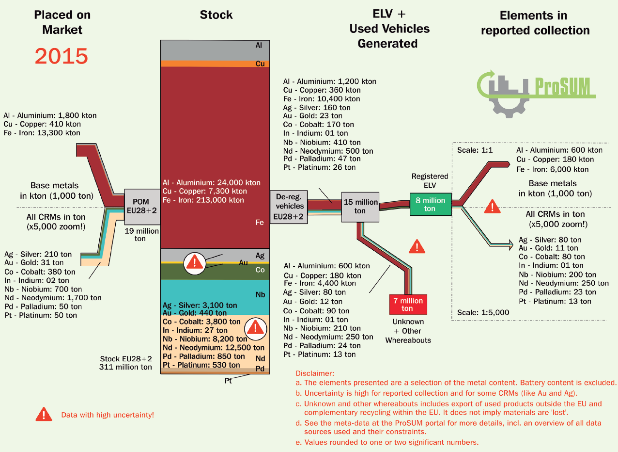
The Sankey diagram from the PROSUM report I recently featured in this post has another, quite unique solution. Here is a zoomed cropped section:

The metals in the end-of-life vehicle (ELV) stream of 8 million tons (in 2016) are mainly aluminium, copper and iron. This stream is on the same scale as the overall Sankey diagram (see full diagram here). However, the other metals in the stream (such as gold, silver or platinum) are contained in comparatively much smaller amounts. The authors of the Sankey diagram hence opted to emphasize them by switching to another scale (1:5.000). As a result the arrow representing the flow of approximately 660 tons of critical raw materials (CRMs) is almost a wide as the arrow that shows 6780 ktons!

The fact that the precious metal stream is highlighted and not to scale with the rest of the flows in the diagram is clearly signalled with a note, a dotted line that separates this diagram area, and even an exclamation mark symbol.

Since CRMs were the focus of the PROSUM study I think such a “trick” is justified. What are your experiences with flows on different scales? How would you handle this “dimension challenge” in a Sankey diagram? Let me know your ideas!

Material Flows in the EU economy

Up on the EUR-Lex, the European Union’s database on laws, regulations, publications and reports is a staff working paper ‘Measuring progress towards circular economy in the European Union – Key indicators for a monitoring framework’ meant as accompanying background text for a ‘Communication from the Commission to the European Parliament, the Council, the European Economic and Social Committee and the Committee of the Regions on a monitoring framework for the circular economy’.

And it shows this beautiful Sankey diagram on material flows in the EU economy (2014).

Beautifully crafted, this diagram shows that “8 billion tonnes of raw materials were processed during 2014 in the EU: of this 1.5 billion (i.e. around 20%) are imported, which indicates the EU dependency on imports of materials. Out of the 8 billion tonnes of processed materials, 3.1 billion tonnes are directed to energetic use, 4.2 to material use and 0.6 are not used in the EU but exported.”

Flows are in Gt/yr (billion tons per year. The composition of the flows is presented at certain points in the diagram as bar charts on top of the dark blue bands: metal ores, non-metallic minerals, fossil energy materials/carriers and biomass. For each of those four groups individual Sankey diagrams can also be found in the working paper.

The EU never stops to surprise me! In this case in a positive way, as Sankey diagrams seem to have arrived at the top echelons of European policy making (or at least with their staff).

TriVersa biorefinery process

Javier Dufuor on the madrid+d Energía y Sostenibilidad blog reports about a novel lignocellulose biorefinery process developed by Prof. James A. Dumesic at the University of Wisconsin-Madison. This so-called TriVersa process can yield up to 80% of biomass from birch wood as marketable products.

The Sankey diagram for the TriVersa process shows carbon in biomass flows. Values are in percent, starting with the 100% C molecules in birch wood being used as feedstock.

An interesting detail about this Sankey diagram is that it additionally uses the process “nodes” or “boxes” to indicate operating cost and annualized capital cost. No numbers are given here, but the height of the process box indicates the overall cost (in a kind of stacked bar chart).