Month: August 2018

Energy Flows in Wood Gasification Plant

Most Sankey diagrams I find on the web are from Germany, Switzerland or Austria. Anybody in the know, if this due to the visualization type being part of the engineering curriculae in these countries?

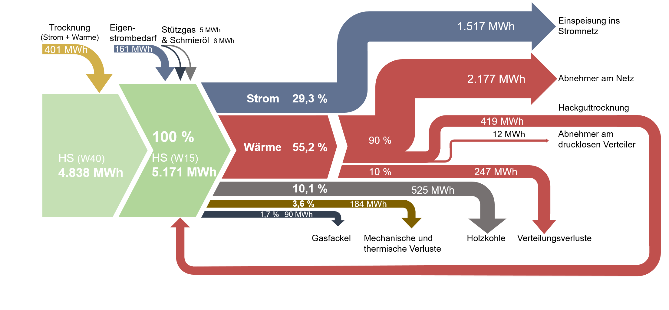
Here is one I found on ‘The Wood Power Plant’ blog by Austrian firm Syntec. It is originally taken from a student master thesis on ‘Life Cycle Analysis of Electricity and Heat Generation of a Wood Gasification Plant including District Heating Network’ (German title: ‘Lebenszyklusanalyse der Strom- und Wärmeerzeugung einer Holzvergasungsanlage inklusive Nahwärmenetz’, thanks Google Translate – you are my friend!) by Elena Käppler of University of Applied Sciences Vorarlberg.

While being graphically quite appealing there are some issue with this Sankey diagram. Flows don’t seem to add up correctly: for example the main stream 4.838 MWh and the 401 MWh coming in at the top would be larger than 5.171 MWh.
Also, some flows are not true to scale. Check out the red arrow representing 247 MWh (going down to ‘Verteilungsverluste’) and compare it to the red one going back in a loop, which represents 419 MWh (‘Hackguttrocknung’).
Nordic Transport Energy in 2050

The report ‘Nordic Energy Technology Perspectives 2016’ published by IEA looks at energy scenarios for Northern Europe / Scandinavia and pathways to carbon-neutrality. Several Sankey diagrams are included in this extensive study.

These are the energy flows in the nordic countries caused by transport. The first Sankey diagram is for the current situation (data from 2015), the second for a 2050 carbon-neutral scenario (CNS).


© OECD/IEA 2016 Nordic Energy Technology Perspectives 2016, IEA Publishing. Licence: www.iea.org/t&c

In the 2050 scenario we see a massive shift from diesel and gasoline powered transport to biofuels and electricity. This ambitious target could be achieved with “fuel efficiency improvements on existing technologies but also rapid penetration of alternative drivetrain technologies such as hybrids and electric vehicles” (p. 66).

Check out the full report here.

Swiss Sankey Sweetness

Unpretentious and humble, quietly producing beautifully crafted Sankey diagrams … this is one reason why I admire the Swiss (and also for their Swiss Schoki, cheese and engineering skills).

This is the energy flow chart for the Swiss canton ‘Basel-Stadt’ for 2014 published by the Statistics Agency of the canton (Statistisches Amt des Kantons Basel-Stadt).

Flows are in Gwh. Nine different energy sources on the left, but only three sectors of energy use: transport, residential and non-residential. Observe how the colors of the icons match the corresponding colors of the arrows. Flow quantities below approximately 150 GWh are not true to scale and are drawn with a minimum width to keep them visible. The footnote alerts the reader to this graphical pecularity.

This Sankey diagram does set a standard for other similar energy flow charts, in my opinion.

Download the report from here (in German), the diagram is on page 11.

Vintage Wind Park Sankey Diagram

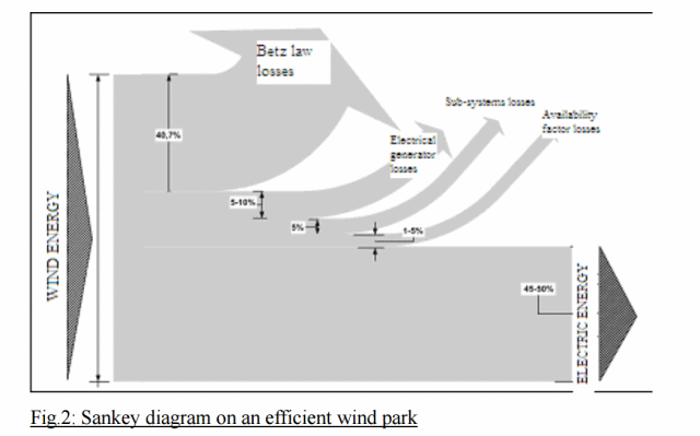
A vintage black and white Sankey diagram for an efficient wind park is shown in this post on the Hypergeometric blog aka ‘667 per cm’ blog.

Out of the several Sankey diagrams shown, this one was new to me. So I dug a little deeper into the original source.

Published originally in: Koroneos, Christopher & Katopodi, E. (2011). Maximization of wind energy penetration with the use of H2 production — An exergy approach. Renewable and Sustainable Energy Reviews. 15. 648-656. 10.1016/j.rser.2010.06.022.

The authors from Aristotle University of Thessaloniki, Greece argue that Sankey diagrams can also be used to visualize exergy flows, and that they can be used to compare “exergy losses of an efficient and an unefficient wind park”.

The one above has “an excellent exploitation of wind energy for an organised park that operates efficiently and effectively”. They further discuss what factors contribute to losses based on an exergy analysis, and show several exergy Sankey diagrams.

Read full article here.