Month: January 2019

LatAm BEN – Bolivia

In my mini-series on National Energy Balances (Balance Energético Nacional, BEN) of countries in South and Central America, I have reached the Plurinational State of Bolivia.

I couldn’t find any Sankey diagrams on the website of the Ministerio de Hidrocarburos, which apparently is responsible for drawing up the energy balances for Bolivia. However, I was sure they must exist, as a press release for the launch event of the report exists. Finally I found a publication of the ministry for 2000-2009 in the BIVICA library and it has some black/white energy flow diagrams.

There have been newer editions of the report until at least 2015, and here is the BEN Bolivia for 2014 (from the OLADE library), You might remember that OLADE, the inter-governmental Organización Latinoamericana de Energía plays an important role in motivating countries to draw up their BEN and runs a website where BENs are available for many Latin American countries).


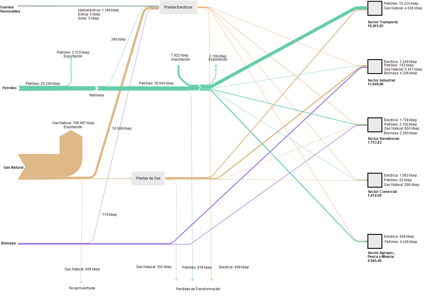
The unit of flows is ‘kbep’ (kilo barrels of oil equivalents / miles de barriles equivalentes de petróleo). Now, this Sankey diagram is definitely not to scale: the width of the flow representing 133,902 kbep of gas would have to be almost 6 times wider than the one standing for 23,065 kbep of petroleum. The biomass flow would have to be much thinner in comparison, hence it is over emphasized in the diagram for the reader who is unaware. My feeling is that the person who did this wasn’t acting with bad intentions, but had no technical means or support to do this properly and just glued it together from round rectangles, arrows and other shapes.

Definitely a candidate for a remake, if I find the time… Edit: I found some time to remake this BEN for Bolivia with flows being to scale. Quite a difference to the above! It becomes obvious, that the country is primarily a natural gas exporter. I didn’t notice this dominance of energy export at first. Now with the flows being to scale, the details and differences of the other flows are hard to tell. One would have to remove the natural gas export to show more of the domestic energy flows.

An analysis of the BEN Bolivia and some background on the data is available (in Spanish) in this paper.
Greenhouse Gas Emissions Brazil 2012

SEEG Sistema de Estimativas de Emissões de Gases de Efeito Estufa (Greenhouse Gas Emissions and Removals Estimates System) is an initiative of the Observatório do Clima (Climate Observatory) in Brazil.

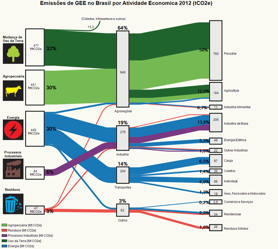
This Sankey diagram on the SEEG web page (in Portuguese) shows greenhouse gas (GHG) emissions in Brazil in 2012.

On the left are the emitters by sector: land transformation, livestock farming, energy generation, industrial processes and waste sector. Emissions are grouped in the middle column by activity: agriculture, industry, transport and other. The third column is a detailed breakdown of the activity sectors.

The agricultural sector contributed 64% of Brazil’s GHG emissions in 2012, with most likely methane (CH4) from livestock breeding and CO2 release from deforestation as the major sources.

Emissions are shown in Mt CO2-e[quivalents], even though the caption says differently. Overall greenhouse gas emissions were 1490 Mt CO2e (or 1.49 bn tonnes CO2e). Detailed data is available on the website, so this can be seen as the consolidated overview of GHG emissions.

More recent GHG data for 2017 from Brazil has been published at an event in November 2018 in São Paulo, but I couldn’t find a Sankey diagram (yet).

European Energy Transport Capacity 2030

This is an interesting kind-of-a-Sankey figure. Back in August I had posted on Nordic Transport Energy in 2050 with two Sankey diagrams from the ‘Nordic Energy Technology Perspectives 2016’ report published by IEA.

The topic of this diagram (taken from the same report) is the energy transmission or transport capacity between different regions in Europe and covering the area of the European Network of Transmission System Operators (ENTSO-E).


© OECD/IEA 2016 Nordic Energy Technology Perspectives 2016, IEA Publishing. Licence: www.iea.org/t&c

To visualize transmission capacity, Europe has been cut into energy regions, and a gap has been inserted between them to be able to distinguish them better. The width of the “bridges” represent the available energy transport capacity between these regions in 2030.

Some countries are divided into several energy producing regions. For example, if you look at Sweden, it is divided into SE_N1, SE_N2, SE_M and SE_S.

The bands are non-directional, so we do not know which region delivers to which region. And probably the energy transport will be able to go in both directions.

Check out the full report here.