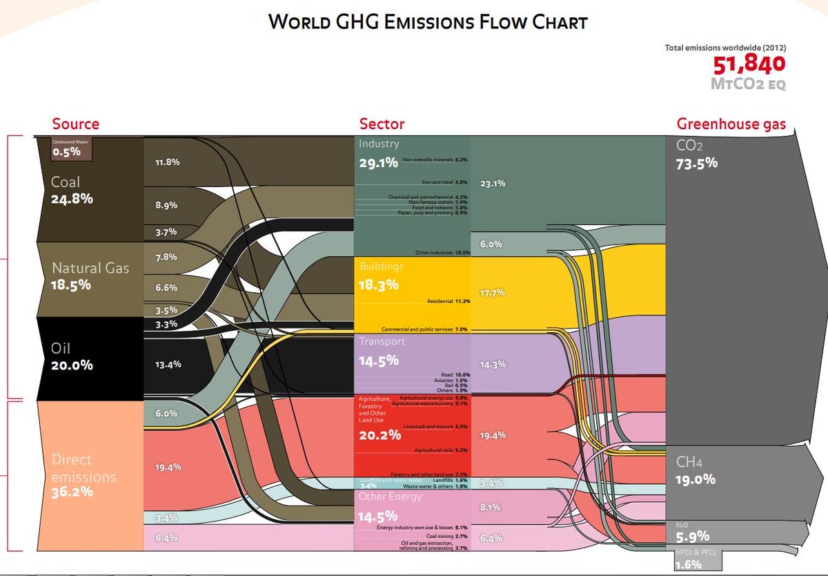
This “dense” or “block-style” Sankey diagram might look familiar to some. Indeed it is based on the greenhouse gas (GHG) emissions Sankey diagram for 2000 published by the World Resources Institute WRI (see this post). Consulting firm Ecofys (now Navigant) has updated the data and refined it, but kept the overall appearance of the figure.
via @ChrisChambers64
Total emissions of climate gases were 51,840 Mt Co2-eq. Carbon dioxide and methane contributed more than 90%. The industry sector is the largest emittor, followed by agriculture and land use.
Very clear and compact Sankey diagram, conveying the most important information about GHG emission sources.

