Month: June 2019

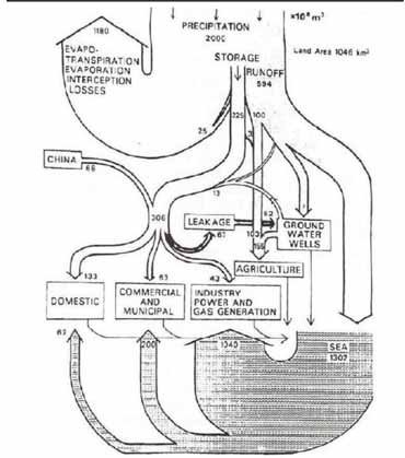
Hong Kong Water Flows

Sometimes I get a little nostalgic… Here is a Sankey diagram of water flows in Hong Kong. My guess is that it pre-dates 1997, so this would be the former British colony Hong Kong. Originally published in Worldbank’s Eco2 Cities book (Hiroaki Suzuki, Arish Dastur, Sebastian Moffatt, Nanae Yabuki and Hinako Maruyama. Eco2 Cities: Ecological Cities as Economic Cities. 2010), it is pictured in this guide(link currently broken) on page 41.


Flows of water are shown in 1.000.000 m³ of water (difficult to see, but I read this as 10 to the power of 6). Obviously hand drawn, so flows are not fully to scale.

Hongkong receives an average 2.000 Mm³ of precipitation (per year?) on a land area of 1.046 km² (interesting: todays area is 1.108 km²). Most of the water directly evaporates, and a large chunk goes into the sea.

This is considered an early example of a material flow analysis (MFA) visualization, and also of an urban metabolism study.
WEEE in Midi-Pyrénées

From what I know, France’s approach to tackling energy and waste issues is to break the topic down to the regional level, and to involve local stakeholders.

Here is an article on ‘Métabolisme territorial et filières de récupération-recyclage: le cas des déchets d’équipements électriques et électroniques (DEEE) en Midi-Pyrénées’ by Jean-Baptiste Bahers that was published in the journal Développement Durable et Territoires. Vol. 5, n°1 in February 2014.

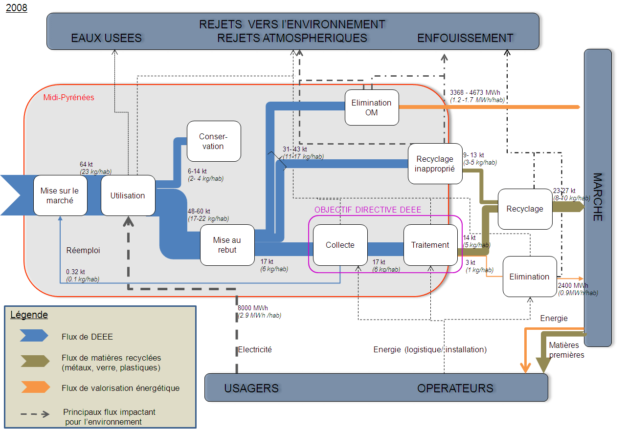
It discusses the ‘Territorial metabolism and recovery-recycling chain: the example of Waste Electrical and Electronic Equipment (WEEE) in the “Midi-Pyrénées” region and has the following Sankey diagram figure.


Licensed under CC BY-NC 4.0

WEEE waste streams are in kilo tonnes (kt) in the year 2008. Additionally, recovered energy from waste treatment is shown (in MWh) with orange arrows. The red line delimits the region, so apparently the electronics waste recycling and disposal (élimination) takes place outside the Midi-Pyrénées region. Some flows are labeled with a range (e.g. 6-14 kt), which is obviously difficult to draw as Sankey arrow. My guess is that the median value was used to determine the actual width of the affected arrows. A nice feature are the per capita values (e.g. 2-4 kg/hab), which makes it much easier to grasp and to relate to for the indivdual person living in Midi-Pyrénées.

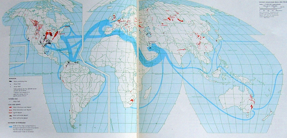
World Oil Flows Map

Did a clean up some of my hard disks and came across a number of gems I had saved. Unfortunately I hadn’t noted the sources for all of them.

Here is one of these. A photo of two facing pages in a book depicting world oil streams. You can find more Sankey diagrams on maps here on the blog if you search for the tag ‘map’. This one is different though, as it uses a special map projection (probably Goode homolosine) with a cut along the Atlantic and Hawai’i as an inset.


Unfortunately I do not know from which book that was taken. Neither do I know the year of reference or the unit of measure for the flows. We can see the oil shipments mainly starting from the Middle East and Venezuela with Europe and the U.S. as main destination markets. Additionally, areas where coal, natural gas and petroleum are extracted are marked on the land areas.

In the botton left corner the legend reads for “Movement of petroleum”: Width of flow lines is proportional to tonnage of petroleum (crude and products). The flow lines do not necessarily indicate exact routes of movement’