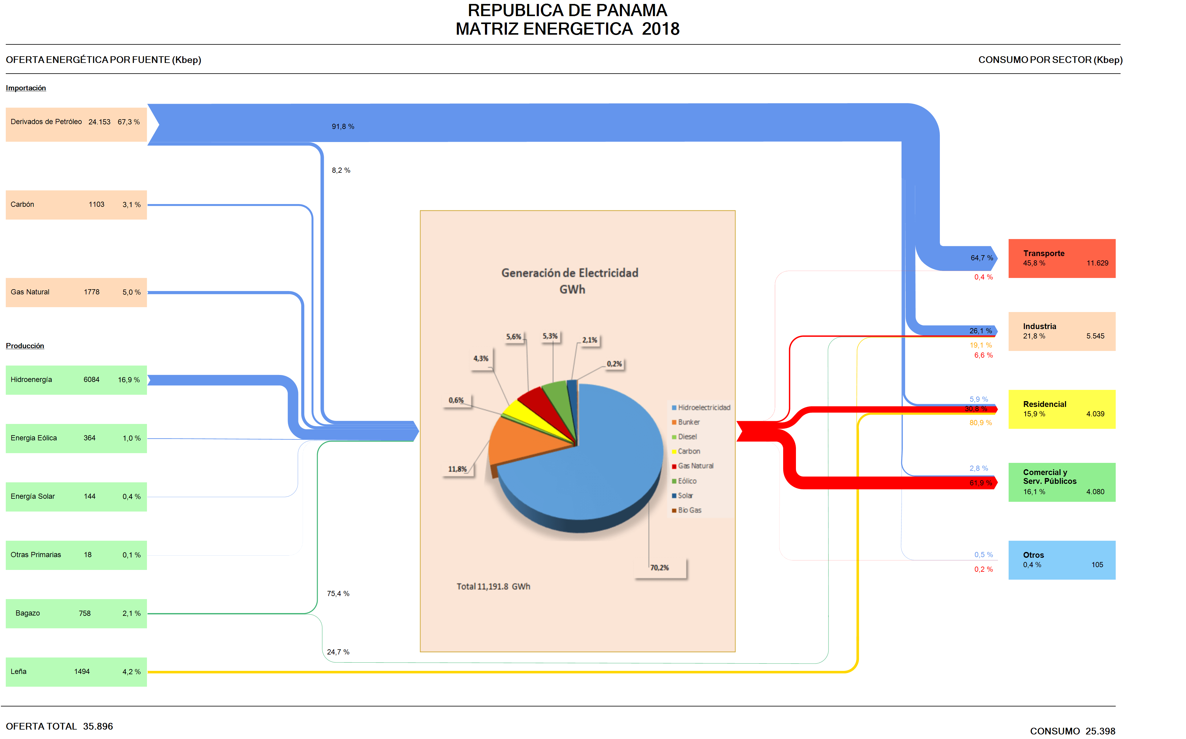
Skipping the remaining countries in South America (Venezuela, Guyana, Suriname, French Guiana) for the time being, my series of Sankey diagrams depicting the National Energy Balance of Latin American countries continues with Panama.
Data for the Balance Energético Nacional (BEN) is available on the website of the Ministry of Energy (Secretaría Nacional de Energia), but I could only find this visual representation of the Matriz Energético done in Excel.
Arrow lines are all the same width and glued together from horizontal and vertical line segments. To be featured here on the blog, it has to be some kind of Sankey diagram, with the magnitudes of the arrows or bands representing the flow quantity.
I checked the sieLAC page maintained by OLADE, but there I could only find energy flow diagrams up to the year 2010.
So I decided to “translate” this Excel figure (which has all the numbers) into a Sankey diagram. As it turned out, the work wasn’t straightforward, since this figure uses two, actually three different units. Primary energy on the left and consumption per sector is in kbep (kilo barrels of oil equivalents). The pie chart in the middle that represents the electric energy generation is just an insert with data in GWh. The arrows in the Excel figure are labeled in percent. I started out using the kbep scale, but then was unable to convert the quantities for the streams, since actually energy losses are omitted in the figure.
Here is my remake:
I chose to work with the percentage scale for the downstream splits per fuel, setting the magnitude of the energy generated at the same size as the input. We can see that the energy landscape is dominated by imported petroleum derivates consumed for transport. Actually this is almost three times as much energy as is being used for energy generation. Domestic energy production is mainly from renewables with only some coal and natural gas.
Colors and general layout of the remake stick pretty much to the original figure.
