Dutch consulting firm Metabolic have posted a great article ‘Why data visualization is critical to driving sustainable change’ on their blog. It features several examples of Sankey diagrams and argues that good visualization is key to sustainability projects and communication.
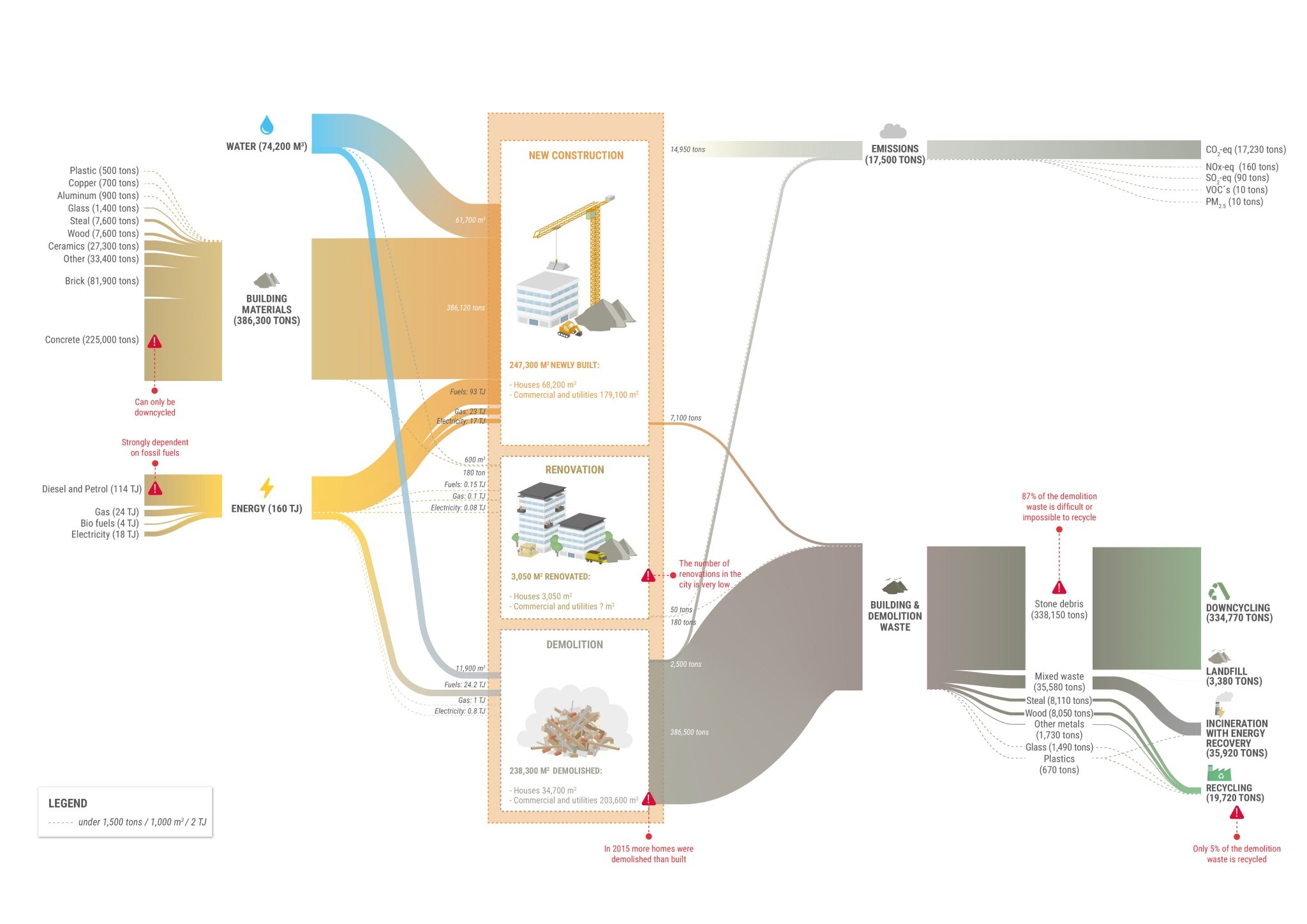
This infographic shows material flows (construction materials, demolition waste) in tons and energy in TJ. Flows relate to the construction sector in Rotterdam in the year 2015. This was originally produced by Metabolic for the report ‘Circular Rotterdam’.
The authors say. “This Sankey diagram on Rotterdam’s construction sector serves as a strong example of a data visualization for sustainability. It gives municipal authorities and industry stakeholders a clear idea of where they need to intervene – emissions generated largely in construction, material waste largely in demolition. Potential intervention points are highlighted in red; from reducing dependence on fossil fuels in construction to ensuring buildings are designed for renovation or disassembly rather than demolition.”


