Month: March 2020

Rapeseed Production

From the museum of Sankey diagrams, here is a black&white classic. This Sankey process diagram for rapeseed oil production is taken from the year 2002 dissertation ‘Simultane Öl- und Proteingewinnung bei Raps’ (Simultaneous oil and protein production from rapeseed) by Andreas Waesche, Berlin Technical University.


Flows are in kilograms per ton of rapeseed input. Black is the water fraction, dark gray is oil, and light gray is oil free dry matter. Rapeseed husks, filtered matter and liquid rejects branch out on arrows to the right. Extract from the T4 separation stage (‘Extrakt als Ruckfuhrung’) is fed back into the second node although this loop is not shown here.
Cogen System Thermodynamic Analysis

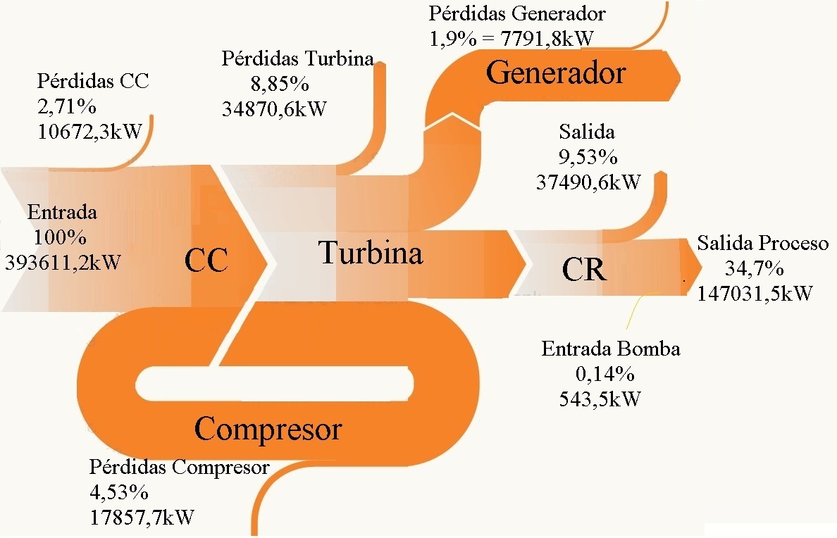
An analysis of energy efficiency and exergy effciency of a cogeneration system in a sugar refinery in São Paulo state in Brazil is presented in the ‘Análisis energético, exergético y económico de un sistema de cogeneración: caso para una planta azucarera de San Pablo’ by Omar R. Llerena of Universidade de São Paulo (Published in: Ingenius no.19 Jan/Feb 2018 under Creative Commons license CC BY-NC-SA 4.0)


Flows are in kW, and even though this diagram appears to be ‘casero’ made from blocks, triangles and curve shapes, the flow widths seem pretty much to scale.
Acronym ‘CC’ is for the combustion chamber and ‘CR’ stands for a heat recovery boiler (caldera de recuperación).

The article also features a Grassman diagram for the exergy analysis. So, if you are interested, please visit the article here.

Tokyo, Paris, Mexico City: MSW flows

A comparison of the different pathways that municipal solid waste (MSW) is going in large metropolitan centres such as Toyko, Paris and Mexico City is presented in the article ‘La recogida de basura en Mega-ciudades: En el marco de la sostenibilidad’ by Fabian Tron. Available in Revista INVI v.25 n.70 12/2010 on Scielo in Spanish.


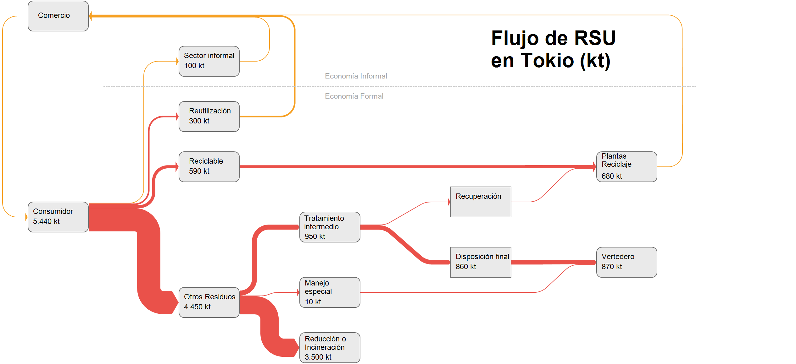
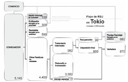
While the data on waste quantities itself is quite old and dates back to 2005, I found the system how household waste is handled differently in these three cities quite interesting. To get an idea of the “weight” of the different pathways, I decided to do a remake of the three figures as Sankey diagrams. Here is the one for Tokyo.


Flows are in 1000 tonnes (kt) per year. There is an informal sector (Economia Informal) where waste streams are not under control of the municipality. The largest part of non-recyclable household waste goes directly to incineration or “reduction”. The remainder is led to treatment plants and eventually most of it ends up in landfill (Vertedero). Note that smaller flow quantities are over-emphasized and are not to scale (otherwise they would hardly be visible in the diagram).

If you want to see the two other Sankey diagrams, please let me know in the comments.

Interprovincial Migration Flows Canada

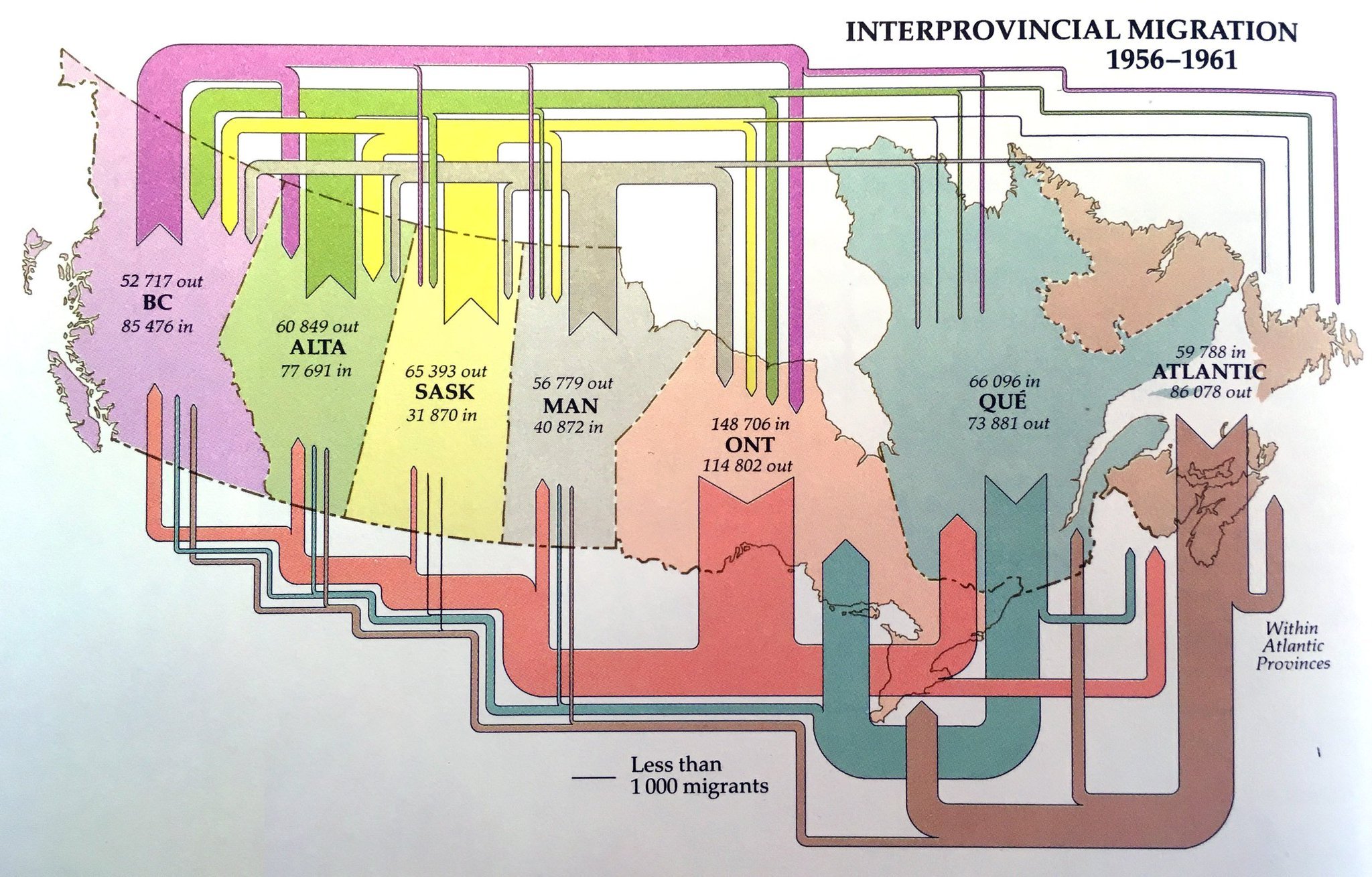
From the museum of Sankey diagrams comes this beautiful visualization of migration flows between Canadian provinces in the years 1956 to 1961. Sorry but I didn’t note the source… still wanted to share it with you.


Unfortunately, flows are not to scale: compare, for example, the exits from the Atlantic provinces in the period (86,078 people) which should have an arrow similar to the inflow of 85,476 to British Columbia. Or look at the exodus from Ontario provice, which seemingly is larger than the influx to the provice (but in fact is smaller).

Biomass and Bioenergy in The Netherlands

The study ‘Sustainable biomass and bioenergy in the Netherlands’ was carried out by researchers Goh, Mai-Moulin and Junginger from Utrecht University in the framework of the Netherlands Programmes Sustainable Biomass. It looks at “biomass from the three major categories, i.e. woody biomass, oils and fats and carbohydrates used in different sectors in the Netherlands”.

For each of these three categories a Sankey diagram is presented, like for example this one for oils and fats.


The diagram has a very clear structure. Import streams are from the top and exports leave to the bottom. Domestic Dutch production is from the left, use of oils and fats in the Netherlands is to the right. Flows are in million tons (MT) dry mass. Data is for the year 2014.

See the full report here.

Energy Balance La Réunion 2018

Two years ago I posted an early version of the energy balance for the French overseas region La Réunion, an island in the Indian Ocean. Visiting the website of Horizon Réunion (formerly Energies Réunion) now, I am happy to see that they have taken the elaboration of the energy balance much further, and are now publishing this detailed Sankey diagram for energy flows in 2018.

The diagram has been created by Observatoire Énergie Réunion (OER). Flows are in ktoe (ktep, kilo tonne d’équivalent pétrole in French). Overall primary energy for the island was 1441.8 ktep, of which 87% is fossil and 13% from renewable sources. We can see that mobility is the largest chunk of energy use with 64.5%.

You can access the full report with all background data here.