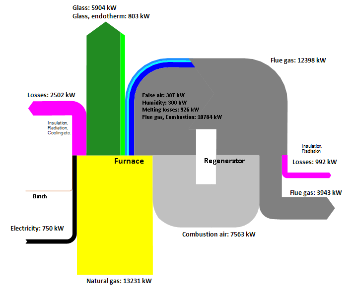
Glass Service s.a., a consulting firm from Czech Republic offers energy audits for companies from the glass industry. This is a Sankey diagram from their website. Flows in kWh for a sample furnace, with energy recovery from flue gas.
Pakistan Energy Flow Diagram
Published on the ‘The Efficient Appliances Blog’ is Pakistan’s First Energy Flow Diagram by Nida Rizwan Farid. The Sankey diagram is a piece of work for Pakistan’s Integrated Energy Plan and covers energy data for 2012/2013.
A more detailed explanation of the energy situation is given on this page. The author observes that “[o]ut of the 40.2 MTOE of final energy that trickles down the consumers, 72.7% of it is lost by the usage of inefficient appliances, motor vehicles and industrial processes. Only 10.96 MTOE of useful energy is received.”
Mapping Scottish IndyRef Votes
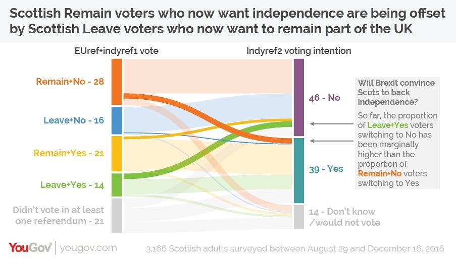
Good use for a distribution diagram shown in the January 2017 Guardian op-ed ‘Why hasn’t Scotland changed its mind on independence?’. It shows Scottish voter behaviour in the first pre-Brexit vote independence referendum (‘IndyRef1’) and intended vote in the second independence referendum (‘IndyRef2’), based on a poll among some 3,200 Scots in Nov/Dec 2016.
(via Coffee Spoons blog, originally from The Guardian, using YouGov data)
The left columns has two categories (Brexit Leave/Remain and first independence vote ‘Aye’/’Nae’), the second only one category. Both columns have the undecided voters fraction in light grey.
The changeovers from one camp to the other are shown emphasized in strong colors. One can see that the ones who voted “No” in the first referendum and that would now vote “Yes” for Scottish independence are compensated by voters who said “Yes” in the first vote, and who would now probably go for a “No”.
There seem to be less undecided voters (down from 21% to 14%), but the overall outcome would at present be the same: 46% No, 39% Yes (Indyref1: 44% No, 35% Yes). Of course a lot has happened since the poll in Nov/Dec 2016 and there is still a long way to go up to IndyRef2.
Spendings on Energy Efficiency Measures
This is quite an interesting Sankey diagram from the World Energy Outlook 2014. It visualizes international spending on energy efficiency measures in the transport sector under a hypothetical ‘New Policies Scenario’.
A total of 14.5 trillion US$ would be spent until 2040 to improve energy efficiency in the transport sector. The largest chunk (37%, 5.3 trillion US$) on improving private cars. This amount is further broken down to four geographic regions. The money would be spent mainly on improving the power train, and on development of light-weight components.
The underlying scenarios are described in detail at the beginning of the WEO-2014 study. The authors point out that “[f]or each scenario, we offer a set of internally consistent projections to 2040. None should be considered forecasts.”
“The New Policies Scenario is the central scenario of WEO-2014. It takes into account the policies and implementing measures affecting energy markets that had been adopted as of mid-2014, together with relevant policy proposals, even though specific measures needed to put them into effect have yet to be fully developed. These proposals include targets and programmes to support renewable energy, energy efficiency, and alternative fuels and vehicles, as well as commitments to reduce carbon emissions, reform energy subsidies and expand or phase out nuclear power.”
Sankey Flow Show
A new web-based Sankey tool, Sankey Flow Show, is available from German software maker THORTEC Software. It promises “attractive flow diagrams made in minutes”.
And indeed the tool is rich in features and design options: Different node elements, shadow effect for arrows (called ‘connections’), toggle constant/Sankey connections style, and customizable data input are some of the highlights.
Here is one of the Sankey diagrams produced with Sankey Flow Show. See more samples here. You can sign-up for a free trial to check it out yourself.
I have added Sankey Flow Show to the list of Sankey software.
Desalination by RO Process Retrofit, Sankey
Removal of salt from seawater (desalination) is used to produce drinking water and water for irrigation in the Canary Islands, Spain. This is an energy intensive process.
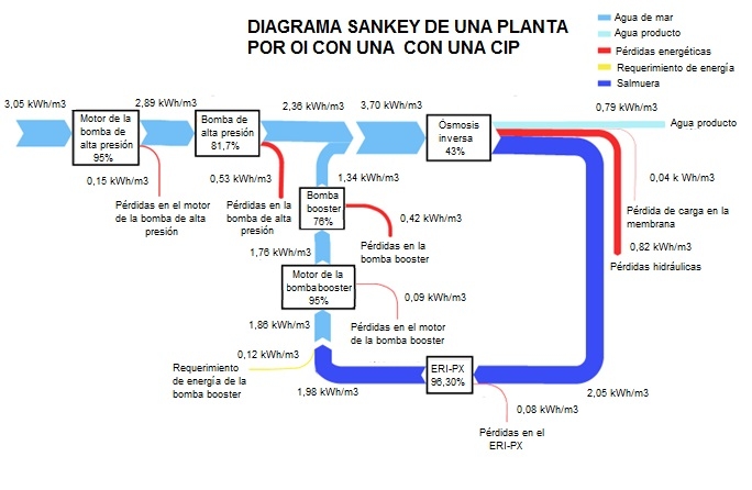
The article ‘La importancia de los sistemas de recuperación de energía en la desalación de aguas en Canarias’ (The importance of energy recovery systems in water desalination in Canary Islands) by Baltasar Peñate Suarez and Sigrid Arenas (both of Departamento de Agua del Instituto Tecnológico de Canarias, ITC) on the IAGUA blog (in Spanish) describes how existing reverse osmosis (RO) salt removal systems with Francis turbines were retrofitted to be more energy efficient.
The two Sankey diagrams in the blog post visualize the energy flows before and after the retrofit. Energy consumption per cubic metre of water desalinated could be reduced from 3.65 kWh/m³ to 3.05 kWh/m³ by installing isobaric energy recovery devices and last generation membranes.
Check out the blog post to see both Sankey diagrams.
Misc Sankey Diagrams Uncommented 15
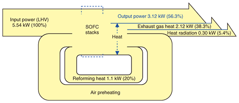
Just before the weekend another Sankey diagram for you. One reader suggested I should present a Sankey diagram that contained an Easter egg (without specifying whether he meant flows going in a round, egg-like arrow path or a joke hidden inside the diagram)
Here is one from Japan. It has two loops, and qualifies as a joke too. Just look at the quantities displayed and you know what I mean…
This is from an NTT Technical Review article ‘Development of SOFC Power Generation Module with High Electrical Generation Efficiency’ by Yoshiteru Yoshida, Katsuya Hayashi, and Masayuki Yokoo.
EU Raw Material System Analysis
A study on key raw materials and their flows “through the EU economy, as raw materials or as parts of basic materials, components or products” has been produced by BIO Intelligence Service for the European Commission, DG GROW (BIO by Deloitte (2015) Study on Data for a Raw Material System Analysis: Roadmap and Test of the Fully Operational MSA for Raw Materials. Prepared for the European Commission, DG GROW).
It contains Sankey diagrams for 28 materials considered critical or important to European economy, such as cobalt, lithium, or tungsten.
The flows of these materials into the EU-28 geographical area (imports) as well as out of the EU-28 (exports) are displayed for all substances in the same way. Recycling of the substance within Europe is represented as a loop, leading to a kind of see-saw-ish diagram. Additions to in-use (e.g. the substance being part of a product in use) and a certain amount of the substance being disposed off (e.g. as waste) are also shown as arrows to the right. Below is the diagram for cobalt. Flows are in tonnes for the year 2012 (t/y).
All Sankey diagrams are color-coded the same-way, providing additional information whether the material (in the case above: cobalt) is imported as raw material or as part of a product, and whether it is exported as processed material, waste, or also as part of a product.
The study can be downloaded from this page or directly here (PDF, 6 MB)


