Tag: Africa

Botswana Energy Flows

Botswana, a country with just over 2 million population, borders South Africa to the North. Would you be able to tell its capital?

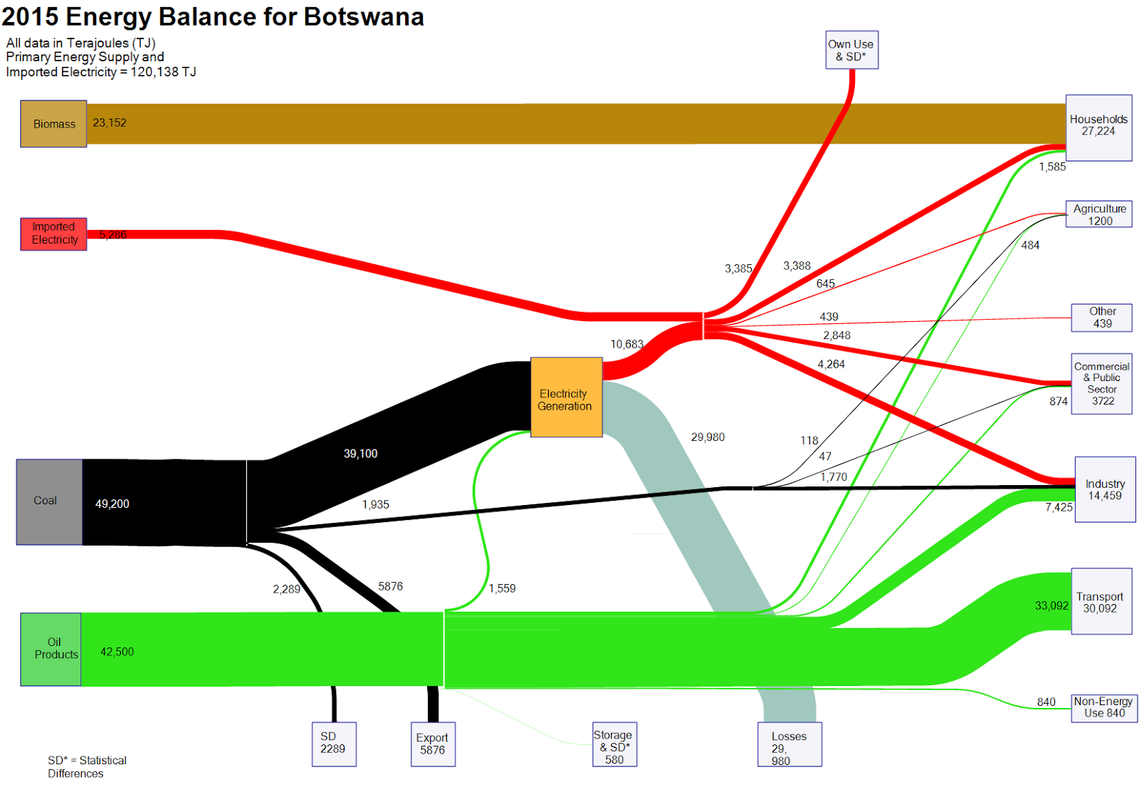
Nevertheless, a Sankey diagram with the energy balance of Botswana can be found on the web. Mike Mooiman, a professor at Franklin Pierce University, New Hampshire and a former visiting scholar at University of Botswana featured it on his ‘Energy in Botswana’ blog. These are the energy flows for the African country for 2015 (based on IEA data).


Flows are in terajoule (TJ) and overall energy demand was 120,138 TJ. Biomass (wood) is the predominant fuel in private households (e.g. for cooking). Locally mined coal accounts for 40% of the primary energy and is used for electricity generation with an efficiency factor of below 30%. Imported oil products account for over 40% of the energy consumed (mainly for transportation).

The 2012 energy balance for Botswana is also available on Mike’s blog.

Cape Town Water Use Sankey Diagram

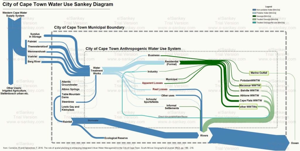
From a post ‘Cape Town’s water crisis : Towards a more water secure future’ on the Future Cape Town blog comes this Sankey diagram on the water use in the city of Cape Town (South Africa).

The author of the diagram, Rebecca Cameron, is with MCA Urban and Environmental Planners and looks at how Cape Town could transition towards a more water secure future. This Sankey diagram was originally published in her article Cameron, R and Katzschner, T. 2016. The role of spatial planning in enhancing Integrated Urban Water Management in the City of Cape Town. South African Geographical Journal. 99(2), pp. 196 – 216.

Absolute flow values are not given in this version of the Sankey diagram. Flows are in million cubic metres per year (Mm³/a). Water from five different sources outside the municipality feed the city of Cape Town, as well as five sources within the city. A breakdown of water supplied by the municipal water works is shown. Additional color coding of the arows indicate water quality (dark green = sewage, light green = treated water).

The author explains:

“This diagram is helpful in that it places all aspects of the water system in to one diagram. Here, water supply, water use, wastewater treatment and stormwater have been considered as a single system where too often the urban water cycle is fragmented when addressed within different sectors. The arrows of flow follow a key to represent the quantity and quality of water. The size of the arrow of flow is proportionally indicative of the quantity of water that flows from one process to one another. The colour of the arrows indicates the quality of the water flow; this includes non-potable, potable, sewage, treated sewage, and treated sewage for reuse. This is important to represent as, to intervene in an urban water cycle, both quantity and quality of water must be considered and used appropriately to move towards a more efficient and sustainable water system.”

From the rivers most of the water goes to the ocean. Through evaporation and precipiation it (hopefully) replenishes the reservoirs again that feed the city (this last part not shown in the diagram).
UNEP: Nigeria Freshwater Challenge

UNEP’s GRID Arendal web page that “collect[s] and catalogue[s] all graphic products that have been prepared for publications and web-sites from the last 15 years in a wide range of themes related to environment and sustainable development.” It has mainly maps and infographics. Not that many Sankey diagrams, but one I found this one interesting:

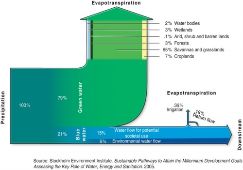
It is titled ‘Nigeria and the Freswater Challenge’, originally from a 2005 study by the Stockholm Environment Institute (SEI).

The description says:

Out of the total precipitation reaching Nigeria, it can be separated into green and blue water. Green water (79% of the precipitation) represents the fraction of rainfall that generates soil moisture and which supports terrestrial ecosystems. It is not returned to groundwater and rivers, but will eventually evaporate or transpire through plants. Blue water, on the other hand, represents the fraction (21%) of the precipitation that runs into rivers and aquifers, and that has a potential for withdrawal for societal use. Out of this, the environmental water flow is the amount of water needed to sustain ecosystem services. In the case of Nigeria, there is a huge potential to increase the withdrawal for irrigation and food production to meet current and future needs.

Flows display percentages rather than absolute values. The green water arrow representing 79% is broken down further and reveals the contributions, but only on one segment. Nice idea!