Tag: agriculture

Losses in Fruit Production

Food loss or wastage has been a topic a previous posts here on the Sankey diagrams blog before (see here or here).

Here is another Sankey diagram from the dissertation ‘Environmental assessment of Catalan fruit production focused on carbon and water footprint’ by Elisabet Vinyes i Guix (p. 73). It visualizes losses in the production chain for apples and peaches in Catalunya.


For each kg of fruit arriving on the market (or at the point of sales), some 1.21 kgs of fruit are being cultivated. Losses occur in the farming process itself as well as along the retail system. Of the 1 kg fruit purchased by the consumer, only 83% is actually eaten. 17% turns into waste.

Global Agriculture Biomass Flows 2010

An interesting Sankey diagram on Global Biomass Flows 2010 can be found on the PBL Netherlands Environmental Assessment Agency website.


(Author: PBL, published under Creative Commons License CC BY 3.0)

This is from a research report ‘Integrated analysis of global biomass flows in search of the sustainable potential for bioenergy production’ published 2014 (available here) that estimates the worldwide biomass flows. It explains: “The biomass flows in the agro complex are presented in ExaJoules in the Sankey diagram (…). Using energy density data for all common commodities, the mass data have been converted to energy data. The energy content depends on the moisture content. In this study, the commonly referred weight–energy ratio’s were used.”

Basically, the diagram is made up from two main strands or pathways for biomass that are interlinked: In the top half the food production from agricultural soils (both crops and livestock breeding). In the lower half the grassland/meadows.

This is exclusively for the agricultural sector. The forestry sector is covered in a separate Sankey diagram (in one of my upcoming posts).

Note that small flow quantities (<3 EJ) are not to scale but rather have a minimum arrow width to keep them visible.

Sustainability of Olive Growing in Andalusia

The Niche Canada blog ran an interesting piece by Juan Infante-Amate from Unversity Pablo de Olavide in Spain titled ‘The largest tree crop concentration in Europe: The making of olive landscapes in Southern Spain’. It is a summary of research done on the changes in olive cultivation in Andalusia from traditional olive growing in the 18th century to today’s industrialized production.

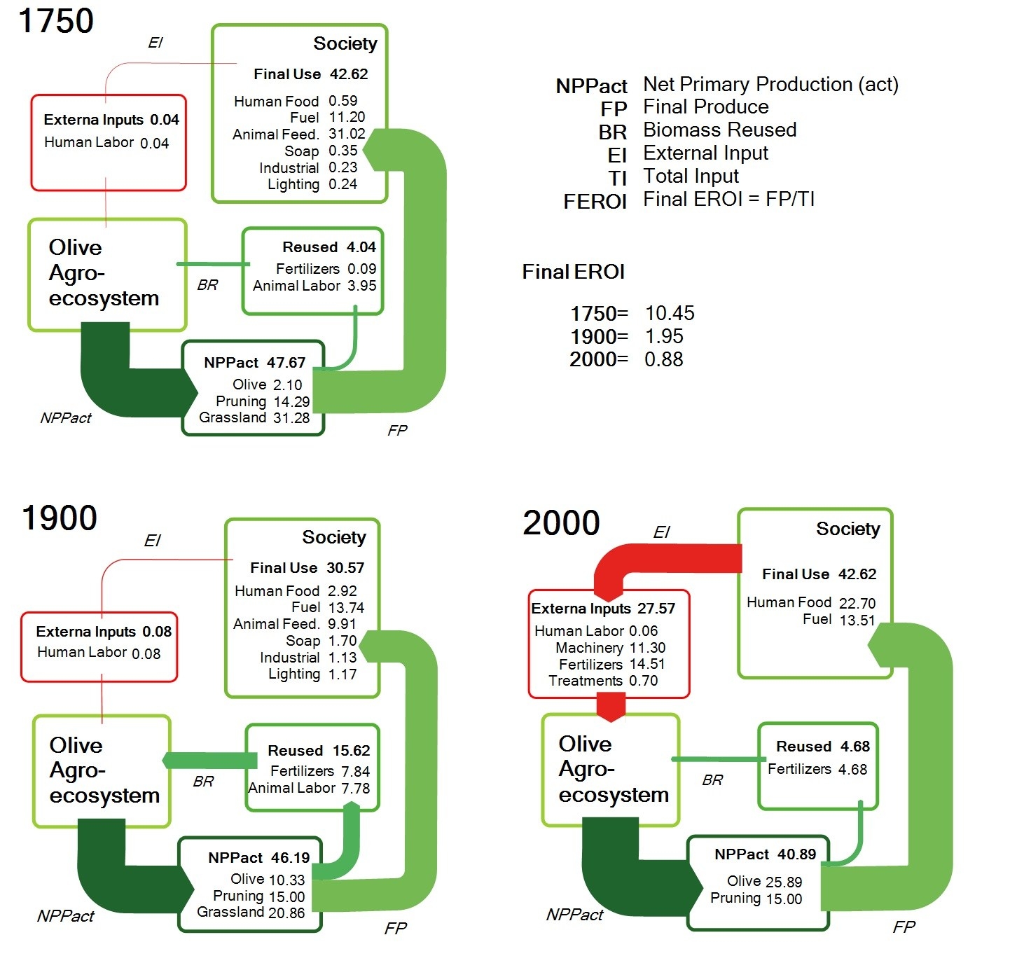
The post features these three schematic Sankey diagrams. Data is for one specific site:


(licensed under a Creative Commons Attribution-NonCommercial 4.0 International License)

The above are three snapshots of the energy flows of one production site in Andalusia in 1750, around 1900 and today. By relating the final product quantity (FP) to the total input of energy or work (TI) the researchers are trying to measure sustainability with the indicator FEROI. An indeed, “[e]verything suggests that over the course of the history of Mediterranean landscapes these current conditions have been the least sustainable.”

Interesting approach and use of Sankey diagrams to compare a sustainability indicator. References to the full research papers can be found at the end of Infante-Amate’s Niche Canada post.

Global Food System Sankey

Food losses and food waste has been addressed in a number of scientific research papers in recent years. Peter Alexander et.al. write about ‘Losses, inefficiencies and waste in the global food system’ (In: Agricultural Systems, Volume 153, May 2017, Pages 190-200, doi.org/10.1016/j.agsy.2017.01.014)

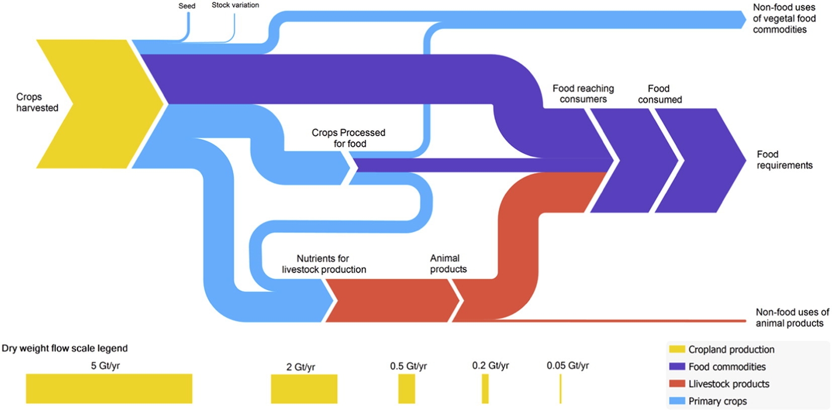
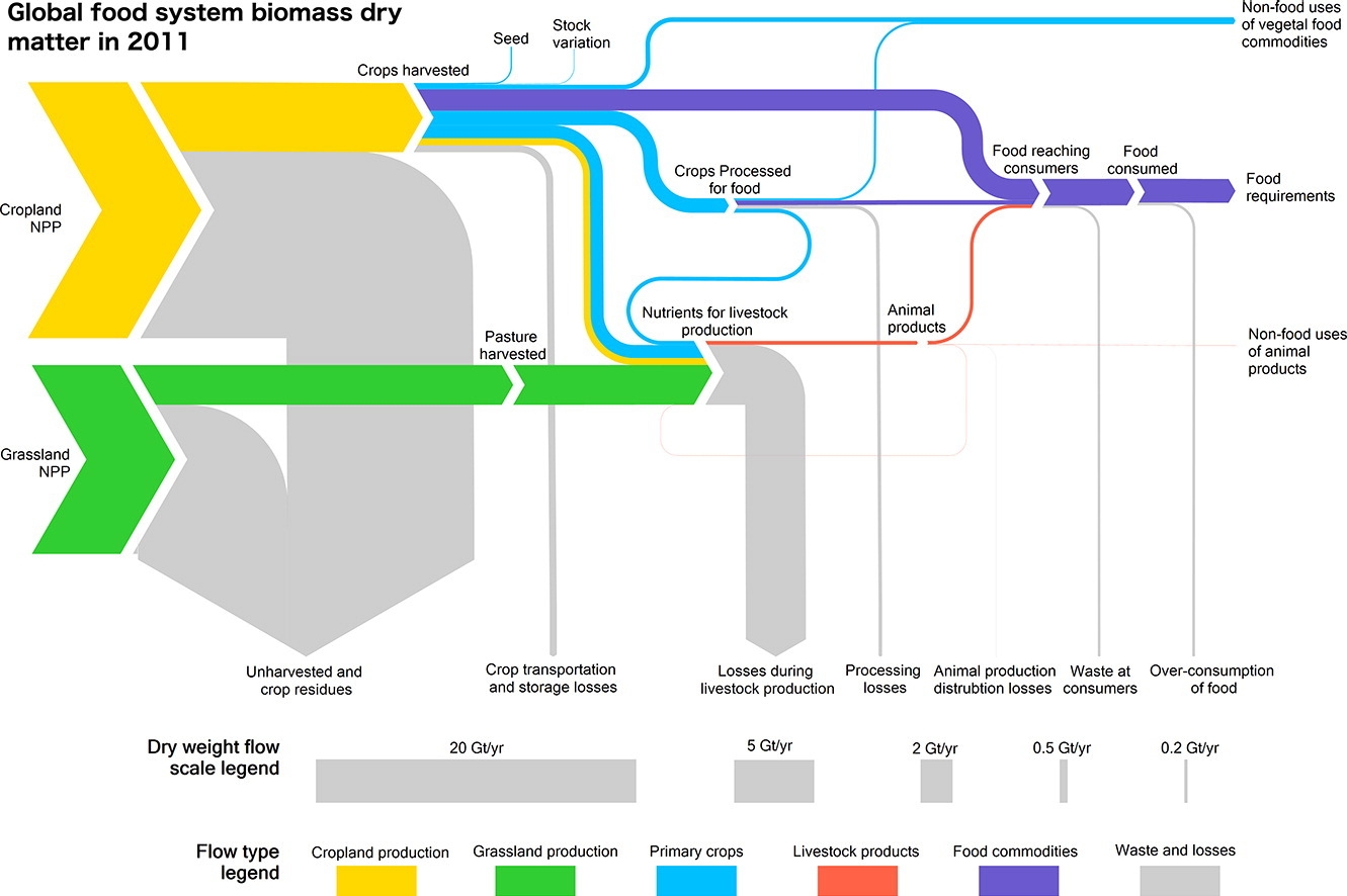
The article contains two beautiful Sankey diagrams. The first depicts the global food system in 2011. Flows are shown as dry mass. Flows are not individually labelled with the underling quantity, but rather a scale at the bottom shows 5 representative flow quantities and their corresponding width.


(under terms of Creative Commons Attribution 4.0 License (CC BY 4.0))

Crop (yellow) and grassland (green) net primary production (NPP) are shown as sources for the global food system. Losses are branching out as grey arrows. These “inefficiencies” of the system are described in detail in the article. The authors observe that “44% of harvested crops dry matter are lost prior to human consumption” and that “the highest loss rate can be found in livestock production”.

The second Sankey diagram shows a section of the above figure, just the dry matter flows from crop harvest and processing, without any losses. This is interesting because it allows us seeing the share of processed and non-processed food being consumed by humans worldwide, and the the share of crop-based food intake (dark blue) compared to animal-based food intake (red). You could call this the veggie / non-veggie split. Based on dry matter that is.


(under terms of Creative Commons Attribution 4.0 License (CC BY 4.0))

If you want to see the corresponding global food system wet mass, protein and energy Sankey diagrams check out this interesting article. A recommended read for all of us eaters.
GHG Emissions of Energy from Biogas Plant

An article by Bachmaier, Hans; Effenberger, Mathias and Gronauer, Andreas in German agricultural technology publication ‘Landtechnik’ 65 (2010), no. 3, pp. 208-212 describes how “for ten agricultural biogas plants, a detailed balance of greenhouse gas emissions (GHG) and cumulated energy demand (CED) was calculated”.

Below is the Sankey diagram for plant E that has the “best GHG balance of all ten plants with net savings of 85 g CO2-eq per kWh el. Characteristics are a high share of poultry manure in the input saves energy for crop production; no additional mineral fertilizer needed; credit for surplus digested residue; high level of heat use.”

Biogas plant G has “Regular treatment of animal manure from own livestock; intermediate level of heat use; high methane emissions from CGU; high demand of fossil resources during plant operation (electricity supply from grid, fuel oil).”

Both diagrams feature the GHG emission burdens in CO2-eq per kWh electric energy produced from biogas. Upstream chains for fertilizer, diesel and electricity taken into account too. Displaced GHG emissions nonus in green. It is interesting to see that in this agricultural energy scenario methane (CH4) and nitrous oxide (N2O) are contributing to climate change in the same dimension as carbon dioxide.

Ate your muesli this morning?

I have talked about a cereals Sankey diagram by INRIA Grenoble a couple of weeks ago in this post.

Here are two more Sankey diagrams from the underlying article ‘Etude des flux de céréales à l’echelle locale: Exemples en Rhône-Alpes, en Isère et dans le SCOT de Grenoble’ by J. Courtonne, J. Alapetite, P. Longaretti, D. Dupré.

These are the mass flows for cereals production in France (2007/2008) in Mt (1000 tons)

Here is the same cereals process chain “translated” into a water footprint. Unit is million cubic metres of water consumed.

A very clear structure in both diagrams with three columns: grains production, transformation and final products. Choice of color corresponds to the topic.

eco-data.fr: Cereals Sampe

A research group from INRIA Grenoble engineering school has set up a website for visualization of environmental data. Sankey diagrams are one available visualization option. The below is a sample provided on the website.

The Sankey diagram shows flows along the cereals production chain in France from the 2007/2008 harvesting campaign. Quantities are in 1000 tonnes.

Different grains are shown on the left: wheat (‘blé’), hard wheat (‘blé dur’), maize, barley (‘orge’) and others. Two large end nodes for unprocessed grain exports and use as animal feed (‘consommation animale’). There are further exports as intermediate and processed products. Only a comparatively small fraction is consumed by humans in France as bread, pasta, biscuits.

Could not detect use as energy crops, it is maybe hidden in the ‘industrial use’ flow. Anyway, an interesting application case for Sankey diagrams.