Tag: copper

European Copper Streams 2012

After all these colorful Sankey diagrams, here is something soothing for your eyes.

This b/w Sankey diagram shows European copper streams in 2012. It is taken from the 2017 dissertation by Simon Gloser-Chahoud of Technical University Clausthal in Germany with the woooh title ‘Quantitative Analyse der Kritikalität mineralischer und metallischer Rohstoffe unter Verwendung eines systemdynamischen Modell-Ansatzes’ (‘Quantitative analysis of the criticality of mineral and metallic raw materials using a system-dynamic model approach’ …thanks Google Translate!).

Flows are in kt. The dotted line references the geographical boundary of the EU-27 states. We can see that 1.100 kt copper concentrate was imported and 830 kt came from mines in Europe. Import and export of finished products containing copper is almost balanced. The overall addition of copper to the European stock (estimated at 90.000 kt) was at 3.200 kt. Copper in waste streams leaving this stock amounted to 2.500 kt, of which 1.750 kt were fed back into the copper production.
Sankey Diagrams in Material Flow Accounting

Another field where Sankey diagrams are used widely is Material Flow Accounting, the analysis of material flows on a national or regional level. MFA focuses on bulk materials or individual substances (e.g. zinc, copper, cadmium) and the quantities in which they enter, leave or accumulate in a national economy.

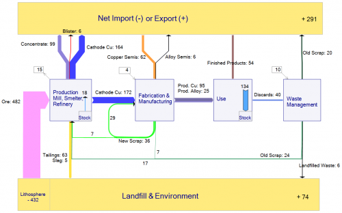
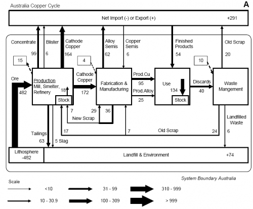
The diagram below is from a peer-reviewed paper presented at the 4th LCA conference in Australia (van Beers, van Berkel, Graedel: The Application of Material Flow Analysis for the Evaluation of the Recovery Potential of Secondary Metals in Australia, 2005). It shows the copper flows within the system boundary of Australia, the unit is Gg/year (= 1000 metric tons per year).

This “clustered” Sankey has six different flow widths, grouping together flow quantities within a specific range (e.g. <10, 10 < 30,9, …). Flows larger than 999 Gg/year are not shown any wider. This avoids that very large quantities “spoil” the whole diagram, as smaller flows become less significant in Sankey diagrams to scale.

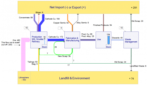
An alternative way to overcome the problem or very wide flows in a Sankey diagram spoiling the chart would be to define a cut-off quantity. Flows that are large than the cut-off quantity are excluded from the scale, and are shown with a hatch or moirée pattern. The two Sankey diagrams below were made based on the data from the above publication. The first one shows the large “Ore” flow with a cut-off level at 300 Gg/year (an additional note warns the reader that this flow is not to scale”, while the second diagram is fully to scale.


Very thin arrows additionally get explicit arrow heads to be able to identify their flow direction.

Feel free to comment