Interesting blog post and use case for Sankey diagrams by Dr. Ulrich Sigmund at the ANKHOR Feel Your Data Flow blog. He visualizes compiler file sizes using Sankey diagrams.
I am not an expert at this. But apparently 1 pixel in a Sankey arrow represents 400.00 Bytes being handled by a compiler.
In the above simple pic the main chunk of data is code from the SDK directly.
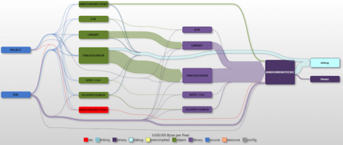
In the next diagram there are intermediate steps. There are objects from the SDK, but also a fair amount created from project files. They are used to create libraries and finally to compile the product. The bright blue arrow is debug info collected during the build process.
Ulrich concludes: “The Sankey diagrams do not only show why your hard drive is cluttered with intermediate files, they also helped me spot some fragilities in the build process. Sometimes the build order was not 100% correct and some of the intermediate files ended up in the wrong folders (due to the fact that the projects have been moved through five generations of Visual Studio by now).”
Any IT guys following here to comment whether this is helpful?


