Came across densitydesign’s images on flickr and was really fascinated by the visualizations presented there.
Density Design is a research framework and an experimental laboratory, born as a laboratory course in the final year of the Master Degree Course in Communication Design at the Politecnico di Milano.
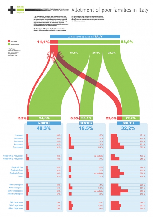
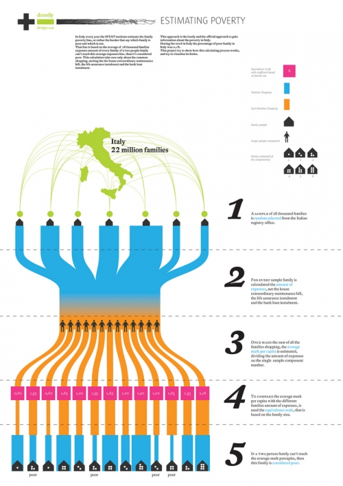
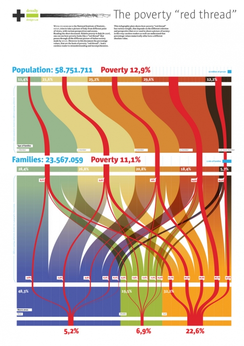
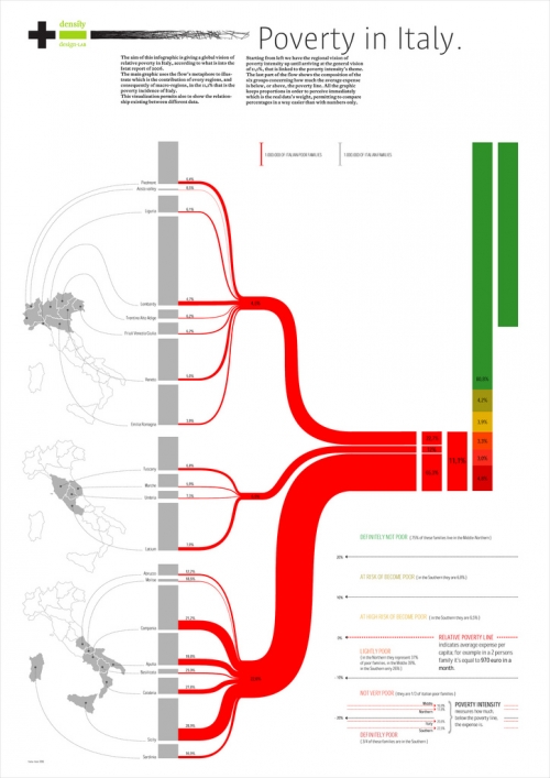
One of their recent projects was on social conditions and poverty in Italy. Some of the visualizations that were created in the course of this project resemble Sankey diagrams, and this is why I thought I should share them with you.
The designers had several dimensions of information they wanted to put into the visualization of statistical data on poverty in Italy. The four shown above chose bands of proportional widths to display the numbers rather than pie charts. In contrast to Sankey diagrams these are not flows, because they are not directed. The works by Luca Rossi (2nd above) and Elena Capolongo (4th above, my personal favourite) try to link the quantities to regions using a map of Italy.
A nice followup project would be to display the migration movements from Southern Italy to the North and abroad due to the social conditions, as previously reported about here.
Density Design has kindly granted permission to show these visualizations here. Read the summary (Project progress report 01. Economic statistic & Communication Design) and learn about their other projects on the Density Design blog. I am adding them to the blogroll too.


