Category: Publications

Energy Recovery from Process Air

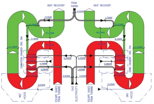
This article on “Energy Savings in Tissue Production Process: The Case of the Hayat Tissue Mill in Turkey” by A. Isiklar, L. Aydin, D. Mainardi and O. Lopez was published in July 2008 in the TAPPSA Journal (Technical Association of the Pulp and Paper Industry of the Southern Africa). The article describes how energy can be recovered from process air in a tissue plant in Turkey using a cogeneration hood. It features three beautiful Sankey diagrams, one of which is presented here.

“The exhaust gases coming from the hood are used for the production of the steam needed to feed the YD and the other auxiliary equipment of the mill (wet strength pulper, hall ventilation). The residual energy in exhaust gases in excess from the boiler are used in order to feed a chiller unit, which in turn runs the air conditioning system of the electrical room”.

This almost symmetric top to bottom oriented diagram shows the energy in MW for a certain production capacity (details not given in the article). It is a section of the other Sankey diagram featured in the article (Fig. 3) showing the whole process including the gas turbines plant, the cogeneration hood and the waste heat boilers (omitting only the absorption chillers). Only the latter shows the reduced heat loss (see light blue arrows labeled “to atmosphere”).

As for me, that’s the kind of curves I love… 😉

Swiss Biomass Sankey Diagrams

Gabor Doka pointed me to a publication by the Swiss EPA (Federal Office for the Environment, FOEN). The publication titled “Biogene Güterflüsse der Schweiz 2006” (‘Flows of biogenic goods in Switzerland in 2006’) features many different Sankey diagrams. “Biogenic goods are defined as goods of biological origin, excluding those of fossil origin”. Data is based on Swiss statistical figures and valid for 2006. Available in German only (Download PDF 7,5 MB).

The overall structure of biomass flows is given in a generic layout and as Sankey diagrams with proportional arrow magnitudes for mass flows (unit is in 1000 tons, based on dry matter) as well as for energy content (in GWh, based on lower heat value of dry matter). These overview diagrams are structured in three columns ‘Production’, ‘Conversion’, and ‘Use/Disposal’. Imports are from top, exports to the bottom. This very clear structure for both mass and energy flows makes the complex diagrams easier to comprehend. These overview Sankey diagrams are available for download as a separate PDF file (still 3,2 MB)
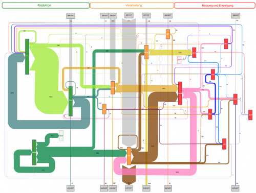
The main diagram is then broken down into individual Sankey diagrams for the different sectors involved, such as plant production (PLB), animal farming (THA), and forestry (WAW) in the production column (orange colored processes), or food industry (LMI) and wood/paper industry (HPI) in the conversion sector (green colored process). Finally, in the use/disposal sector (red colored processes) we find goods consumption (WAK) along with energy generation and waste treatments.

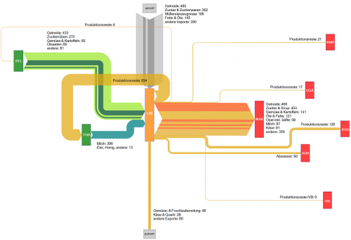
This is the sectoral Sankey diagram for the food industry in Switzerland. We can see that a large part of the biomass for food production is imported, and that most production wastes are fed back into animal farming again. The red boxes are different waste treatments receiving input from the food industry.

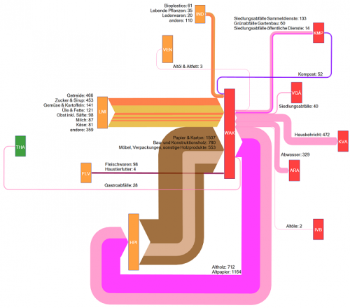
The above is the goods consumption section. Main biogenic goods inputs are from food industry and wood/paper industry. The meat input is rather small comparatively. A big chunk of the mass output (namely waste wood and waste paper) feeds back into the wood/paper industry. 472.000 tons ended up in waste incineration that year, some 329.000 tons in waste water.

The Sankey diagrams in the study are interesting to browse and reveal a lot more interesting facts. The stuctured approach with the breakdown into smaller diagrams is very useful. The authors Baier and Baum from ZHAW at Wädenswil have done a great job in compiling this.

“The results of this study will serve as useful decision aids for strategic planning and assessments concerning the potential, use and management of biogenic resources (…) makes it possible to detect quantitative changes that occurred during a given period of time and to reach conclusions concerning the efficiency of measures taken.

Actually this way of visualizing statistical data with directional (from-to) information attached to it could serve as a role model for other national mass and energy accounts, I think.

Uh – this has become my largest post ever 😮 . But I think this was well worth it and the publication merits it. Your comments appreciated.
Sankey Diagrams for Carbon Footprint

I was pointed to an article on carbon footprint, that used Sankey diagrams to underline a method of carbon accounting along the supply chain. This article was part of the “first virtual global conference on climate change” CLIMATE 2008 that took place, yes, exclusively on the Internet from November 3 to 7, 2008. (I must admit that this event passed largely unnoticed by me, although reading some of the papers now gives me the impression that it would have merited more attention.)

The paper titled “Carbon Accounting and Carbon Footprint – more than just diced results?” by Prof. Mario Schmidt from Pforzheim University describes the various approaches of corporate carbon accounting, carbon footprint of products, and Life Cycle Assessment LCA. Schmidt introduces a method that allows determining “cumulative emissions … at each point of the supply chain up to the POS”, and calls this the CO2 backpack.


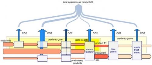
The four Sankey diagrams above from the article illustrate the idea. They show (1) the CO2 equivalent emisisons along the supply chain, (2) the value added in a supply chain, (3) the relative CO2 emissions per value of product, and (4) the total emissions of the products along the supply chain with sectoral gate-to-gate, cradle-to-gate or crade-to-grave approaches.

This article is well worth reading, you should do so while it is still available online. Update: the domain has gone offline
Schmidt is an acclaimed expert in Sankey diagrams and has also published on the history and methodology of Sankey diagrams.

Article on Sankey Diagrams in JIE

A two-part article on ‘The Sankey Diagram in Energy and Material Flow Management’ was published in the Journal of Industrial Ecology (JIE). The author, Mario Schmidt is a professor at Pforzheim University in Germany. The first part focuses on the history of Sankey diagrams, while the second centers on ‘Methodology and Current Applications’.

Abstracts and links to the full articles are available at the publisher’s website.

Mario Schmidt (2008) The Sankey Diagram in Energy and Material Flow Management. Part I: History Journal of Industrial Ecology 12 (1) , 82–94 doi:10.1111/j.1530-9290.2008.00004.x

Mario Schmidt (2008) The Sankey Diagram in Energy and Material Flow Management. Part II: Methodology and Current Applications
Journal of Industrial Ecology 12 (2) , 173–185 doi:10.1111/j.1530-9290.2008.00015.x

I am not a subscriber, but maybe someone with access to these publications wishes to post a summary comment.

Monthly Household Income and Spendings

Christian Behrens from the Department of Design at Potsdam University of Applied Sciences in Germany put up a website on Information Design Patterns. It features “design patterns that describe the functional aspects of graphical components for the display, behavior and user interaction of complex infographics”.

The website is modestly called an “application prototype” of a pattern browser, and is part of his Master Thesis titled “The Form of Facts and Figures”.

All patterns are tagged and can be searched. For each type he presents a fact sheet with description, usage, required data, and rationale. Christian provides an own example for each pattern, and a “real-world example” from an external source. Additionally, related diagram types are listed.

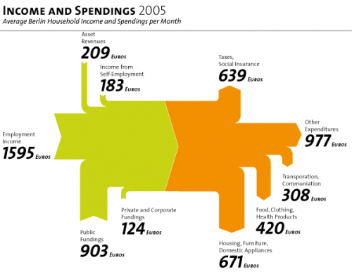
The Sankey diagram is A 5.1. The example shows the average income and spendings of a Berlin household in 2005. Salary, asset revenues and public subsidies make up for the total income, shown in green. The income is spent on taxes, housing, food, clothing and other, shown as orange arrows.

I do miss a number stating the total (3015 Euro, roughly 4500 US$) as a label for the magnitude in the middle, but nevertheless this is a superb example of information presentation with a Sankey diagram. Just try to imagine the same information shown as two pie charts…

Enjoy browsing the Information Design Patterns website.

Materials Accounting and Mass Balances

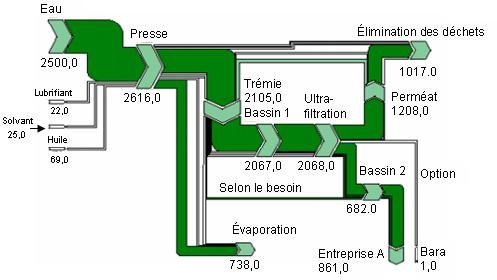
Environment Canada in 2001 published a Pollution Prevention Planning Handbook, a 153 page guidance manual on processes and techniques for pollution prevention. Update: The original handbook has been removed. Sucessor pages have been put online, and can be found here.

In appendix B of the handbook materials accounting and mass balances are presented as one technique. The text states that

materials accounting and materials mass balances can be presented in a tabular or diagrammatic format. A Sankey diagram provides one useful method for representing a picture of material flows and balances.

and a sample Sankey diagram is shown.

Although not all quantities of the individual flows are shown, and there is no reference to the unit used, I think this is a fine example of using Sankey diagrams. The mass imbalance at the first process “Presse” (at the very left) is clearly visible. From the neighboring downstream processes you can see that at least 2105 units (to “Trémie”) and 738 units (to “Évaporation”) leave the process, that has inputs of only 2616 units. The diagram was made with S.Draw.

Sankey Diagrams in Periodic Table of Visualization Methods

Remember having to learn the elements of the periodic table back in chemistry class?

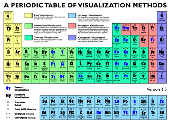
Visual Literacy now presents a ‘Periodic Table of Visualization Methods’ that has been published by two scientists from the University of Lugano in Switzerland.

Each elements represents a visualization method, from ‘C’ like ‘continuum’ to ‘Sd’ like ‘spray diagram’. The Sankey diagram can be found as element ‘Sa’ in the periodic table. It is colored in green for being in the ‘Information Visualization’ category. Furthermore its characteristics are ‘Overview’ and ‘convergent thinking’.

You can see the full periodic table at visual-literacy.org and hover the mouse over to see an example for each visualization method. The original article (Lengler R., Eppler M. (2007). Towards A Periodic Table of Visualization Methods for Management. In: IASTED Proceedings of the Conference on Graphics and Visualization in Engineering 2007, Clearwater, FL, USA) and the table separately are available as PDF files.

Sankey Diagrams for Material Flow Management

Mario Schmidt, a professor at Pforzheim’s University of Applied Sciences has published a paper on Sankey diagrams and their use in material flow management. The article, entitled “Der Einsatz von Sankey-Diagrammen im Stoffstrommanagement”, has two main sections: In the first part the author reviews how and where this type of diagrams have been used since they first appeared in a publication by Capt. Riall Sankey. This section also contains numerous samples: Sankey diagrams displaying the energy efficiency of the steam engine and of a 1911 a race car, material flow diagram from the iron and steel industries and many others. In the second part Schmidt elaborates on the methodology of Sankey diagrams and explains how extensions to the original Sankey diagrams (e.g. for cost flows or for material stocks) can be made.

The article is in German (sorry folks!), but according to Schmidt he’s working on an English publication…