Alerts distribution, Start Fund Network

Something in this technically well-crafted distribution diagram caught my attention, and at first I didn’t really know what it was…

This is from the Start Fund Report 2017. The Start Network is made up of 42 humanitarian aid agencies and “enables member NGOs and their partners to respond quickly to crises that would traditionally slip under the radar of humanitarian response”. Get more information on the Start Network here and on the Start Fund here.

This is a breakdown of “activated alerts” by geography, by crisis type and by activities that were triggered in the reporting period 01 April 2016 to 31 March 2017. Out of 74 alerts that year 43 resulted in activations (i.e. release of funds for immediate response to a humanitarian crisis).

So what made me stumble and raised my scepticism while looking at this diagram? Can you spot it?
[If you wish to find out yourself, stop here and do not read my thoughts below!]

I had intuitively tried to figure out the number of activated alerts in Africa. But how many alerts correspond to 50.7% out of 43? So I got out my pocket calculator and tried to get some integer numbers for the other values represented by the streams (or ‘bands’). I figured that the percentage values would probably be rounded to one decimal digit, but nevertheless could not get to any meaningful numbers for alerts per geography (nor per crisis type or per activities).

Next I thought that maybe this Sankey diagram doesn’t visualize absolute number of alerts, but rather the money that the fund distributed for these cases. But then, the sub-headline clearly states that it “shows activated alerts” and not “money distributed in response to activated alerts”.

The note “data is from alerts 77 to 150” under the diagram made me think: Hey, what if that was just a small typo and they are actually showing the distribution of 73 alerts instead of 43 alerts. Well, unfortunately none of the percentage values match with a base of 73 cases either and would yield absolute numbers.

My best guess, at present, is that we are actually looking at 150 alerts (the total number of cases the Start Fund has actually been activated over the last three years) and not at 43. Taking into account that the percentage values are rounded (50.66% 50.1%) this seems to be the best match producing mostly integer numbers. But I might be wrong…

Maybe the author of the graphic or the report wishes to shed some light on this… …
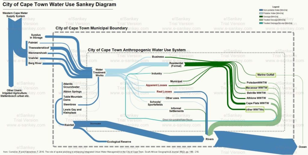
Cape Town Water Use Sankey Diagram

From a post ‘Cape Town’s water crisis : Towards a more water secure future’ on the Future Cape Town blog comes this Sankey diagram on the water use in the city of Cape Town (South Africa).

The author of the diagram, Rebecca Cameron, is with MCA Urban and Environmental Planners and looks at how Cape Town could transition towards a more water secure future. This Sankey diagram was originally published in her article Cameron, R and Katzschner, T. 2016. The role of spatial planning in enhancing Integrated Urban Water Management in the City of Cape Town. South African Geographical Journal. 99(2), pp. 196 – 216.

Absolute flow values are not given in this version of the Sankey diagram. Flows are in million cubic metres per year (Mm³/a). Water from five different sources outside the municipality feed the city of Cape Town, as well as five sources within the city. A breakdown of water supplied by the municipal water works is shown. Additional color coding of the arows indicate water quality (dark green = sewage, light green = treated water).

The author explains:

“This diagram is helpful in that it places all aspects of the water system in to one diagram. Here, water supply, water use, wastewater treatment and stormwater have been considered as a single system where too often the urban water cycle is fragmented when addressed within different sectors. The arrows of flow follow a key to represent the quantity and quality of water. The size of the arrow of flow is proportionally indicative of the quantity of water that flows from one process to one another. The colour of the arrows indicates the quality of the water flow; this includes non-potable, potable, sewage, treated sewage, and treated sewage for reuse. This is important to represent as, to intervene in an urban water cycle, both quantity and quality of water must be considered and used appropriately to move towards a more efficient and sustainable water system.”

From the rivers most of the water goes to the ocean. Through evaporation and precipiation it (hopefully) replenishes the reservoirs again that feed the city (this last part not shown in the diagram).

Sankey Diagrams with matplotlib

The matplotlib.sankey module doesn’t get much attention, at least that is my impression when browsing the web for new Sankey diagrams. Maybe this is due to the fact that it primarily targets a tech audience, or at least people able to code in Python.

I have reported on this package back in 2011.

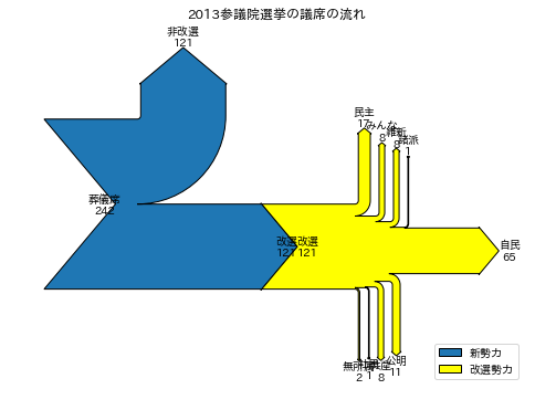
Here are two new examples from a Japanese blog.

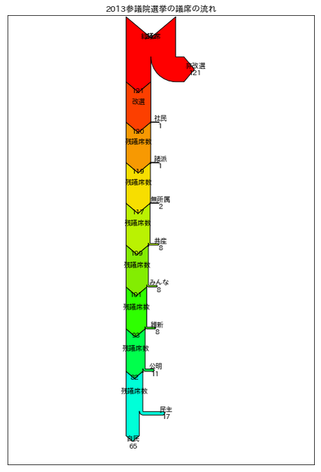
And a top-down oriented Sankey diagram with arrows branching out to the right.

The project is on sourcefourge: API documentation, demos

Regional Energy Flows Nouvelle-Aquitaine

Nouvelle-Aquitaine is a region in the southwest of France, with Bordeaux being its capital.

France, despite being a rather centralized, Paris-focused country relies on a decentralized approach for sustainable development, greenhouse gas (GHG) emissions reductions and energy saving. Thirteen so-called ‘regional energy agencies’ have been founded since 1995 engaging with regional actors and local communities. AREC (Agence Régionale d’Évaluation Environnement et Climat) is the environment and climate agency for the Nouvelle-Aquitaine region.

Many publications on energy and climate change are available on their website. Below is a Sankey diagram depicting the regional energy balance for Nouvelle-Aquitaine (Source: ‘Profil énergie et gaz à effet de serre en Nouvelle-Aquitaine – Année 2015 – Edition 2017’).

Flows are in GWh for 2015. Overall primary energy was 283.605 GWh, with 182.719 GWh final energy consumption. On the left side energy sources are split into imports (from outside Nouvelle-Aquitaine, 88%) and regionally produced energy, 12%). As is common in France, nuclear energy dominates the picture. On the right side we see the breakdown of energy consumption. The services sector (tertiary sector) is featured explicitly. It is responsible for 13% of Nouvelle-Aquitaine’s energy consumption, less than industry (19%) but more than agriculture (5%).

The Sankey diagram is very colorful and sports round icons. This goes well with the overall style of the report that targets explicitly at local communities and actors.

Feed-to-Food caloric flux Sankey diagram

Another way to look at energy flows! Here is a Sankey diagram of US feed-to-food caloric flux. This is from a paper by Shepon et.al. titled ‘Energy and protein feed-to-food conversion efficiencies in the US and potential food security gains from dietary changes’ published October 2016 in Environmental Research Letters (Environ. Res. Lett. 11 (2016) 105002 – doi:10.1088/1748-9326/11/10/105002) under Creative Commons CC 3.0

Flows are in Pcal (Peta calories, 1012 kcal). Production figures are based on data from U.S. National Research Council and a “Mean American Diet” (MAD) with an average consumption of 2500 kcal per day is used. We can see energy in three feed classes being transformed into energy in edible animal products. The authors explain:

“On the right, parenthetical percentages are the food-out/feed-in caloric conversion efficiencies of individual livestock categories. (…) Overall, 1187 Pcal of feed are converted into 83 Pcal edible animal products, reflecting a weighted mean conversion efficiency of approximately 7%.”

In light of this, energy conversion efficiencies of 30-40% seem to be fantastic…

Check out the article for another Sankey diagram of protein flux.

Global Paper Flows Sankey Diagram

Researchers from the Institute for Sustainable Resources (ISR) and the Center for Resource Efficiency & the Environment (CREE) at the University College London (UCL) have set up this Sankey diagram of global material flows in the paper life cycle, from primary inputs to end-of-life waste treatment.

Flows are in megatonnes based on data for 2012. We can see the five phases in the paper life cycle, from wood harvest over pulping, paper making, to use and discard/end-of-life. Almost half of the paper used and discarded worldwide in 2012 was recycled (194 Mt out of 399 mt). However, 154 Mt of used paper still ended up on landfills.

The authors further discuss environmental performance metrics. They point out that looking only at the recycling rate may lead to a wrong impression. They propose to also consider another recycling metrics (recycled input rate, RIR), and a material efficiency metrics.

The paper ‘Global Life Cycle Paper Flows, Recycling Metrics, and Material Efficiency’ by Stijn Van Ewijk, Julia Stegemann, and Paul Ekins has been published in the Journal of Industrial Ecology. A summary can be found here, or access the full article at Wiley Online Library (Open Access under Creative Commons license).

Thanks to the author Stijn van Ewijk for pointing me to this recent publication.

Energy Flows in Styrian Dairy Production

Styria is the second largest state of Austria, in the south eastern part of the country. It is famous for its beautiful mountains, its wines and some decent yodelling 🙂

It is also home to green tech industries, in fact “Styria is home to more than 150 clean technology companies … [whose] revenue totals €2.7 billion. This equals to 8 percent of the Gross Regional Product (GRP), and is one of the highest concentrations of leading clean technology companies in Europe.” (Wikipedia)

The ‘Styrian Promise’ is a project aiming at the implementation of energetically and economically meaningful energy efficiency concepts in Styian production companies. Case studies from food, textiles, metals and other industries are presented on the project wiki.

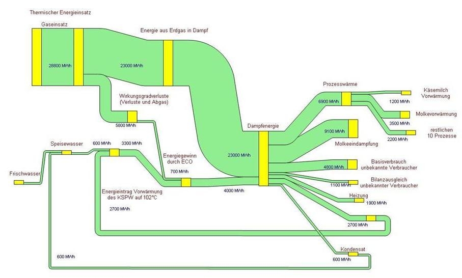
Above is a Sankey diagram depicting the energy balance at Obersteirische Molkerei Knittelfeld (Upper-Styrian dairy in Knittelfeld). Flows are in MWh per year. The main energy requirement is steam from natural gas: Whey drying and steam for milk pre-heating are the largest consumers of process heat. Read more detail on the dairy production here.