Coal Trade Flows Map

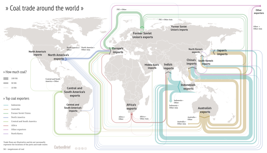
Drawing Sankey diagrams on a world map to show flows between different geographical location is always a challenge. One of the inherent problems is that large (=broad) arrows may run between two points on the map located very close to each other. Another problem is that one wishes to have the arrows more or less along the actual trade routes, which in many cases is close to impossible (take, for example, ships going through the Panama or the Suez canal).

I have shown quite a number of ‘Sankey diagram maps’ here on the blog, but most of them had shortcomings. Now here is an example that does extremely well in tackling the issue of Sankey diagram flows on a world map.


(CC licence – Carbon Brief)

This flow map of coal exports around the world shows the top exporters. It was crafted by Rosamund Pearce for the Carbon Brief article “Mapped: The global coal trade”. She decided to route the Sankey arrows nicely sorted, in parallel, and not along the actual shipping paths. See how much of the coal trade from Indonesia to China is led “virtually” south of Australia and New Zealand? Additionally the arrows are not led precisely to the actual port, but rather connect at a suitable place of each continent. With these simplifications the trade flow map is much clearer, understandable.

Another world coal flow diagram from 2012 can be found here.
Lying with Sankey diagrams (6)

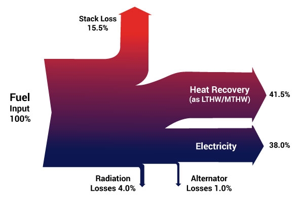
I really find it innovative when consulting firms show Sankey diagrams on their website to illustrate their work, and market their services.

However, I find it weird when these diagrams violate the basic rules of Sankey diagrams and flows are not proportional to the flow quantity. That doesn’t really contribute to build up confidence in their capabilities.

‘nough ranting … Have a nice weekend!

Water Use in Qingdao, China

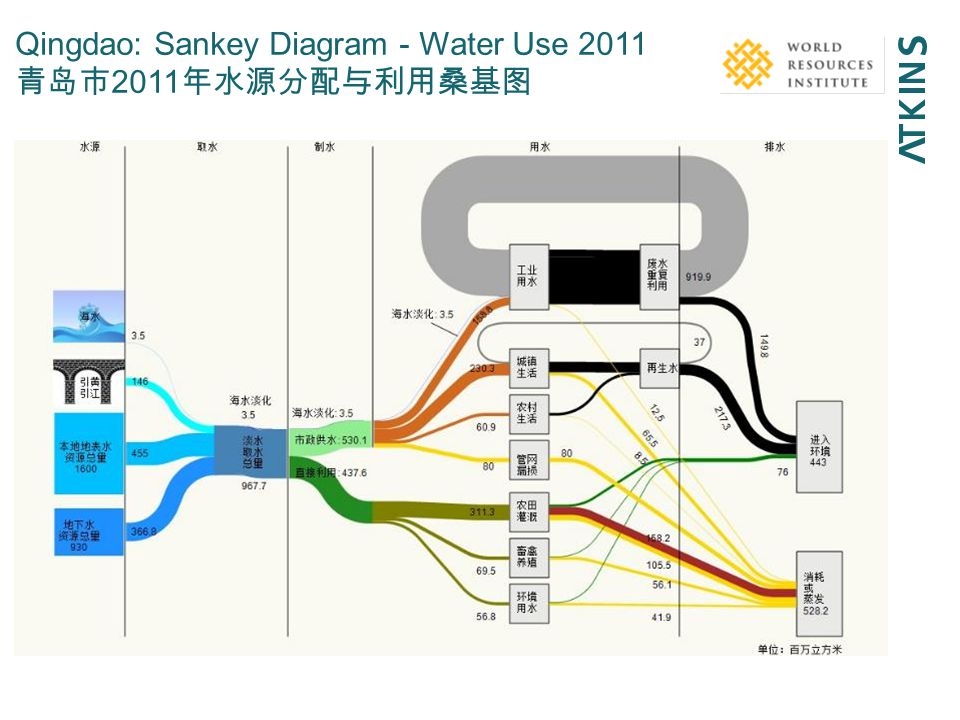
Interesting Sankey diagram on water use in Qingdao, China in 2011. This is from a presentation titled ‘Urban water security – Water-energy-food nexus’ by Josh Weinberg of Stockholm International Water Institute. Atkins and World Resources Institute (WRI) appear as co-authors.

Unit of flow seems to be million m³ (百万立方米). Water origin is mainly surface water (455 mio m³) and local ground water (367 mio m³), with some additional (146 mio m³) brought in from Yellow River and Yangtze River.

Not sure about the split shown with two green flows, possibly breaking down the water use to urban (city of Qingdao) and province.

The middle part shows consumers: Farming (?) is largest consumer with 311 mio m³ per year, followed by ??? with 230 mio m³, and use in industry with 153 mio m³. Polluted water is shown in black.

Maybe someone who reads Chinese wants to chime in…

Lying with Sankey diagrams (5)

Haven’t posted much in this mini-series recently … not that there would be a lack of Sankey diagrams that have technical defects or simply misrepresent flow quantities with deliberate arrow widths.

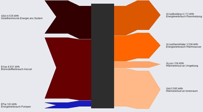
In this Sankey diagram from a website by AEPC the blue arrow is grossly exaggerated and not to scale with the other flows.

Flows are in KWh. Energy inputs (solar, fuel for boiler and pumps) on the left. Uses and losses to the right.

Sweden’s Energy Balance

Julien Morel of the Swedish Energy Agency (‘Energymyndigheten’) has pointed me to the newly released Swedish Energy Balance for 2014.

The publication (available here) has the English version of the diagram on page 4:


This one is interesting, as it is set up mirrored, to be read from right to left, in contrast to the common way of presenting national energy flows (e.g. here for Australia or here for Iran).

Overall consumption was 368 TWh in 2014. Sweden relies roughly one third on nuclear energy, one third on fossil fuels, and one third on renewables (wind, hydro and biofuels).

The different areas of the energy system are further detailed per consuming sector and per fuel type and shown with individual Sankey diagrams. So if you understand some Swedish, go check out the 17-page presentation.

Building Energy, Simple Sankey Diagrams

From my collection of Sankey diagrams here are three very similar samples depicting energy flows in a building. All three are from Germany (did I mention that more than half of the Sankey diagrams seem to be from Germany or Austria?).

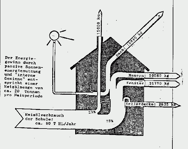
These are all very simple Sankey diagrams. This first one is a hand-drawn goodie from the times when reports were still done with a typewriter. It shows use of fuel oil (‘Heizol’) in a school building, and interesting to see, the flows are given in kilograms fuel oil rather than to represent the heating value. The school building consumes 80 tonnes of fuel oil per year.

Note that flows are not to scale (arrow for equivalent of 10580 kg fuel oil annual heat loss through walls is about the same width as the one representing 31770 kg heat loss through windows). So this Sankey diagram doesn’t deserve an A…


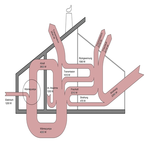
The next building energy flow Sankey diagram shows flows in Watts (W). Not sure where I found this one. Flows again are not proportional (spot the 470 W flow and compare it to the others). Main inputs are radiation (‘Strahlung’) and electric energy. A heat pump cycling energy can be seen, so it seems that this one is maybe for a passive house.

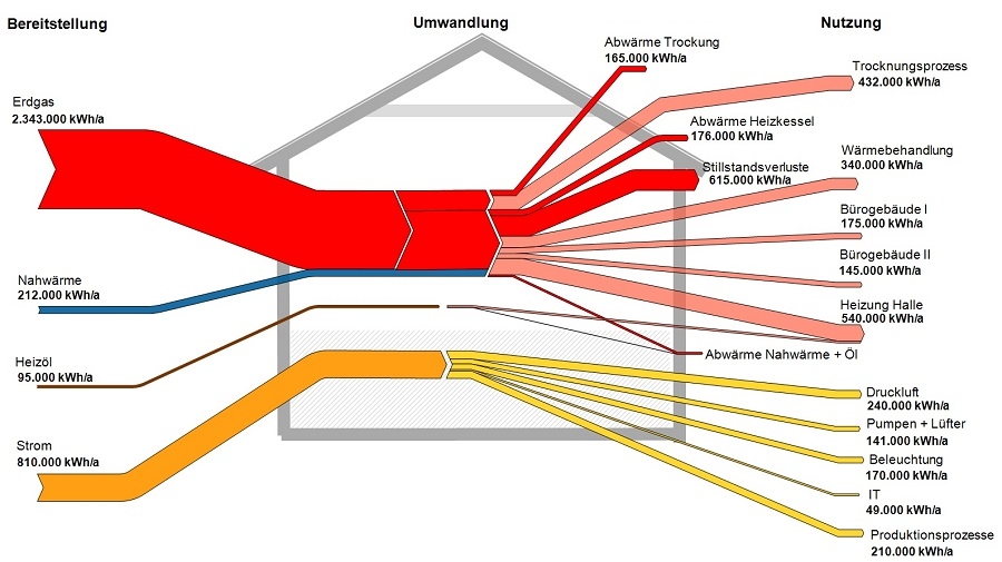
This last one done with a Sankey diagram software hence flows are to scale in this one (although I have some doubts regarding the width of the fuel oil input arrow on the left). Flows are in kWh per year. Main fuel type is natural gas (red), some district heating (blue). Electric energy in yellow, consumed by IT, lighting, air compressors, and so on. This energy flow Sankey diagram is probably for a factory building or complex.

I will try to add the sources where I found these three diagrams. Please forgive my negligence this time.

Lost Gem: Energy Analysis, Motiva

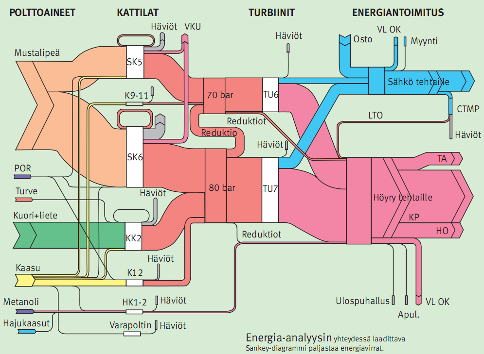
Digging out some gems from folders on my hard disk. I found this one back in 2010 or so, but had not documented the source properly – shame on me. I just know that it is from consulting firm Motiva. Had I really forgotten to feature this here on the blog?


This one is the result of an energy analysis in a company. No numbers or units given in this diagram. Fuels by type on the left (‘polttoaineet’), then from left to right bunkers/tanks (‘kattilat’), two turbines (‘turbiinit’) generating electric energy (‘sähkö’) and steam (‘höyry’).