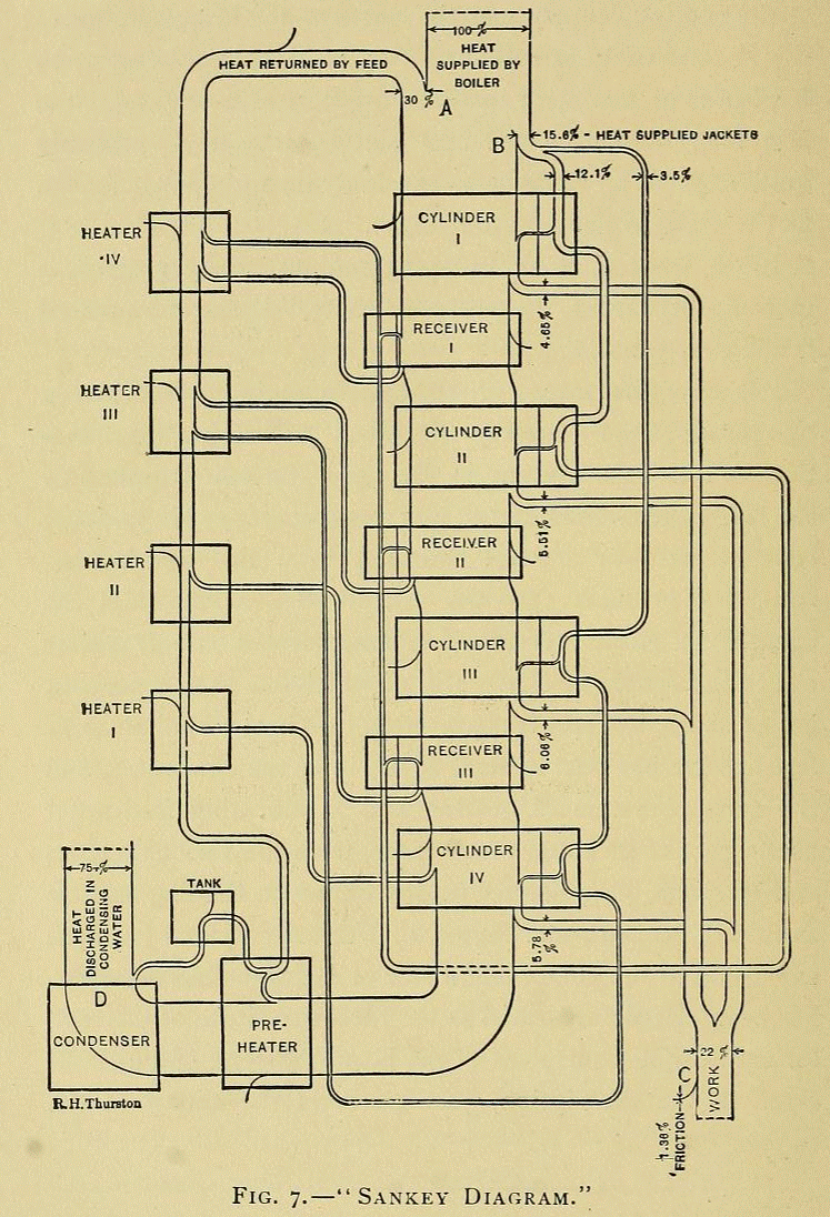
A follower of this blog notified me of a Sankey diagram in Robert Henry Thurston’s book on ‘Stationary steam engines, simple and compound; especially as adapted to light and power plants’ published in 1902.
I am sharing this beauty with you for your enjoyment…
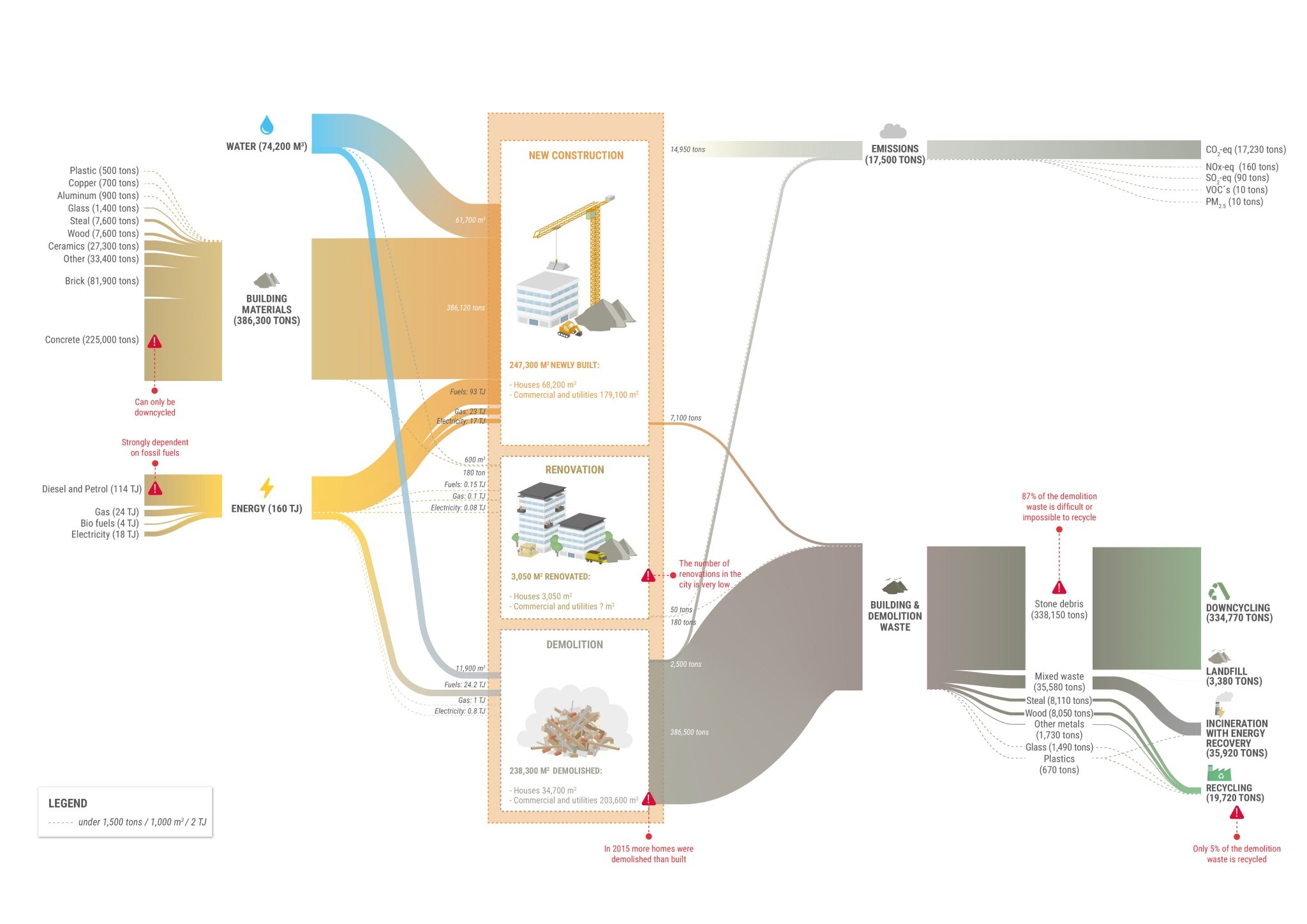
Metabolic, Rotterdam Construction Flows
Dutch consulting firm Metabolic have posted a great article ‘Why data visualization is critical to driving sustainable change’ on their blog. It features several examples of Sankey diagrams and argues that good visualization is key to sustainability projects and communication.
This infographic shows material flows (construction materials, demolition waste) in tons and energy in TJ. Flows relate to the construction sector in Rotterdam in the year 2015. This was originally produced by Metabolic for the report ‘Circular Rotterdam’.
The authors say. “This Sankey diagram on Rotterdam’s construction sector serves as a strong example of a data visualization for sustainability. It gives municipal authorities and industry stakeholders a clear idea of where they need to intervene – emissions generated largely in construction, material waste largely in demolition. Potential intervention points are highlighted in red; from reducing dependence on fossil fuels in construction to ensuring buildings are designed for renovation or disassembly rather than demolition.”
State Budget Visualized
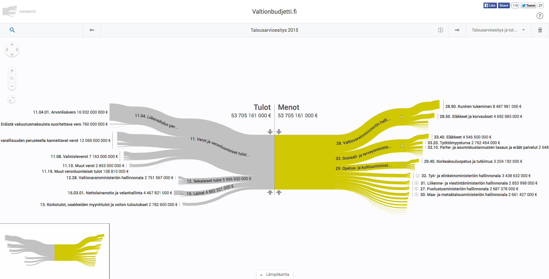
Valtionbudjetti.fi is a great website from Finland that has the state budget visualized as Sankey diagram.
Tulot is the income and Menot the expenditure. Flows are in Euros.
This visualization and apparently the website has been made by Helsinki-based Hahmota. Check out the state budget website and enjoy exploring the animated diagrams.
Check out Hahmota’s Twitter feed for more.
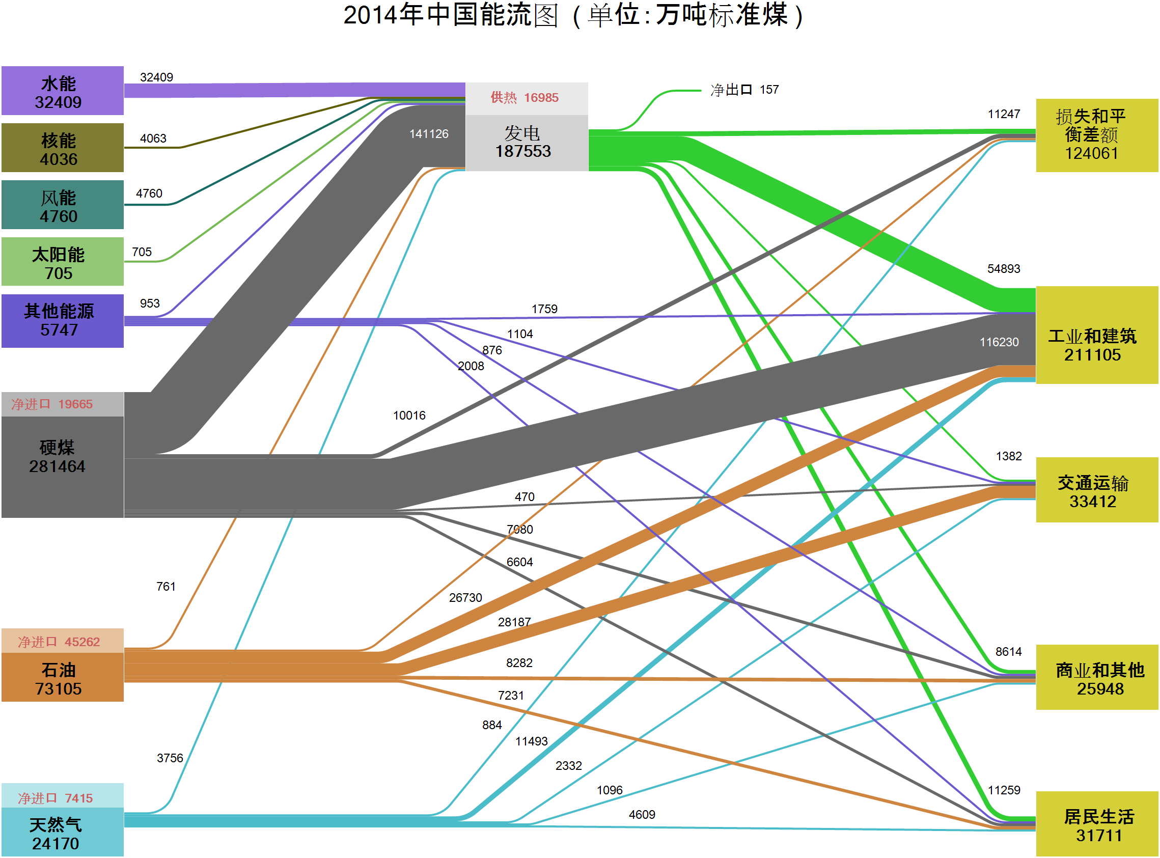
China Energy Balance 2014
Here is what seems to be the energy balance for the People’s Republic of China (PRC) for the year 2014. Found this in the e!Sankey 5 trial, where this included as a sample file in the Chinese version. I don’t read/speak Chinese, so not much I can explain here…
Energy Flows Germany 2018
Energy consumption in Germany is tracked by AG Energiebilanzen (Working Group on Energy Inventories) and a Sankey diagram is published annually. This is the latest one for 2018 featured on their website.
And again, it leaves me disappointed… Why does such a prestigious group as AGEB, that has been in the business of producing energy inventories since 1990 and energy flow diagrams at least since 2013, if not longer, produce Sankey diagrams that are not to scale?
Energy Usage Timeline 1800-2017
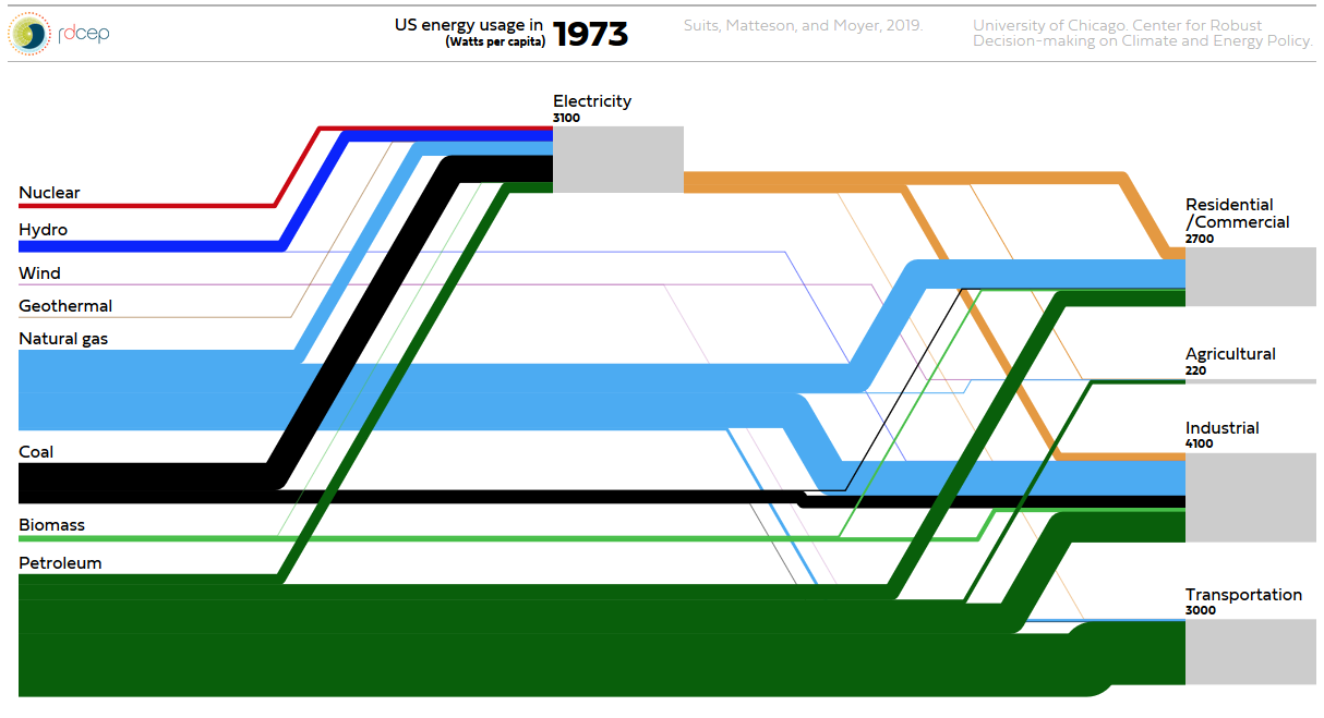
Watch this beautiful animated Sankey diagram for per capita energy usage in the United States from 1800 to today… Created by Suits, Matteson, and Moyer. University of Chicago, Center for Robust Decision-making on Climate and Energy Policy. Click here to go to plasm.ist website and watch animation. Update: new website here
Energy Transition in Germany, Study
A great number of Sankey diagrams are coming out of Germany, don’t know why that is…
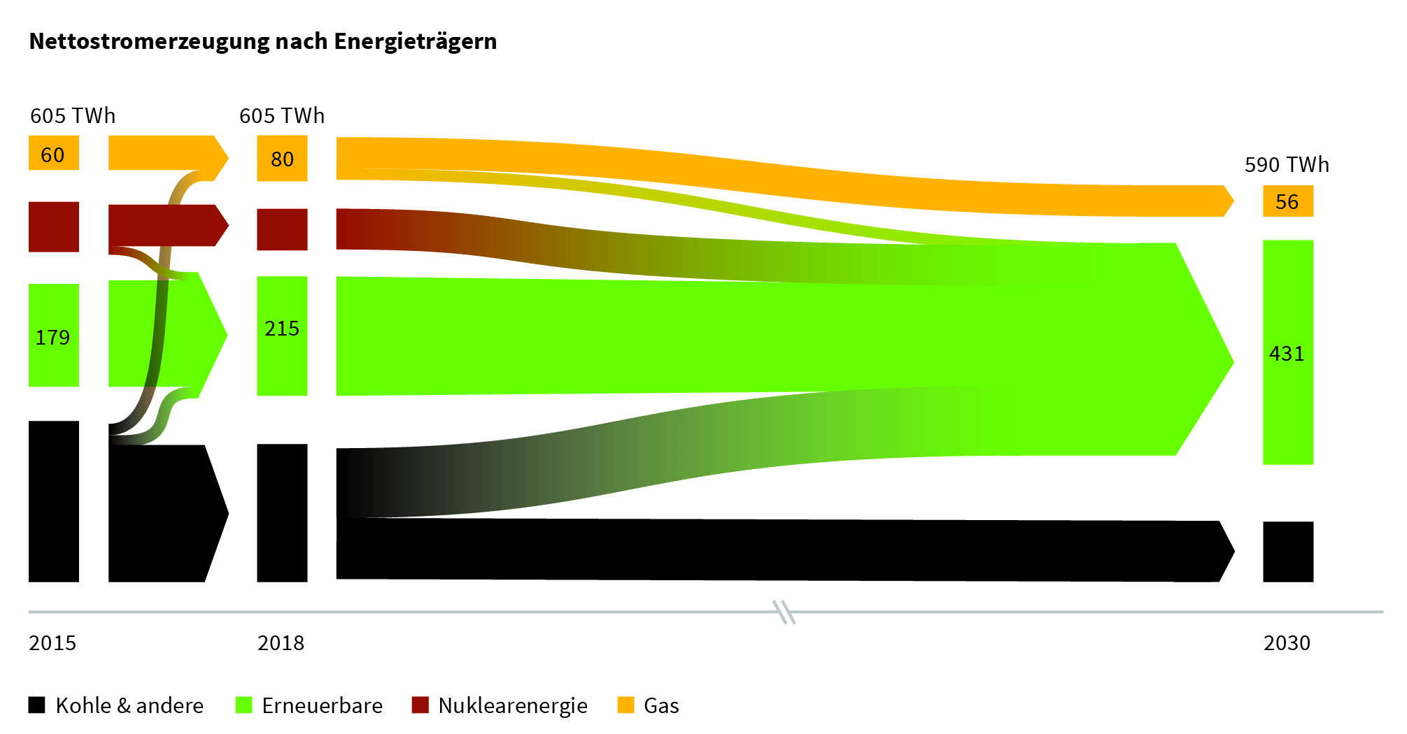
This one is from a study on the (stalling) progress of the ‘energy transition’ (some prefer to call it ‘energy turnaround’, ‘Energiewende’ in German). German Energy Agency (dena) and University of Cologne (EWI institute) have published an intermediate progress report. On climate change, Angel Merkel’s coalition has set the ambitious goal of reducing Germany’s greenhouse gas (GHG) emissions to 55% of the 1990 emission levels by 2030. One pillar of the energy turnaround is the increased use of renewable energy sources.
The study (PDF here, in German) contains a number of Sankey diagrams like this one:
The overall energy consumption of 605 TWh/year in 2015 hasn’t been reduced until 2018, but there is already a noticeable shift away from coal (black streams) and an increase in renewables. On the path to 2030 nuclear energy is to phased out completely and coal an gas are to be reduced significantly in favor of renewables with the overall consumption down to 590 TWh/year, mainly by means of energy efficiency measures.
Sankey Diagrams in Data Analysis Tools
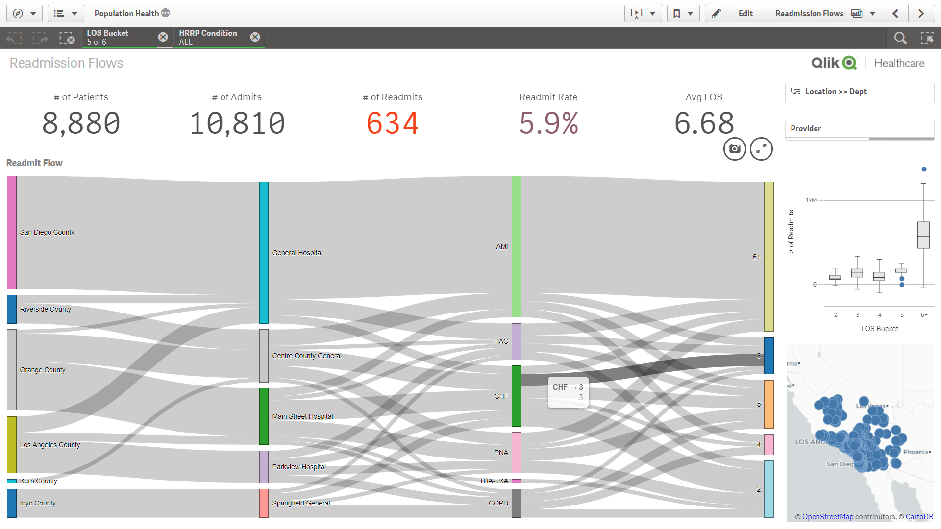
If you are using a big data analysis tool aka business intelligence (BI) visualization tool you are probably aware that many of them have added distribution diagrams (relationship diagrams), a specific subtype of Sankey diagrams. However, it is not always straight forward to produce them.
Qlik Sense users who need some background before producing their own graphs of this type might want to check out this blog article on ‘Visualizing Flows with Sankey’ on the Qlik blog. Or this one from the Qlik healthcare user group.
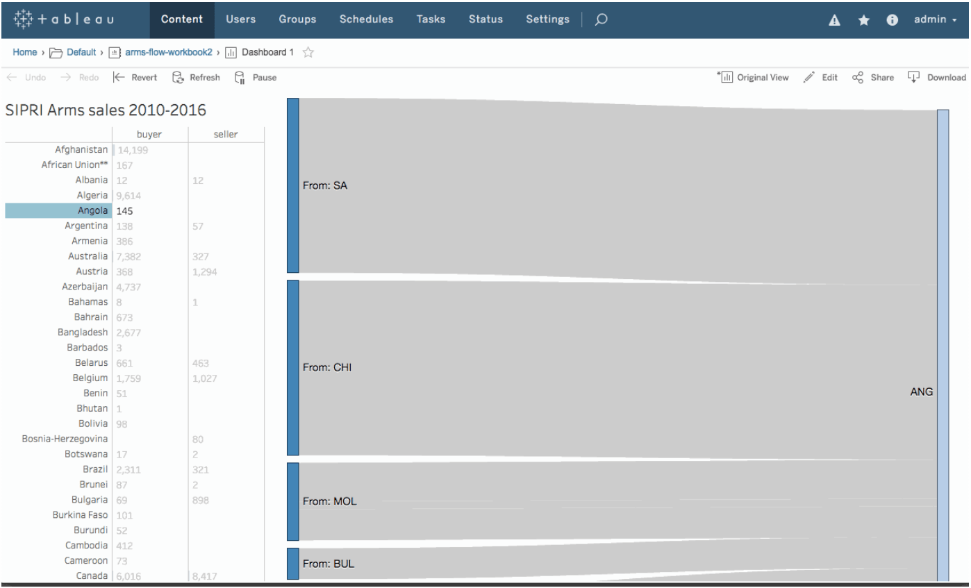
Users of Tableau can get an idea of how to do Sankey diagrams from this Tableau community board post and some detail background from Yoshi Arakawa’s blog here. I have mentioned the Sigmoid curves here on the blog in a December 2018 post.
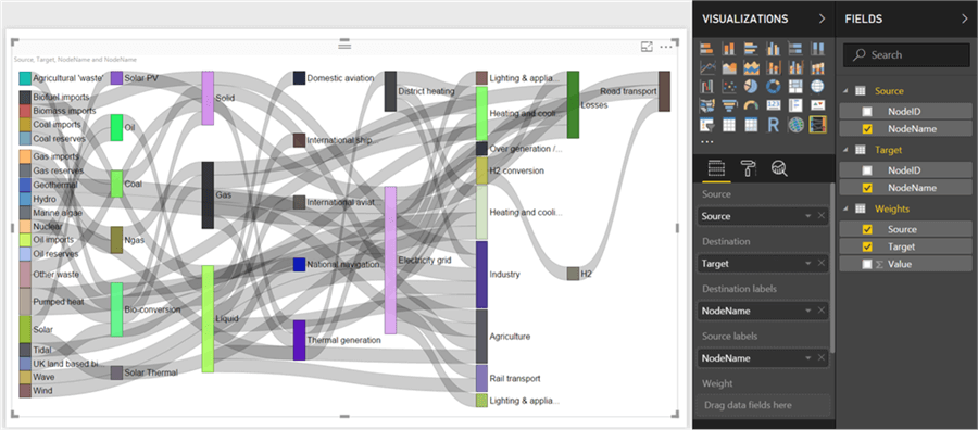
Microsoft Power BI also has category relationship diagrams, although they might “not [be] available by default in Power BI Desktop”. The post by Siddharth Mehta at MSSQLtips.com shows the 16 steps to produce your Sankey diagram from data managed in Power BI.
All three visualizations look very similar. This is because all three tools base their implementation on Mike Bostock’s d3-Sankey package.
