Aircraft Crashes Cause/Phase Relationship

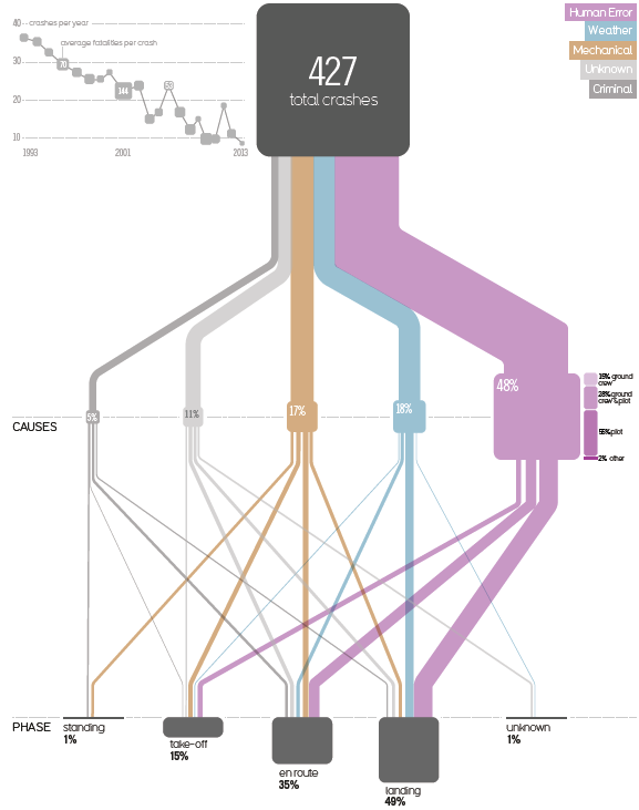
This one is from a very interesting 2015 blog post titled ‘Visualizing the causes of airline crashes’ by Rick Wicklin on the SAS blog.

The original graphic discussed is from David McCandless’ book ‘Knowledge is Beautiful’. Wicklin, a researcher in computational statistics at SAS has praise for the beauty of McCandless’ infographics, but criticizes the use of a Sankey diagram, points to two main issues with the diagram, and suggests to instead use a mosaic plot to convey the message.

The underlying data is for the time frame 1993 to 2013. The 427 aircraft crashes in that period are broken down in two categories: the cause of the crash (human, mechanical, weather, criminal) and the phase of flight when the crash occured (landing, en route, take off, standing on ground).

In addition to the width of the bands linking the nodes, the size of the nodes themselves are used to represent a percentage share. (This is BTW one of the problems that Wicklin identifies, read more here).

The inset at the top left should also be mentioned, as it shows that the absolute number of aircraft crashes over two decades has a downward trend… maybe a consolation to those that who are afraid of flying…
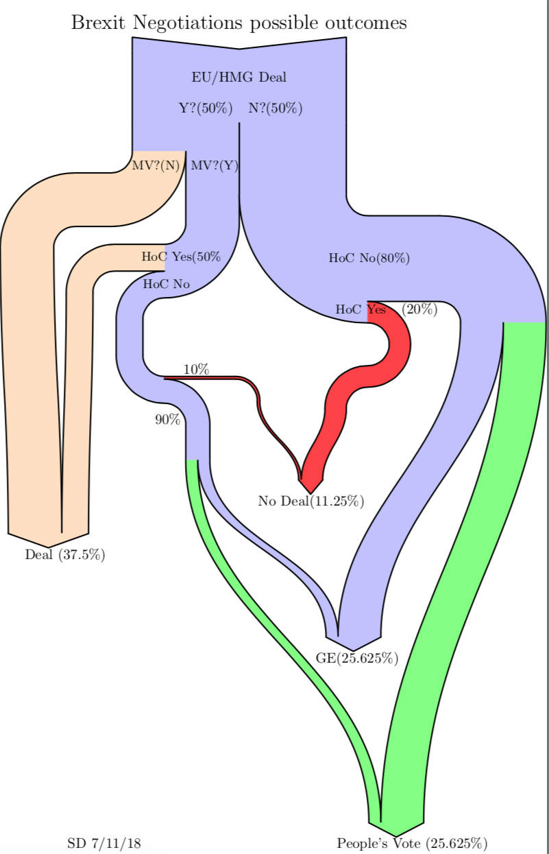
Brexit Negotiations Outcomes – Outdated!

As Boris Johnson makes a dash to Luxembourg today for negotiations with Juncker on Brexit, this Sankey diagram from a blog post ‘Brexit Negotiation Outcomes using a Sankey Diagram’ by Sean Danaher at Progressive Pulse – less than a year old (Nov 9, 2018) – is soooo outdated. In fact the situation was (and still is) so fluid that any attempt to describe it can be outdated within a week or even a day…


This is a decision-tree diagram, just that the estimated probabilities for a decision are shown as weighted paths. Decision paths can merge again when they lead to the same result.

Note: I try to keep this blog non-political. The only other politics related Sankey diagrams are here (Scottish referendum) and here (Trump).

Dairy Supply Chain GHG Emissions

Rediscovered this Sankey diagram in a 2011 project report ‘Scottish Dairy Supply Chain Greenhouse Gas Emissions’ (Sheane, R., Lewis, K., Hall, P., Holmes-Ling, P., Kerr, A., Stewart, K., Webb, D.: Identifying opportunities to reduce the carbon footprint associated with the Scottish dairy supply chain – Main report. Edinburgh: Scottish Government, 2011).

Flows are in megatonnes of CO2-equivalents (Mt CO2e) greenhouse gas emissions (GHG) in 2007 related to the production of milk and dairy products in Scotland.

A total of 1.657 MtCO2e GHG emissions were caused along the dairy supply chain emissions, which was equivalent to 3% of Scotland’s direct GHG emissions. With a yield of 1.3 billion litres of milk on dairy farms in Scotland in 2007 this corresponds to 1.1 kgCO2e/kg of milk or 1.2 kgCO2e/litre of milk.
If you look at the origins of the emissions in the diagram you will see ‘enteric fermentation’ (aka ‘cow fart’) and liquid manure (‘cow poop’) as the main causes.

Read the full report here.

LatAm BEN – Panama

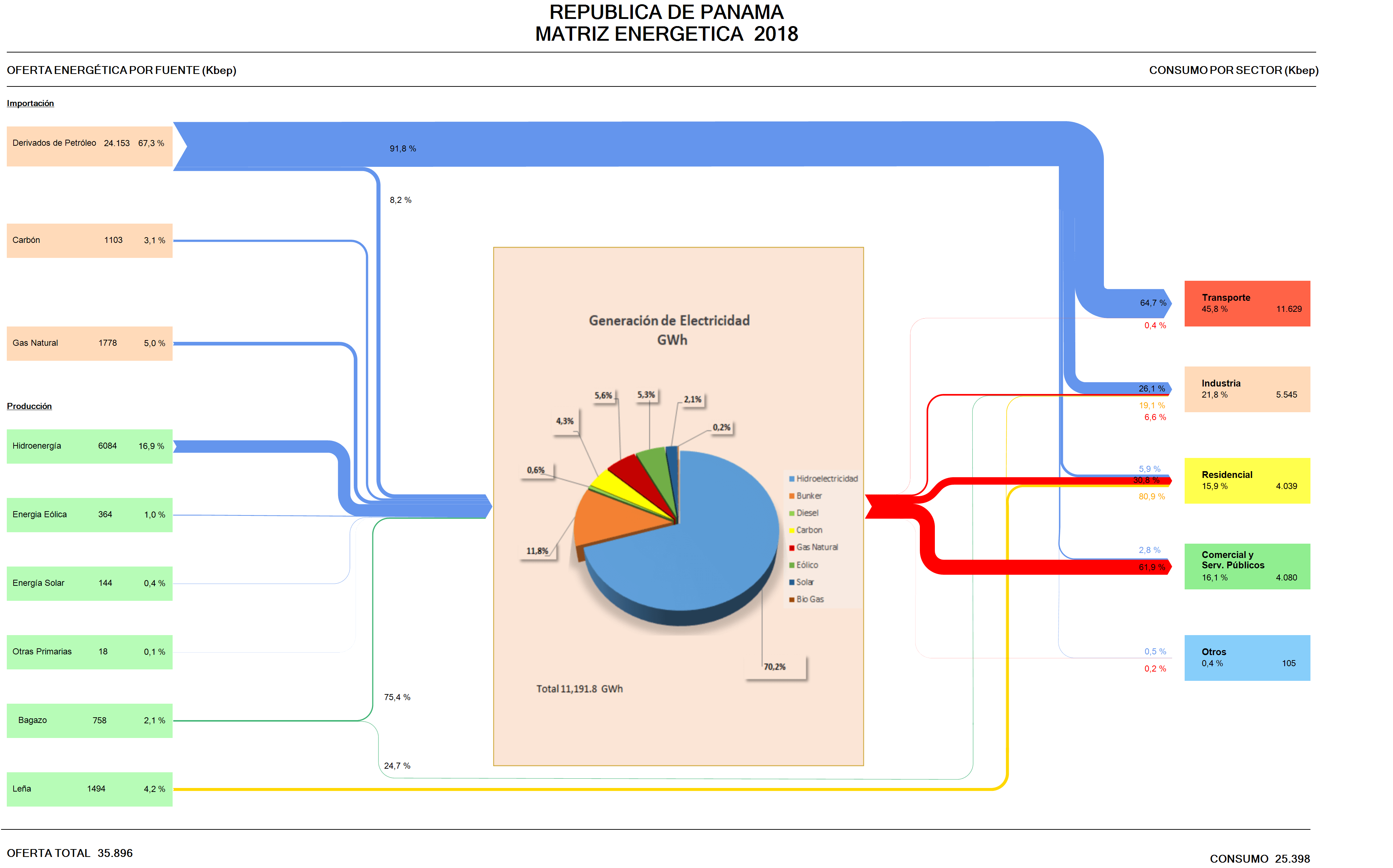
Skipping the remaining countries in South America (Venezuela, Guyana, Suriname, French Guiana) for the time being, my series of Sankey diagrams depicting the National Energy Balance of Latin American countries continues with Panama.

Data for the Balance Energético Nacional (BEN) is available on the website of the Ministry of Energy (Secretaría Nacional de Energia), but I could only find this visual representation of the Matriz Energético done in Excel.

Arrow lines are all the same width and glued together from horizontal and vertical line segments. To be featured here on the blog, it has to be some kind of Sankey diagram, with the magnitudes of the arrows or bands representing the flow quantity.

I checked the sieLAC page maintained by OLADE, but there I could only find energy flow diagrams up to the year 2010.

So I decided to “translate” this Excel figure (which has all the numbers) into a Sankey diagram. As it turned out, the work wasn’t straightforward, since this figure uses two, actually three different units. Primary energy on the left and consumption per sector is in kbep (kilo barrels of oil equivalents). The pie chart in the middle that represents the electric energy generation is just an insert with data in GWh. The arrows in the Excel figure are labeled in percent. I started out using the kbep scale, but then was unable to convert the quantities for the streams, since actually energy losses are omitted in the figure.

Here is my remake:


I chose to work with the percentage scale for the downstream splits per fuel, setting the magnitude of the energy generated at the same size as the input. We can see that the energy landscape is dominated by imported petroleum derivates consumed for transport. Actually this is almost three times as much energy as is being used for energy generation. Domestic energy production is mainly from renewables with only some coal and natural gas.

Colors and general layout of the remake stick pretty much to the original figure.

Hydrological Cycle

A 2013 booklet ‘The Energy Sustainability Challenge: How will natural resource constraints change the way we produce and use energy?’ published by BP describes scientific findings in the fields of energy and natural resources. In the section on ‘New tools for systems analysis’ they present two Sankey diagrams. “Sankey diagrams are used to visualise how a resource moves from source to use.”


This one shows the hydrological cycle for precipitation over land areas. “Starting at the left, the distribution of rainfall among the continents is illustrated, with the numbers indicating the volume of water measured in km³. Of that water, the majority falls on forests, followed by grasslands, cropland and other land types. The water contributes to the products of these lands – terrestrial ecosystem services, food and other land use.”

Hong Kong Water Flows

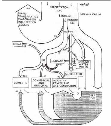
Sometimes I get a little nostalgic… Here is a Sankey diagram of water flows in Hong Kong. My guess is that it pre-dates 1997, so this would be the former British colony Hong Kong. Originally published in Worldbank’s Eco2 Cities book (Hiroaki Suzuki, Arish Dastur, Sebastian Moffatt, Nanae Yabuki and Hinako Maruyama. Eco2 Cities: Ecological Cities as Economic Cities. 2010), it is pictured in this guide(link currently broken) on page 41.


Flows of water are shown in 1.000.000 m³ of water (difficult to see, but I read this as 10 to the power of 6). Obviously hand drawn, so flows are not fully to scale.

Hongkong receives an average 2.000 Mm³ of precipitation (per year?) on a land area of 1.046 km² (interesting: todays area is 1.108 km²). Most of the water directly evaporates, and a large chunk goes into the sea.

This is considered an early example of a material flow analysis (MFA) visualization, and also of an urban metabolism study.

WEEE in Midi-Pyrénées

From what I know, France’s approach to tackling energy and waste issues is to break the topic down to the regional level, and to involve local stakeholders.

Here is an article on ‘Métabolisme territorial et filières de récupération-recyclage: le cas des déchets d’équipements électriques et électroniques (DEEE) en Midi-Pyrénées’ by Jean-Baptiste Bahers that was published in the journal Développement Durable et Territoires. Vol. 5, n°1 in February 2014.

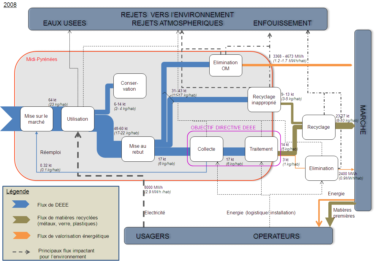
It discusses the ‘Territorial metabolism and recovery-recycling chain: the example of Waste Electrical and Electronic Equipment (WEEE) in the “Midi-Pyrénées” region and has the following Sankey diagram figure.


Licensed under CC BY-NC 4.0

WEEE waste streams are in kilo tonnes (kt) in the year 2008. Additionally, recovered energy from waste treatment is shown (in MWh) with orange arrows. The red line delimits the region, so apparently the electronics waste recycling and disposal (élimination) takes place outside the Midi-Pyrénées region. Some flows are labeled with a range (e.g. 6-14 kt), which is obviously difficult to draw as Sankey arrow. My guess is that the median value was used to determine the actual width of the affected arrows. A nice feature are the per capita values (e.g. 2-4 kg/hab), which makes it much easier to grasp and to relate to for the indivdual person living in Midi-Pyrénées.