Tag: energy loss

FOE Diagram: Up in Smoke

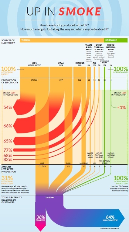
Friends of Earth have published this Sankey diagram produced by ‘Information is Beautiful’ on their webpage on July 6. It shows how energy is wasted in the United Kingdom. It shows that “huge amounts of energy are wasted every day in our gas, coal and nuclear power stations” and, in fact, “over half of the energy in gas and around two thirds of the energy in nuclear and coal used to produce electricity is lost as waste heat.”

The diagram is based on data from Department of Energy and Climate Change, DUKES 2011 and Energy Saving Trust 2012. Absolute figures are given for the different sources at the top in the diagram, and for the amount of energy “left after production” (328.3 TWh). So mainly it is the (non-)efficiency of the production expressed as relative percentage figures that is shown.

One interesting thing about this energy flow Sankey is that it distinguishes between “Thermal” (yellow) and “Renewable” (green) sources of electricity. This is in contrast to the classic renewable/non-renewable split, since in this diagram biomass falls under thermal sources. Interesting.

High-res PDF with the diagram can be found here. There is also another Sankey diagram in the original PDF that shows the consumption of energy in private homes. Will show that one in a separate post some other time.
Energy Flow Charts UK 2009

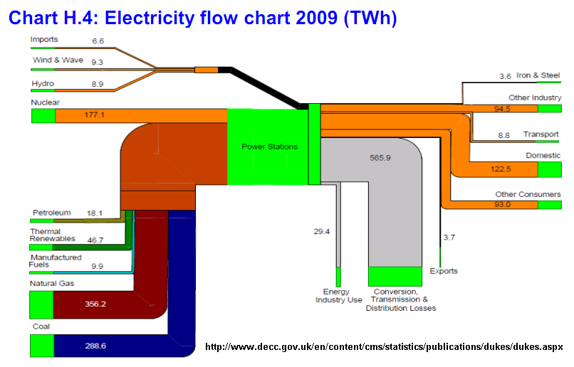
Featured on Jo Abbess’ blog on ‘Energy Change for Climate Control’ recently was this Sankey diagram. It appears in his recent post on ‘The Waste of Power’. It was originally published in Annex H of the 2009 Digest of United Kingdom Energy Statistics (DUKES) published by Department of Energy and Climate Change (DECC).

The report has numerous other Sankey diagrams like this one, similarly structured. They show energy use of coal, petroleum, natural gas, and renewables.

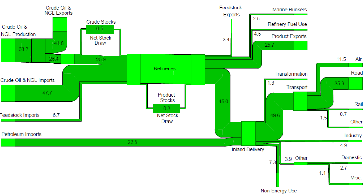
Below is the one on petroleum flows in 2009 in millio tons. A lower threshold has been introduced, so that small quantities don’t fall below a minimum width (see, for example, the flow of 0.7 mio tons to “Rail”, compared to the one of 4.9 mio tons to “Industry”, which would in principal be 7 times wider if it was to scale.

Nice and colorful!

Superimposed Sankey diagrams

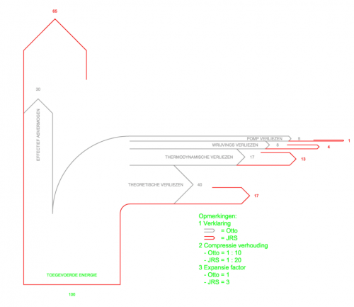
The below Sankey diagram from the JS Systems homepage tries to show the differences between a normal Otto engine and the “JS Motor”. The prototype JS rotation motor, from what I grasp, has different compression and expansion parameters and could prove to be twice as efficient.

To show the difference in efficiency, two Sankey diagrams have been superimposed. The diagram with the grey outline is for the Otto engine, the one with the red outline is for the JS engine. The diagram shows energy losses branching off to the right (e.g. thermodynamic losses 17% in a typical Otto engine, 13% only in the JS motor). Useful energy is represented by the flow to the top.

I am not endorsing this motor, nor have I seen it work. But I like the idea of presenting a comparison in one Sankey diagram instead of two separate Sankey diagrams.

Also, please check out this previous blog post on Sankey diagram overlay.

B4E: Energy loss is synonym of ‘non-quality’

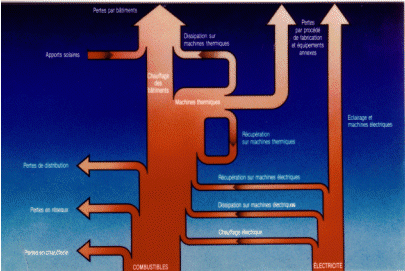
French La Courneuve based engineering consultancy B4E shows the following Sankey diagram on their energy diagnostics page.

Unfortunately the resolution is not good enough to determine any detail. I can understand as much as that they present fuels (“combustibles”) and electric energy (“electricité”) as the main energy sources. From these two sources the use of energy and losses (“pertes”) in a company is visualized in a bottom-to-top layout. No numbers are given, so this is just a schematic visualization.

As they say in the text: energy loss is synonym of ‘non-quality’

Energy Loss Simulation for Students

Heading off for the week-end, but wanted to share a fun game for students I recently discovered on the website of Nelson Thornes, educational publisher from the U.K.

This Flash simulation teaches students “how we lose energy to the environment” and “what is the effect of maintaining a constant body temperature”.

Go ahead and try it: You have to choose whether you are a herbivore or a carnivore, whether you are cold-blooded or hot-blooded, and your activity level.
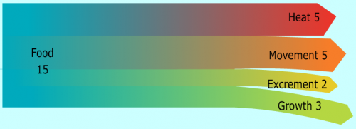
Here is the image that was created for me (couldn’t choose mixed diet though, so opted for meat).

When you’re done, just click on the button labeled “Sankey” and you will get a Sankey diagram that shows how the energy from your food is used for movement, growth, body off-heat and …. well, see for yourself!

A great idea, and a good idea to teach students about energy transformation and loss, and to get them acquainted to Sankey diagrams as alternative to pie charts.

(Images reproduced with permission of Nelson Thornes from http://www.nelsonthornes.com)

Energy Losses in Small Fish Trawler Operations

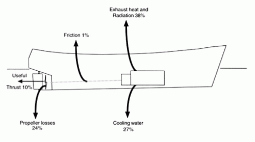
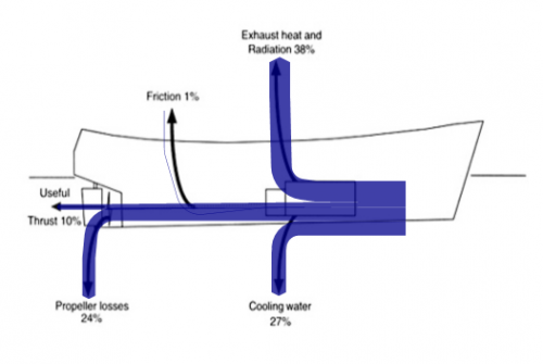
In a report on “Fuel and financial savings for operators of small fishing vessels” by J.D.K. Wilson from Maputo, Mozambique (available on the FAO website), the author explains that in a small slow-speed vessel, only approximately 35% of the energy created from the burning of fuel can actually be utilized to run the propeller, thus can be “spent on useful work such as pulling the net”.

I have “translated” the given values into a Sankey diagram, using the original image as a background layer. This works quite fine, apart from the very thin (1%) flow of friction losses.

On a side note: this is the first time I am presenting a right-to-left oriented Sankey diagram on this blog.

The author concludes, that energy can be saved on the engine and transmission, however the mode of operation (e.g. to reduce the effect of wave resistance), and hull maintenance also play a role. Read more interesting details.

Bioclimatic Construction – mais oui, avec Sankey!

The French architecture company AMEO is specialized in construction bioclimatique. The term is probably best translated as ‘bioclimatic building’ … but sound much more chic in French!

The houses they build are made from environmentally sound materials (mainly wood, and other materials such as and cellulose-based materials) where ever possible. Local micro-climate is taken into account, and passive solar energy is used for heating.

Sankey Diagram for a Bioclimatic Building (Source: AMEO Architecture)
Used with permission of AMEO – Source: http://www.ameo-architecture.com

The company presents energy gains and losses and the advantages of the bioclimatic building to their customers using Sankey diagrams as the one shown above. Unfortunately two of the flows have no quantity indicator, and two of the quantity shown in the labels have probably been switched (see thin flow labeled 13779 kWh, but wide flow labeled 5850 kWh). However, I like this diagram for its simplicity.

Decentralized Energy Benefits

The World Alliance for Decentralized Energy (WADE) runs a website on decentralized energy, called localpower.org. It has a strong educational element, and shows the benefits of producing energy locally, rather than in central power plants.

“Centralized power plants waste huge amounts of energy because their heat output cannot be used locally. Efficiency of the US electricity system, for example, is even lower today than in the early 20th century, and far below its potential.”

WADE - Showing the losses of centralized power plants

The Sankey diagram shown on the website (full size image) illustrates the losses of centralized power generation and is explained as follows:

The large red arrow represents energy from all fuels wasted in the form of waste heat. Capturing waste heat then clearly represents the largest source of potential for efficiency improvement. (…)
The smaller red arrows represent power consumed by the power plants themselves and the power lost during transmission and distribution respectively. The yellow arrows represent the actual useful energy derived from the original fuel inputs – about a third of the actual energy society should be aiming to use.

I won’t be going into the pros and cons of decentralized energy or centralized power, but rather highlight the good and the weak points of how Sankey diagrams are presented: This Sankey diagram doesn’t show any units, a fact that makes it susceptible to criticism. The insterstices in the green area on the left, meant to be separation lines, are somewhat strange (they make me think of an ancient Mayan comb), and do of course conflict with the idea of maintaining arrow width to scale. Lastly, the large arrow heads on the right side overdo the real width, underpinning the statement that a large portion of energy is being lost.