Month: June 2007

Engine Efficiency of Cars

The U.S. Department of Energy (DOE) is funding research projects that target the increase of efficiency of car engine.

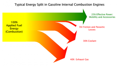
The Sankey diagram shown in this post on the Green Car Congress blog visualizes that only 25% (green arrow) of the energy from combustion is used as “effective power” for mobility and accessories, while 40% of the energy is lost in exhaust gas.

Projects are being carried out at John Deere, Caterpillar, Detroit Diesel and Mack Trucks, to name just a few.

“Seven of the twelve projects focus on advanced combustion technology with a heavy focus on HCCI (Homogeneous Charge Compression Ignition). There is also an diesel-compressed-air hybrid truck powertrain under development. The remaining projects deal with technologies to convert waste heat from engines to electrical or mechanical energy.”

The inefficient energy use of car engines and other vehicles are the main reason for the transport sector being (next to energy generation and transmission) the sector where most energy is being lost (see this post).
Guilty of Sankey Abuse?

The majority of Sankey diagrams I have come across so far show energy flow systems (see this post or this one) and material flow systems (my last post or this one). To a lesser extent the examples found on the web show flows of materials in process systems (e.g. a plant).

To show the number of people that have been accused of abuse of detainees in a Sankey diagram is a novel idea. The example below, originally published by the New York Times (and posted by Derek Cotter on Edward Tufte’s board ‘Ask E.T.’) features the distribution of the 600 cases and what the different outcomes were.

Diagram from N.Y. Times

The poster of the comment does criticize the inadequate diagram and says that “it might as well have been a pie chart instead”, however, the use of a Sankey diagram does give a kind of time line or at least a line of the decisions taken in the juridical system.

Choosing gray as the color rather than making it a colorful Sankey does reflect the topic adequately, I think.

Guilty of Sankey abuse? Or acquitted?

Lying with Sankey diagrams (2)

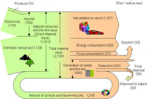
The below Sankey diagram of the ‘Material Flows of Japan in the FY 2000’ has been published by the Japanese Ministry of Environment (環境大臣) and has been reproduced in a number of publications and presentations (sample PPT). Similar charts, representing the inputs into the Japanese economy and the outputs are available for subsequent years.

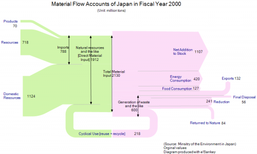
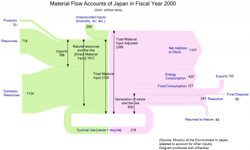
When I copied the values of the Sankey diagram and re-designed it (see pic 1 below), it quickly became obvious that the inputs (2130 Mio. tons) don’t match the Outputs (2386 Mio. tons). After some research I finally detected the reason for the mismatch in a footnote to the diagram in a press release by the ministry. It said that, “due to intake of moisture, etc., total output shall be larger than total material input.” This footnote might have been dropped unintentionally when using the diagram in other publications. I wouldn’t really call this “lying” (as the title of the post implies), but maybe negligence. I wonder if anyboy doubted the numbers when looking at the diagram?

In the second diagram below I adjusted this difference of 256 Mio. tons on the input side.


Another rather surprising thing in this Sankey diagram is the fact that the domestic food consumption within Japan (127 Mio. tons/year in 2000) was almost as high as the total quantity of material being exported (132 Mio. tons). Taking into account, for example, the number of cars being exported from Japan, and their weight, this sounds a little unlikely. However, I think that many of the produced goods might be hidden in the “Net Addition to Stock”.

And for the readers who study Japanese … Sankey diagram : サンキーダイアグラム