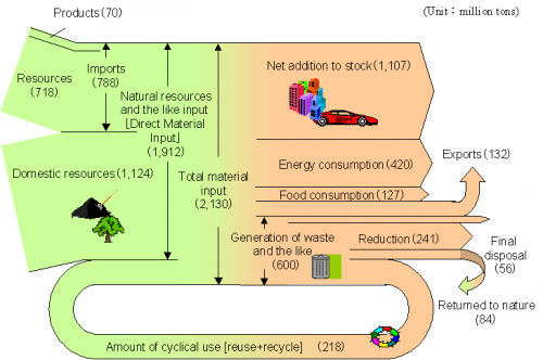
The below Sankey diagram of the ‘Material Flows of Japan in the FY 2000’ has been published by the Japanese Ministry of Environment (環境大臣) and has been reproduced in a number of publications and presentations (sample PPT). Similar charts, representing the inputs into the Japanese economy and the outputs are available for subsequent years.
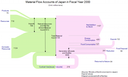
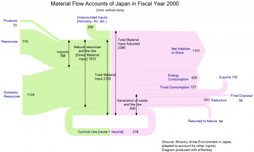
When I copied the values of the Sankey diagram and re-designed it (see pic 1 below), it quickly became obvious that the inputs (2130 Mio. tons) don’t match the Outputs (2386 Mio. tons). After some research I finally detected the reason for the mismatch in a footnote to the diagram in a press release by the ministry. It said that, “due to intake of moisture, etc., total output shall be larger than total material input.” This footnote might have been dropped unintentionally when using the diagram in other publications. I wouldn’t really call this “lying” (as the title of the post implies), but maybe negligence. I wonder if anyboy doubted the numbers when looking at the diagram?
In the second diagram below I adjusted this difference of 256 Mio. tons on the input side.
Another rather surprising thing in this Sankey diagram is the fact that the domestic food consumption within Japan (127 Mio. tons/year in 2000) was almost as high as the total quantity of material being exported (132 Mio. tons). Taking into account, for example, the number of cars being exported from Japan, and their weight, this sounds a little unlikely. However, I think that many of the produced goods might be hidden in the “Net Addition to Stock”.
And for the readers who study Japanese … Sankey diagram : サンキーダイアグラム


