Month: January 2010

Sankey diagram for mountain refuge PV-diesel hybrid system

An interesting project summary can be found on the energyech.at pages, “a virtual exhibition and information platform” by the Federal Ministry of Traffic, Innovation and Technology (Department for Energy and Environmental Technologies) and the Austrian Energy Agency”. A PV-diesel hybrid energy generation system was installed at mountain refuge “Klagenfurter Hütte” in southern Austria to secure power supply and reduce dependency on diesel fuel, and to bring down energy costs.


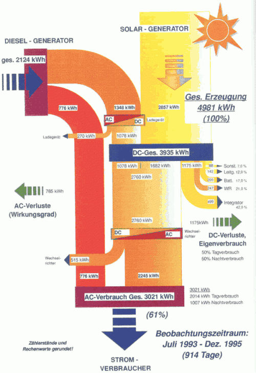
The Sankey diagram shows the energy flows over a 30-month test period from July 1993 to December 1995. Out of the 4981 kWh of energy, 2124 kWh were produced by the diesel engine, while 2857 kWh came from the 18 sqm installed PV modules. A storage battery is installed, and the diesel generator can be used to recharge it if there is no sunshine. The overall efficiency of the system was 61% over the testing period, but could be higher after the energy measuring equipment (consuming 499 kWh itself) was removed after the testing period.

The Sankey diagram shows actually measured values in kWh. It has a top-to-bottom orientation. Diesel is on the left side, the photovoltaic system on the right. Losses branch out horizontally. The battery is the blue box labeled “DC-Ges.” in the middle.
Mes chers amis: ‘How not to Sankey’

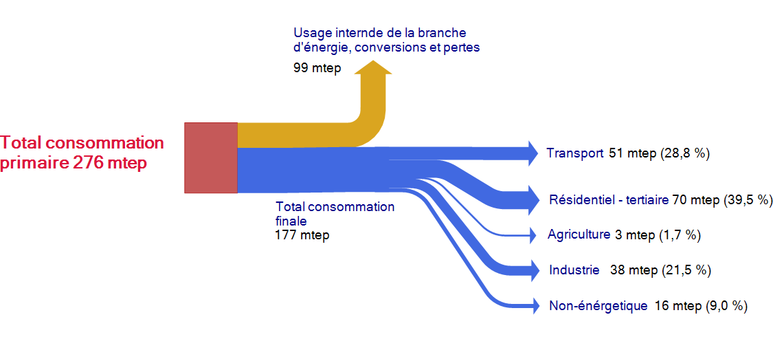
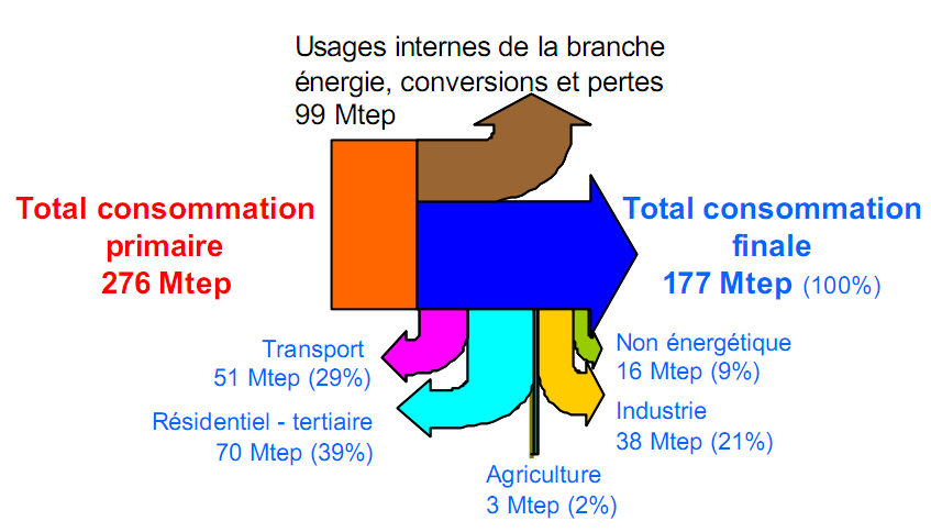
A presentation from 2005 on the French energy flows included the Sankey diagram below (I prefer not to name the author or the link to the original source, in order not to embarass anybody).


This Sankey diagram is pretty much messed up, and definitely a candidate for the “Worst Sankey Diagram Contest” that has already been called for. It took me a few seconds to understand that the flows dangling vertically below the blue arrow are actually a breakdown of the 177 mtep consommation finale. Vraiment … j’ai vu mieux que ça!

This is more or less how I would do it. Less colors, a breakdown of the blue flow into the five consumption sectors.

Material Flows for Nut Processing Plant

The report about the Material Flows on the Big Island of Hawai’Ii I blogged about a while ago has another Sankey diagram which is interesting and I thought I share this one too.

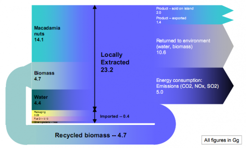
The diagram shows the input/output flows of material in the Mauna Loa macadamia nut processing plant. Annual production is 3.4 tons.

“From a materials standpoint the plant exhibits an impressive import/export ratio, relying on imports to the island for only a small portion of its total production requirements.”

All flows are in Gg (that’s 10E9 grams, or 1000 tons). Apparently a tiny problem with the recycled biomass loop flows, but otherwise a nice one. Small and trace flows not to scale for good.