A reader of the blog alerted me about a new report that contains Sankey diagrams for the United Kingdom’s 2007 and 2050 energy flows. Thanks, Neil!
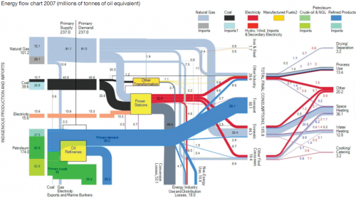
The report is about heat demand and CHP (Building a roadmap for heat. 2050 scenarios and heat delivery in the UK) and was prepared by University of Surrey and Imperial College for the Combined Heat and Power Association (CHPA). [Account is dead in 2018, access the report here instead]. On p. 18 it has the following Sankey diagram. I have shown a similar diagram for the UK in this post.
Data is from the Digest of UK Energy Statistics. All flows are in millions of tonnes of oil equivalent (MTOE). Primary energy demand in 2007 was 237 MTOE.
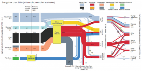
The second Sankey diagram presented (on page 23) is a scenario for 2050. It was calculated using the MARKAL model.
One must read all the assumptions made for the model to be able to interpret it, but you can see immediately that the “energy system in 2050 is signifcantly altered under the common assumptions presented in all-electricity scenarios. In particular, final energy consumption in 2050 will be reduced by 46% against 2007 figures under the assumptions used in the CCC 80% CO2 reduction scenario”.
I invite you to read chapters 3.3. and 3.4 of the report to better understand the 2050 Sankey diagram. Note that the overall primary energy demand is significantly lower, but power generation almost doubles compared to the current situation. Losses from oil refineries are omitted in this scenario due to lack of data.
A great Sankey diagram by the research group made up from researchers from ICEPT (Imperial Centre for Energy Policy and Technology) and Centre for Environmental Strategy at the University of Surrey.
