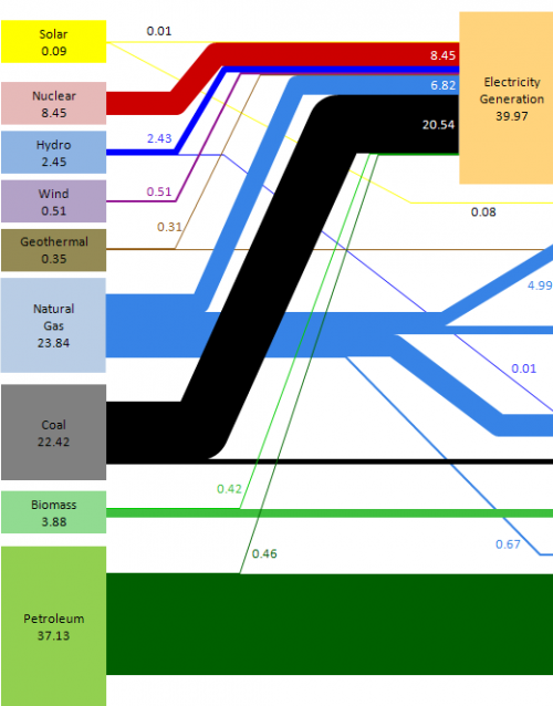
I have been presenting “bad examples” of Sankey diagram before (like this one, or this one), and I have a few more in my collection.
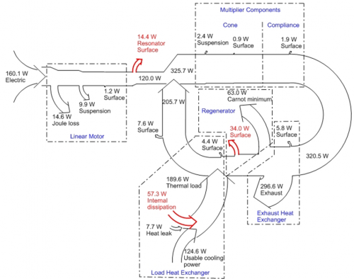
The following one from an PowerPoint presentation by someone from PennState. The topic of the presentation is actually quite interesting: thermoacoustic refrigeration – using sound waves for cooling. It describes the results of a research project.
Unfortunately, this Sankey diagram has some shortfalls, which qualify it as being a “bad example”. These are:
- Sankey arrow widths are not always to scale (see for example the flow of 7.6 W in the middle labelled “surface”, which is definitely not half the width of the 14.6 W flow marked “Joule loss”)
- Arrows branching out of the main flow are shown as short stubs, just as if the quantity is represented by the length (!) of the arrow, rather than its width. A completely new concept for Sankey diagrams. Have a look at the 0.9 W mini-stub “Surface” in the cone area, and at the 1.2 W stub “Surface” in the linear motor box.
- The diagram uses dotted-dashed frames to mark sections in the diagram, at the same time it uses white arrows with a simple border line for the Sankey arrows. Either colored or grey areas, or colored Sankey arrows would have helped enormously.
- Arrows branch off orthogonally, and to accomadate for the reduced quantity in the remaining flow, the border of the arrow on the opposite side curves in. This is not wrong as such, but rather uncommon, and can best be observed in the linear motor section at the left. Same phenomenon for arrows joining the main arrow. The arrow heads just overlap rather than actually joining the other arrow graphically. The receiveing arrow bulges out on the other side.
- The section between the exhaust heat exchanger and the regenerator is awkward, and probably wrong. How can you branch off 296.6 W and 5.8 from a stream of 320.5 W, and are still able to have a flow of 63.0 W lead away from the remaining flow. I have not yet figured out what the problem is, but possibly the “Carnot minimum” flow was supposed to be drawn the other way round.
When I get to figure out the last issue I might draw this Sankey diagram myself, and post it here.

