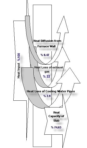
Found this Sankey-like diagram accompanying an abstract submitted for the 2001 International Conference on Thermal Engineering and Thermogrammetry. Posting it here on the blog before this site eventually vanishes. This Sankey diagram is a good example of how not to draw Sankey diagrams, I think. Or, as a Japanese friend would put it politely: “Maybe… [turn head at 30° degree angle, make slight air-sucking noise by inhaling through open mouth] … maybe not so good”.
Here’s the diagram:
The idea was to display heat losses at a slab furnace in a Turkish steel plant. Heat losses were identified in exhaust gases (22 %), at the cooling pipes (2.90 %), and at the furnace walls (0.47 %).
The fact that the widths of the arrows displaying the heat losses were chosen arbitrarily give a completely wrong idea of the proportions. The powerpointish curved arrows don’t really contribute to a better understanding.
All in all, not a very good one. Adding this to my “Lying with Sankey diagrams” mini series (see part 1, part 2), which has been neglected recently.
