Month: July 2010

Worldcup 2010 final Sankey

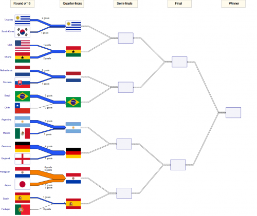
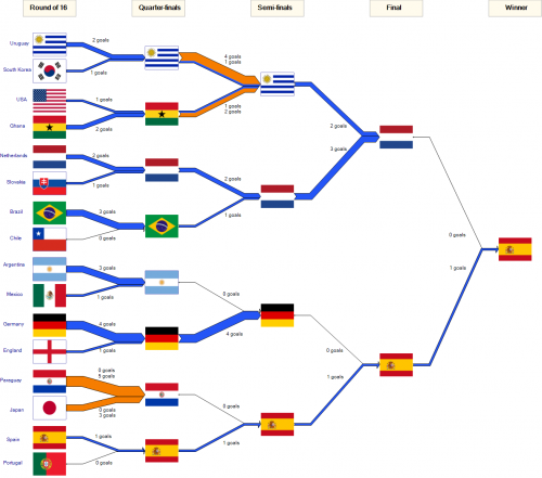
Following up to my last post after the knockout of the 2010 FIFA world cup. Well, things have cooled down a bit now, so here is the completed Sankey diagram showing the tournaments goals.

As one commenter put it, you can “see that Spain’s road to success is a rather boring one (a thin line of 1:0 wins) while Germany was pretty inefficient (big lines, no gain).”

Drawing this was fun, although I was not happy to see my favourite team drop out in the quarter finals already…

In doing the Sankey diagram I found it difficult to handle null flows (that is, explicit zeros, not “no value”) in a Sankey diagram. Also I am not happy with the differentiation of regular goals and penalty goals (brown Sankey arrows). Maybe I’ll come up with a different presentation in time before the 2014 worldcup in Brazil…. 😉
Extended LLNL Sankey diagram

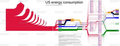
Blog reader Johan Land submitted the Sankey diagram below. “As I am interested in the energy field I especially was fascinated by the LLNL graph over US energy consumption. I spent the weekend on further enhancing the LLNL graph using a trial version of e!Sankey (and data that I have gathered the last few years). I’m attaching the PNG-file for this graph. Feel free to share it if you like the graph!”


(click image to enlarge)

The typical LLNL graph has been extended by the red section on the left that shows a world energy breakdown. Only the U.S. energy consumption is traced further.
The second extension is the pink section. Here, Johan has broken down the energy use sectors ‘Residential’, ‘Commercial’, ‘Industrial’ and ‘Transportation’ in one or two further steps.

All flows are in TWh, data is from 2005 to 2009. The author used several additional data sources and recompiled the data, so that “figures may differ from Lawrence Livermore Laboratory estimations”. See notes for further information.

Good Sankey diagram, and definitely a great job Johan did here. The only suggestion I have, is to add percentage figures to the regional energy breakdown (red section on the left). Unfortunately, the watermark spoils the overall impression, but this is owed to the fact that he used a free trial version.

Johan also mentioned that he is working on forecasts up to 2050, and an animated GIF “running it over time since 1950 up until 2008”. Hope to be able to show you these here on the blog someday.