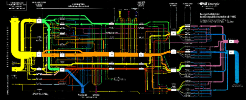
I was asked what the largest Sankey diagram I have seen so far was? Not sure about this. The Swiss biomass flows diagram I featured in January 2009 would be a candidate, but I think the following one is much larger, both in the actual diagram size, as well as in respect to the number of nodes and arrows.
It was created by the marketing department of RWE AG, one of Germany’s big four electricity providers. It shows the energy flows in Germany for 1995. The image file I have is 2588 x 1062 pixels, so when you click on the image below, you won’t be seeing the full image, but only a thumbnail… (also because I don’t want to get sued by their legal department!)
The clear structuring of the diagram is what might be called “very German”: energy sources are at the left, with non-renewables at the top and renewables at the bottom. The second section shows energy conversion, the third section the energy use sectors. These are further broken down, before the arrow join again to show useful energy and energy losses (a 50:50 relationship). Losses in the conversion phase are shown as arrows that branch out vertically to the bottom. Exports and bunkering, on the other hands, is shown as vertical flow leaving to the top. Color coding is very clear, and flows are labeled with figures on each arrow. The unit is petajoule (PJ)
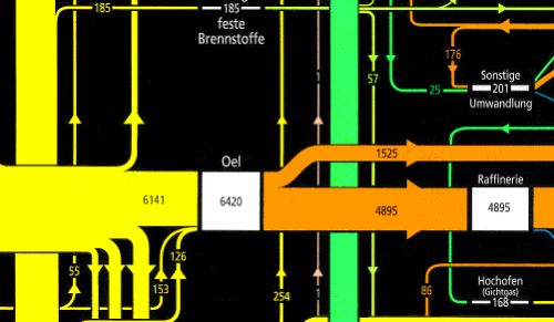
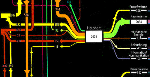
Even the black background goes well with the bright colours. Here are two close-ups of two sections from this energy flow diagram. Enjoy the beauty…


