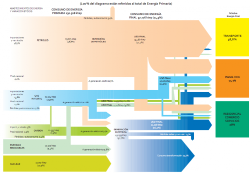
Another example of a national energy flow Sankey diagram, this time from Spain for 2009. To be found on page 40 of the recently published ‘La Energía en España 2009’ (large 10 MB PDF!) downloadable from the Ministry of Industry, Tourism and Commerce (MITYC) website. This is somewhat more advanced than the one from Spain I showed in this post.
Flows are in ‘ktep’ (ktoe, ‘kilo tonnes of oil equivalent, in Spanish), and percentages given are in relation to the total primary energy (130.508 ktep primary energy in 2009).
Nice and colorful, indeed. But again a good example of how to make mistakes (i.e. violate the basic rules) in drawing Sankey diagrams. So, here is the Sankey didactics part….
a) Arrows should be (no: must be!) to scale. Example: See blue arrow ‘USO FINAL’ with 16.1 % in comparison to blue arrow ‘consumo transformación’ with 19.1%
b) The same arrow should not change its width …
… while it runs in the same direction. Example: light green arrow ‘USO FINAL’ gets narrower as it runs vertically before branching to the sectors ‘Transporte’ and ‘Indústria’. Very weird!
… when it changes the direction. Example: pink arrow from the petroleum arrow going to the sector ‘Residencial’ is much wider on the vertical segment than on the horizontal segment.
c) An arrow should not maintain its magnitude …
… as it splits into two different flows. Example: green arrow ‘USO FINAL’ splits into two flows of the same width leading to the sectors ‘Residencial’ and ‘Industria’.
… as other flows branch off. Example: blue arrow ‘USO FINAL’ continues with the same magnitude to the sector ‘Residencial’, even though a considerable portion branches off to ‘Industria’.
d) It would be nice to have labels on all flows. Many negative examples, especially on the right hand side of the Sankey diagram.
Anyone care to do a better version?


