Month: December 2011

Cogeneration Visualized – Part 2

Following up to my recent post on cogeneration Sankey diagrams from Czech websites, here are a few more.

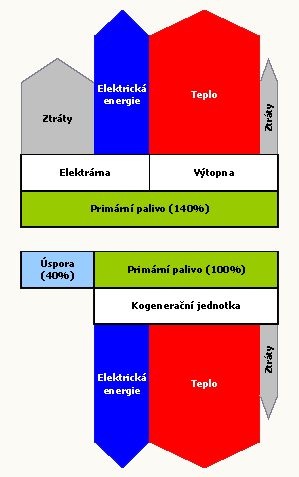
First, a rather simple one which has some fancy arrow heads, partly overlapping other arrows. This one is from the CEZ Energo website and just a schematic visualization of the cogeneration principle.

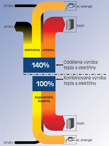
The next one has a strictly vertical orientation and is built from rectangles and simple block arrows. It uses the same values as in the diagram I shows in the last post. Found on the Plzenska Energetika website.

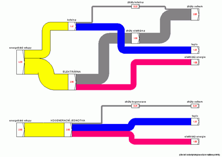
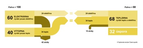
The last one can be found on the TZB Info engineering website. Actually there are two separate Sankey diagrams being compared. A left-to-right orientation, the flow quantities labels sit on the node. This is the only one drawn with a Sankey diagram software (judging from the node symbols I would say it is most likely the discontinued Sankey 3.1 by Fichtner)

.

If you find other cogeneration Sankey diagrams pls drop me a line…

President’s Budget Revenue/Spendings

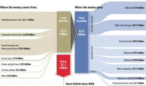
In a post on the winners of the SND 31 competition over at the Infographics News Blog I found the below diagram on the President’s Budget. Originally published by the Washington Post it has won an Award of Excellence in the 31st edition of the Society of News Design contest in the Infographics / Breaking News section.

It is not really a Sankey diagram, since the arrows are not explicitly directed. But it has weighted arrows/bands, in this case representing $$$. This infographic was maybe inspired by this one from Spain that was – after lengthy discussion – named a “distribution diagram”.

I cropped the lower part of the infographic that had details on the deficit as bar chart. See original, full infographic file here.

Two more infographics in this post have characteristics of Sankey diagrams, and I might post them here on the Sankey Diagrams blog, if I run out of ideas one day…

Cogeneration Visualized – Part 1

I love Google’s image search. This is one of the main sources for new Sankey diagrams on this blog.

The other day I used the Czech term for cogeneration (‘kogenerace’) … and immediately had five new diagrams to share with you. Two of them can be found below…

As in most cogeneration schema diagrams, two energy production systems are compared in one diagram. The classic one, and the combined heat and power CHP system. Heat (teplo) and electricity (elektrina) output is set to the same size and primary energy requirement is being compared. Losses (ztráty) branch out to the other side. In the first one these two systems (found on the EkoWATT website) are shown in a vertical orientation:

The second one (from All for Power website) has a horizontal orientation:

The cogeneration system is 1.4 times more efficient (140:100) in the first diagam, the second Sankey diagram has cogeneration 1.47 times more efficient (100:68).

Two or three more to come in another post next time.

European Energy Flows Sankey

Finally have I run across a European Energy Flow Sankey diagram in a post on Google Groups…

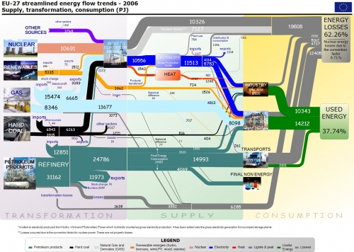
European (EU-27) Energy Usage:

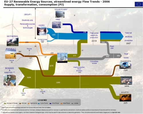
European (EU-27) Energy Usage (renewable energy sources only):

These two images were posted by Herman B. (apparently linked somehow to the European Comission) in reply to an inquiry by Andrew D. I don’t know the original source or publication. Flows are in petajoule (PJ) for the year 2006.

In my optinion they could do without the background image and the photos, but nevertheless, these are fine Sankey diagram examples.