Month: February 2013

Intra EU Horse Meat Trade

Blog reader Johannes send me a note and suggested to feature the below diagram. Thanks for that.

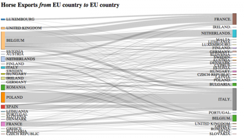
Tony Hirst from OUseful.info created it after seeing a map-based diagram for horse meat trade flows on the Guardian Data Blog. Tony used Mike Bostock’s D3s Sankey Plugin that allows creating this type of diagrams directly from data in Excel/CSV files. In his post he describes how he proceeded to build this Intra EU Horse Meat Trade diagram. Somewhat techie, but nevertheless makes an interesting read.

Overall trade quantity was more than 60.000 tonnes in 2012. Largest exporters are Belgium and Poland (left side), largest importers are Italy and France (right side). Data is from Eurostats.

The above is a only a static picture, but you can go here to play around with the interactive version. Data labels and quantities are available in the interactive version when you hover ths mouse over certain bands. You can also move the nodes up and down vertically and group the countries differently.

This special type of Sankey diagram is also refered to as distribution diagram and (…hate to say it in light of the current scandal) a Spaghetti diagram. Fineo and Parsets (see software list) can also be used for this type of diagrams where statistical data is grouped into categories (here: exporting and importing countries) and bands/streams/spaghettis are shown between the categories to represent the relationships between them.

Here is my May 2012 post on distribution diagrams with d3.js.
UNEP: Nigeria Freshwater Challenge

UNEP’s GRID Arendal web page that “collect[s] and catalogue[s] all graphic products that have been prepared for publications and web-sites from the last 15 years in a wide range of themes related to environment and sustainable development.” It has mainly maps and infographics. Not that many Sankey diagrams, but one I found this one interesting:

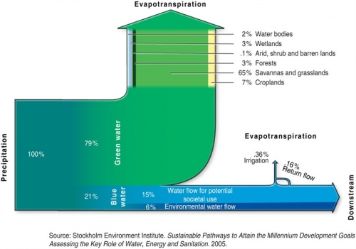
It is titled ‘Nigeria and the Freswater Challenge’, originally from a 2005 study by the Stockholm Environment Institute (SEI).

The description says:

Out of the total precipitation reaching Nigeria, it can be separated into green and blue water. Green water (79% of the precipitation) represents the fraction of rainfall that generates soil moisture and which supports terrestrial ecosystems. It is not returned to groundwater and rivers, but will eventually evaporate or transpire through plants. Blue water, on the other hand, represents the fraction (21%) of the precipitation that runs into rivers and aquifers, and that has a potential for withdrawal for societal use. Out of this, the environmental water flow is the amount of water needed to sustain ecosystem services. In the case of Nigeria, there is a huge potential to increase the withdrawal for irrigation and food production to meet current and future needs.

Flows display percentages rather than absolute values. The green water arrow representing 79% is broken down further and reveals the contributions, but only on one segment. Nice idea!

Energy Flows In Peru

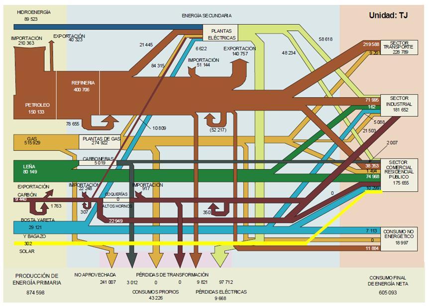
Came across this Sankey diagram showing the energy flows in Peru in an article on Renewable Energies in the Energy Strategy on Alberto Ríos Villacorta’s blog.

It has the typical structure of a national energy flow Sankey diagram as I have shown here on the blog many times. Flows are in terajoule (TJ) and have a general left-to-right orientation. On the left are the different energy carriers (primary energy), conversion in the middle section, consuming sectors on the right. Losses branch out to the bottom.

Unfortunately the streams are not to scale in this Sankey diagram. Compare for example the 80.149 TJ energy from “leña” (wood) in green to the 515.929 TJ of energy embodied in gas (sand color) right above. The gas arrow should be approximately 6 times wider – still it is drawn thinner. Even worse the situation for losses in gas processing where 241.007 TJ are “no aprovechada” while 274.922 TJ pass through gas processing (“planta de gas”). Roughly half of the energy embodied in gas is not used, but it looks as if that arrow branching out to the bottom represents some 10 to 15% of the total flow only. Many other examples of wrong arrow magnitudes can be found.

So, some very general basics of Sankey diagrams are ignored here. Readers should check the flow quantities carefully, and not rely on the perceived quantities represented by the arrows.

EU Steel Flows, from MFA Diagram

Browsing through the blogs on data visualization and infographics (check my blogroll) I often find inspiration in Nels’ MFA diagrams. From time to time I like to beef up the skinny MFA diagram skeletons a bit by converting them into Sankey diagrams. At the same time, by translating the numbers into Sankey arrows one gets a better idea what the main (mass) flows are.

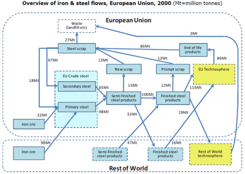
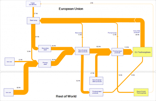
This is a MFA diagram on Iron and Steel Flows in the European Union in 2000 as found in this post. Original data is from a 2008 OECD study, flows in Mt.

The description of the diagram says: “A study of iron and steel flows in 2000 in the European Union showed that an input of about 120 Mt of iron ore (of which 98 Mt was imported) yielded 98 Mt of primary crude steel (i.e. produced directly from iron ore and coke). A further 65 Mt, representing 40% of total crude steel production, were produced as secondary crude steel, produced from scrap steel.”

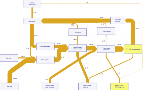
I did a first quick version of the flows as Sankey diagram, trying to stick very much to the layout of the original diagram. All nodes are the same size and more or less located at the position of the master. It already shows that the main steel flows: iron ore imported into the European Union, and steel scrap being recycled within the EU. Export of semi-finished steel products from the EU to the Rest of World (52 Mt) almost balanced with 47 Mt of semi-finished steel products imported into the EU.

I tried to improve the diagram by removing the three nodes ‘New Scrap’, ‘Prompt Scrap’ and ‘End of Life products’ since there is no transformation of these flows at the nodes (also no change in quantity). Further I reduced the size of some boxes and dragged the ‘Semi-finished Products’ (Rest of World) box closer to the ‘Finished Steel Products’ (European Union) box to avoid crossing streams. Wherever possible I try to avoid diagonal arrows.

The final result also has the Rest of World and European Union grouping. I am not to happy with the colors though.

Your thoughts?

Hydrogen Bus Operation Sankey

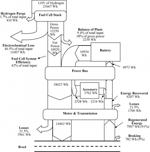
From a project summary on the webpage of the Fuel Cell Research Lab at University of Delaware’s Department of Mechanical Engineering comes this Sankey diagram.

This is for a bus operating on the University of Delaware campus. The Sankey diagram shows energy flow and losses in the hybrid power train for a typical drive cycle. Unit is Wh, percentages are given in the labels as additional information. Energy is recovered when braking and is fed back to the battery (see upstream arrow ‘Energy Recovery’).

“The fuel cell system balance of plant consumes a significant fraction of the energy of the hydrogen supplying the stack, so efficiency gains there are potentially quite useful. Most of the balance of plant energy feeds the air compressor, so efficiency could be increased by improving air humidification to allow lower air system backpressure”

Simple black and white diagram with a top-down orientation. The only extra that does not serve to carry information is the schematic road figuring at the bottom….

For the full publication check Bubna P., Brunner D., Gangloff Jr. J.J., Advani S.G., and Prasad A.K., “Analysis, operation, and maintenance of a fuel cell/battery series-hybrid bus for urban transit applications,” Journal of Power Sources, Vol. 195, pp. 3939-3949, June 15, 2010. doi:10.1016/j.jpowsour.2009.12.080