Month: March 2013

Unlocking the Value of Garbage

Yale School of Forestry & Environmental Studies and The Connecticut Energy & Environmental Protection Agency have conducted a study on waste flows titled ‘Unlocking the Value: Transforming the Connecticut Materials Economy’.

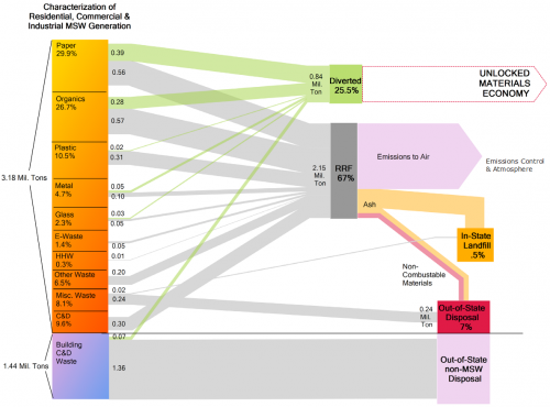
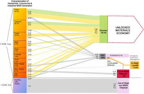
The study features two Sankey diagrams that show the present situation (2010) and a an alternative scenario, where much of the materials are recovered.

This is the current situation in which only 25% of the 3.16 Mt of waste (Building C&D Waste not considered) are recycled.

The authors explain that

“Each year Connecticut residents and businesses generate more than three million tons of munici pal solid waste (MSW, or “regular trash”). Currently existing recycling and reuse programs capture a portion of the value of Connecticut’s waste, while waste-to-energy facilities process and recover energy from most of the MSW that is not recycled. With our recycling infrastructure underutilized, and resource recovery facilities at capacity, there is vast potential to transform our management and processing systems to further unlock the economic potential of waste.”

The optimized scenario with much increased recycling of materials (almost 80%) is shown in this diagram:

Connecticut is looking into the environmental and economic benefit of a recycled materials econonmy.
via Talismark blog

Swimlane diagram for political parties

Stumbled across a number of swimlane diagrams developed by Andy Tow in 2012.

As he describes on his blog these were created during a “Hackathon de Visualizaciones” in Buenos Aires. Andy used ‘Sankey by tamc’ (see Sankey software list) to create several diagrams like these.

This one is for the Santa Cruz province and covers elections 1983 through 2011. More images like these for the Chaco, San Juan and Jujuy provinces are available. These are sample screenshots from the ‘Electoral Atlas’ (see below).

Each node represents elections, with the height of the block representing the percentage of votes/seats received. The “leading” party is always at the top. So the bands between two blocks are basically electoral behaviour and (may) visualize political shifts. When two bands join, there seems to be a coalition.

In this special type of Sankey diagram the nodes are of greater importance. The bands represent quantities, however there is a temporal rather than directional aspect to the flows.

This is similar to the Political Parties in Slowakia diagram and to these.

Check the interactive version of the ‘Electoral Atlas’ by Andy Tow, where you can hover the mouse over the diagram to highlight details.

UK WRAP’s vision of circular economy

While some of you might think of their favourite lunch time snack, in the UK the term WRAP refers tp the ‘Waste & Resources Action Programme’, an independent not-for-profit company.

WRAP now presented their vision for a circular economy in the United Kingdom by 2020, using Sankey diagrams:

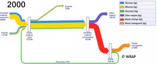
The material flows for the baseline year 2000 are shown in a first diagram here:

In that year, apparently, 212 Mt of material were disposed of as waste (orange arrow), while only 47 Mt were recycled.

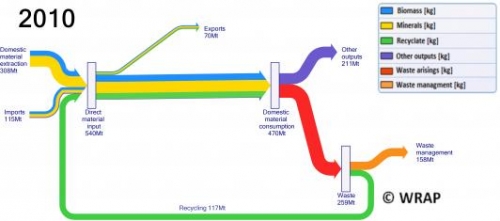
The situation in 2010…

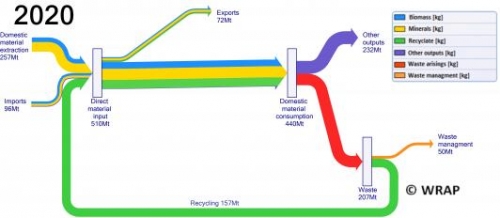
… and the vision for 2020 (from this page):

The goal is to use less input materials, to reduce waste output and to recycle 3/4 of the materials.

See diagrams in high resoultion directly on their website.