Month: September 2013

Where does a family’s tax money go?

From Katie Nieland’s early bird desgin blog, this Sankey diagram shows an average US family’s tax burden.
Income tax goes to the national budget that is further broken down to show spendings.

More than half of the tax load is social security tax, another 1,016 US$ us medicare. Out of the 9,983 US$ taxes some 1,016 US$ go to national defense.

Data for this average Joe Taxpayer is from ‘Your 2010 Federal Taxpayer Receipt’ by whitehouse.gov

SOPA 2013 Award: Wiring the City

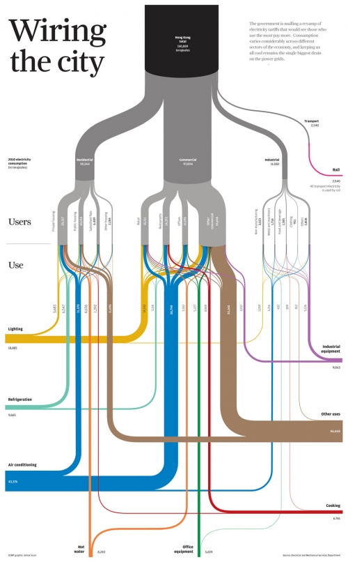
Simon Scarr has won a SOPA 2013 Award for Excellence in Information Graphics (PDF, see p. 13) with this Sankey diagram titled ‘Wiring the City’ originally created for the South China Morning post.

It shows energy flows and energy use in Hong Kong

On his blog he writes: “… we took a look at Hong Kong’s power consumption. Who uses all the electricity in our city and what is it used on? (…) Data set was provided by the government’s Electrical and Mechanical Services Department. (…) This type of chart is known as a Sankey diagram. The thickness of each line reflects a value. In this case, an amount of electricity in terajoules. All of the lines add up to give subtotals and totals by users (grey) and end use (coloured).”

Congratulations, Simon!

Teachers, don’t use these in class

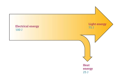
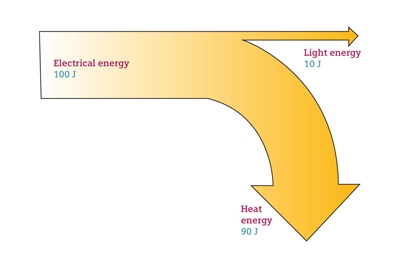
I have nothing against large companies providing free didactic materials like videos and images to support education. But the below Sankey diagram samples from the image bank of a large multinational company are a fail!

Teachers should better not use them in class, as their smarter students may identify the fundamental error in them:

Can you spot the error?

Building Energy Measuring and Modelling

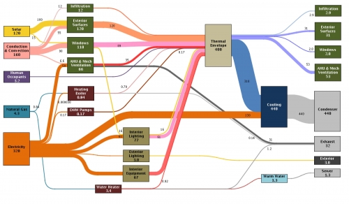
This article on ‘A Pilot for Measuring Energy Retrofits’ describes how researchers from the EEB Hub used an old navy building in Philadalphia to “determine detailed system performance”.

EEB Hub researchers outfitted Building 101 with sensors and a data acquisition system to determine detailed system performance, building energy loads, indoor environmental quality (IEQ), and a detailed operation of the building control system. … The sensors read data from 509 sensing points, collecting 1,048 pieces of data at one-minute intervals. These data points track indoor air quality, occupant comfort, and building energy use.

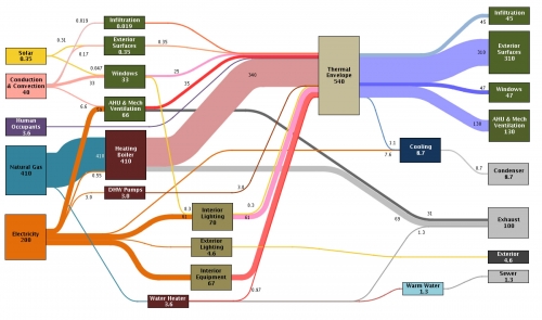
The result of that “inverse modelling” (i.e. measuring) approach are presented in Sankey diagrams and are used “to identify discrepancies in the predicted versus actual energy balance”.

There are significant differences between the January energy use…

… and the energy picture in July

While in winter mainly natural gas is used for heating, the gas consumption in summer is down. In July electricity consumption is significantly higher due to air conditioning.

Unfortunately no unit of measurement is given (it could be kWh), but nevertheless proportions of the energy flows are correct.

Read full article.