Month: December 2013

1970ies Energy Time Series in 3D

The Energy Education References Wiki has a page on Sankey diagrams. It features many samples, snippets and links directed at teachers.

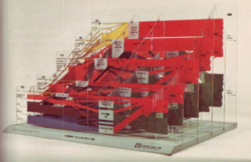
One image in particular caught my attention. This is described as “Energy Display System” created by CSIS in the 70s


(via Energy Education References Wiki)

You all know those national energy flow Sankey diagrams I show here regularly? Now imagine the same type of image as a series consecutive frames for several years. This would produce a kind of animated gif or movie showing changes over time.

The above must be an early 3D version of this. The diagrams are mounted on what seems to be acrylic glass…
Have a Drink

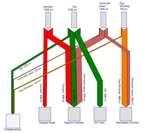
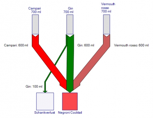
Funny post on German blog “Trinklaune” by Robin Stein. He suggests using Sankey diagrams to control loss of spirits in a pub. Apparently this was kind of a student project.

Here we see the Sankey diagram for a Negroni cocktail made up from equal parts of Gin, Campari and Vermouth rosso.

On every bottle a certain quantity is lost. This is probably because bartenders put in more spirit than they should, or offer free drinks, or maybe just drink it themselves…

As we can see in this figure, losses can add up considerably in a bar that serves several drinks.

Europe Energy Flows 2010

Regular readers of this blog have seen the national energy flow diagrams (energy balances) before. I have featured them from many different countries already.

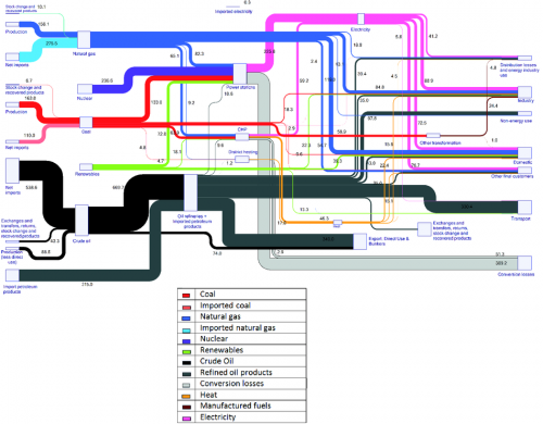
I finally came across a similar Sankey diagram the energy flows of Europe for 2010. It is featured on the European Energy Agency (EEA) website in a report titled ‘Overview of the European energy system (ENER 036) – Assessment published Mar 2013’.

“The figure is a Sankey diagram which shows the composition of the primary energy entering the energy system of the EU-27 in 2010, and where this primary energy was used, either as losses or as consumption by specific sectors of the economy”. It is based on EUROSTAT data for the EU-27 countries.

A legend is available below for the coloured arrows. The diagram is extensively explained and commented on the web page. The content on the source page has been removed, because there is an updated version.

In addition to what we have seen in such diagrams, the primary energy (fuels) is further differentiated with two separate input flows whether the energy carrier was imported or is from domestic European production. This is to visualize dependency on imports.

IPPC Energy Efficiency Report

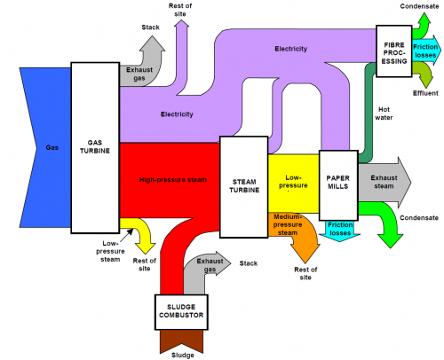
A 2002 Integrated Pollution Prevention and Control (IPPC) report on energy efficiency by UK’s Environment Agency features the following Sankey diagram on page 10.

It shows energy flows in a paper mill. Unfortuntately no values are given nor a unit. So this is to be considered merely as a schematic diagram, not necessarily based on real energy data.

The guidance document explains (p.9):

“It is useful to supplement energy consumption information with energy balances (e.g. “Sankey” diagrams, other flow diagrams or descriptions) to illustrate how energy is used throughout the process (see Figure 2.1). This is particularly relevant where energy conversion is highly integrated within the activities, in order to illustrate any inter-dependencies between energy use and selection of other operational or environmental control measures.”