Month: June 2014

Canada Energy Flows by Province

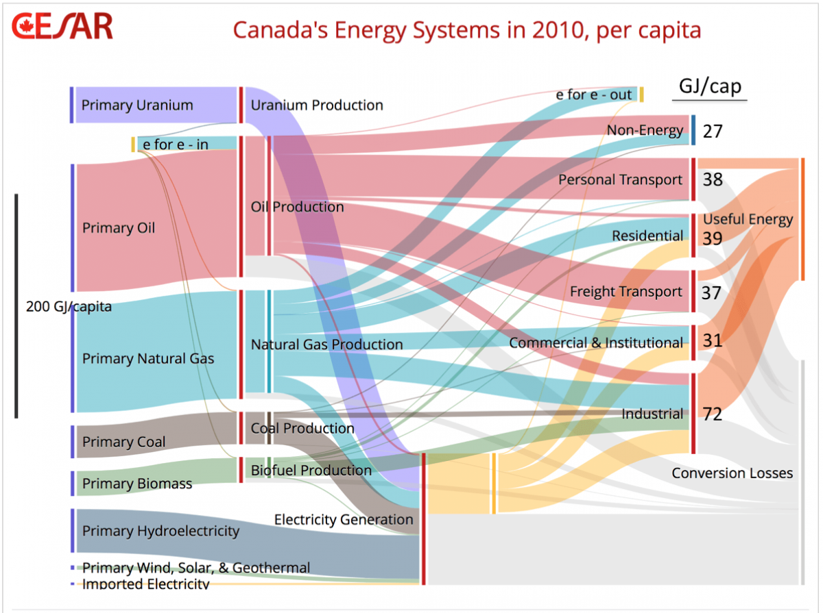
Another Sankey diagram of Canada’s energy flows is featured in a blog post titled ‘Dividing the Big Picture: Visualizing Provincial Diversity’. The post appeared May 5, 2014 on the Canadian Energy Systems Analysis Research (CESAR) blog by David B. Layzell, Professor at the University of Calgary. It is a follow up to a previous CESAR blog post that showed “the big picture” for Canada (featured in a recent post here on the blog).

“The Sankey diagram below shows only the domestic portion of Canada’s energy systems. (…) It also shows how much of that demand is met by oil/petroleum (red), natural gas (blue), electricity (yellow), biomass-derived products (green) or other energy resources.”

Flows are in GJ per capita. This relative unit is different to the other national energy flow diagrams I have presented here on the blog. But it is interesting for differentiating energy consumption in the different provinces.

The article explains:

“There are significant inter-provincial differences associated with each end-use category. For example, British Columbia (BC) residents had the lowest residential energy use in the nation, at 63% of the per capita energy use in Alberta (52 GJ/capita), the national leader in this category. The balmy BC climate compared to what Albertans face each winter accounts for most of this difference. However, our model also draws on government data showing that many BC buildings tend to be better insulated than those from much colder Alberta.”

Check out all Sankey diagrams tagged ‘Canada’ here.
The Road to Rio Sankeyfied

Only a few hours left until the kick-off of the FIFA World Cup in Brazil … A reader from Germany recently sent me a clipping from the May edition of Germanwings inflight magazine (read it online here). The article on page 36/37 has this Sankey diagram:

Interesting visualization, though not fully in line with the basic rules for Sankey diagrams. The width of the bands represents the number of times the world cup has been won. The main issue is that only eight of the participating countries have ever won the cup (Brazil, the pentacampeão won it 5 times, so far…). For most of the nations shown, the green stream or arrow thus stands for zero wins. Zero (nil) however is impossible to display in a Sankey diagram, if you want to maintain the basic rule of arrows being proportional in width to the quantity displayed by them.

Several approaches have been proposed for the “zero quantity flows” such as a thin dotted line, or a thin line with a label “no flow”, or a colourless line. In the above case the choice of the diagram type is – in my opinion – not the luckiest one. The main message is that all teams are dreaming of getting to Rio’s Maracanã stadium on July 13.

Also see my two posts for the 2010 world cup here and here with a slightly different Sankey diagram.

Canada Energy Flows 2010

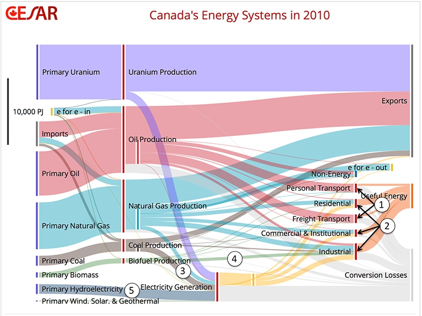
Featured on the Canadian Energy Systems Analysis Research (CESAR) blog is the below Sankey diagram on Canada’s Energy Flows in 2010. The article reports about a new model called ‘CanESS’ (Canadian Energy Systems Simulator) developed by Technologies Inc. and the University of Calgary.

Pulling together data from different sources the tool can visualize energy flows as Sankey diagrams.

The big picture of Canadian energy in 2010 is as follows:

“Canadian primary energy production in 2010 was nearly 25,600 PJ, and after including 3,700 PJ of imports, total primary energy availability was 29,500 PJ. As the Sankey diagram shows, 58% was exported, with the remaining 42% or 12,500 PJ being used domestically, 910 PJ for non-energy applications and 11,652 PJ for the provision of energy end use services to Canadians.”

Read the full article by Ralph Torrie on “the big picture” here.

There is an interactive version that allows you to choose the year (1978-2010), to break down the data onto each Canadian province, or change the unit. Try it out!