Month: July 2014

From Sankey diagram to infographic

I really liked Will Stahl-Timmins’ article on how he developed an infographic on energy consumption in a city.

Will’s blog is called ‘Seeing is Believing’ and his central claim is that information graphics are “the visual transformation of data into understanding”. I agree: infographics are more than just a diagram and labels. They are much more “visual” and their design elements add to a better understanding. Diagrams convey data, infographics convey information. Typically they also have a broader audience: you would find a diagram in a scientific paper, but an infographic in a daily newspaper.

The article ‘Visualising city energy policies’ gives a very good insight into the reasoning of an infographer/designer when creating an infographic. Will describes how he started out from an ordinary Sankey diagram, to get to an infographic step-by-step. This involved studies of different alternatives, sketches on paper, discussions with colleagues, presentations, and many different versions of the infographic in Illustrator…

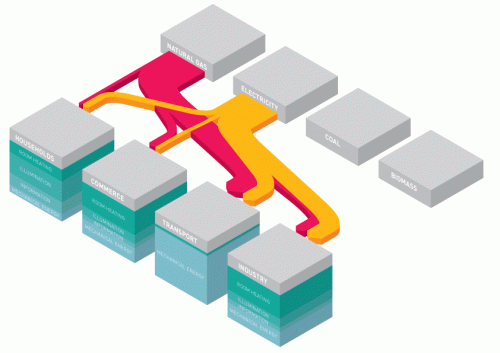
He experimented with an isometric or what he calls a “pseudo-3D” perspective, but also discovered some shortcomings in using them.

Crossing arrows were an issue. So were the stacked nodes (cubes) that hid parts of flows and were difficult to label.

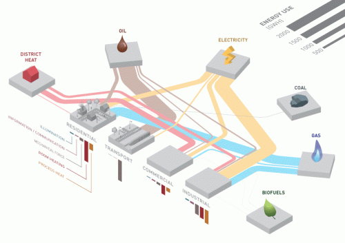
The “intermediate” outcome of his meticulous work was the below infographic. It seemed to have been a long learning process to achieve this result.

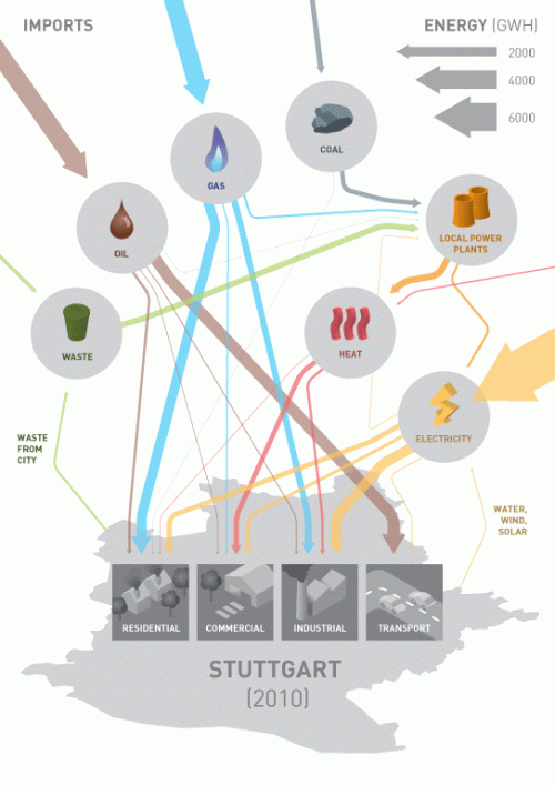
Will went on to include feedback he had gotten from fellow researchers, and decided to add more information on imported energy. At the same time he had to reduce the level of detail. This is the final infographic.

Good work, I think! The resulting infographic is not a genuine Sankey diagram anymore. There are only three arrow widths left, quantities are clustered in these groups. But as I said, an infographic has a different purpose.

It is not mentioned clearly how this infographic will finally be used, and who the target audience is. I imagine it will be used as an illustration in a brochure that summarizes the findings of the URGENCHE project, but to a wider, non-technical audience.

Make sure you read the full blog post at ‘Seeing is Believing’.

Steam generator 3-in-1 Sankey diagram

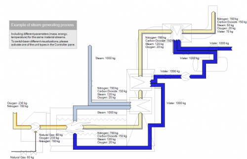
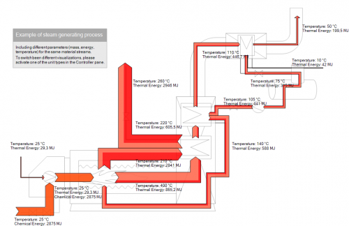
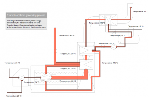
I liked the below 3-in-1 Sankey diagram from the e!Sankey website. Actually three different Sankey diagrams of the a steam generation process.

The first is a quantitative (mass) view of the process where water, steam, gaseous emissions are shown in kilograms:

Using the same basic structure, the second shows the energy content within the flows. Values are in MJ. Temperature is shown as additional information with a lighter color.

And finally the temperature only Sankey diagram of the steam generation process. Here the width of the arrows shows the temperature of the steam or gas.

In the background is a transparent technical process diagram of the steam process. Thanks to Michael for providing these Sankey diagrams.

Yet another Distribution Diagram

I got alerted by Google to a blog post by Maruthi Jampani at the Express Analytics blog. Sure, I am always excited to get fresh new Sankey diagrams worth to be reported here. But more and more I find distribution diagrams like the one shown in the article ‘Power of Sankey Diagram in Data Visualization’ … and get disappointed. Well, not really. The term ‘Sankey diagram’ has gained a certain popularity over the past years, which is good. With the increase in use of d3.js, Parsets or Fineo we see more of these distribution diagrams.

Time to talk about distribution diagrams again?

My two posts back in 2009 (‘Infographics Experts on Sankey Diagrams (Part 1)’ and ‘Infographics Experts on Sankey Diagrams (Part 2)’) were based on a good and funny article by Chiqui Esteban at infografistas.blogspot.com. He suggested several names (in Spanish) for this type of diagram and concluded that the best term is distribution diagram.

The Parsets page explains that they are a “visualization … for categorical data, like census and survey data, inventory, and many other kinds of data that can be summed up in a cross-tabulation. (…) Between the dimension bars are ribbons that connect categories and split up. This shows you how combinations of categories are distributed, and how a particular subset (…) can be further subdivided.”

So we have categories and dimensions. And ribbons that connect them.

Distribution diagrams have commonalities with Sankey diagrams. In fact, one very central characteristic is that the width of the band is proportional to the quantity it represents. In Sankey diagrams the width of the arrow (!) is proportional to the quantity of the flow represented. So they do qualify as Sankey diagrams, but I would say they should be considered a subset or specific type of Sankey diagrams. As I pointed out in a May 2012 post:

It is exactly the fact that these are not directed flows, but rather quantities that are distributed over categories (or dimensions). There is no time relation in them, neither are there flows “from” (e.g. Finance) “to” (e.g. Reporting) or the other way round. These are bands hooked between nodes rather than arrows leading from one node to another. Each category could be represented by a pie chart as well

So I do agree that distribution diagrams (or spaghetti diagrams, swim lane diagrams) are a subset of Sankey diagrams. But Sankey diagrams are more, there is more to them.

I may have to emphasize the genuine Sankey diagrams in the future. Flows in process systems, from one machine to another. Energy input into a boiler, and heat being distributed as steam to other parts of the plant. Streams of people moving between halls at a trade fair. Water being pumped back in loops. Value streams along a supply chain, where each processing step adds to the value of the product. And much more…