Month: January 2016

Iran Electricity Production, Consumption

Following up on my previous post on Iran’s Energy Balance, here is another Sankey diagram from p. 54 the latest edition of ‘Iran and World Energy Facts and Figures, 2012’ by the Ministry of Energy (MOE) of the Islamic Republic of Iran.

Unfortunately the overall national energy balance of Iran is not depicted in the 2012 edition of the report any more.

This Sankey diagram focuses on electric energy only. Flows are in GWh per year (in 2012). Fuel sources for electricity generation are broken down in thr first arrow. Losses branch out at the ‘pow plant’ node as a blue arrow. The generated electricity is further broken down in the vertical arrow into consuming sectors. The overall efficiency of the power plants is at approximately 34%. Note how the small arrow head peeking out to the left is not to scale, and understates the 63.6% transformation losses.

Nuclear energy is less than 1% of the overal electricity production. In 2011, the first year of production 327 GWh were produced from nuclear fuel, upping to 1847 GWh in 2012. See p. 50 of the report.
Iran Energy Flow 2009, Sankey Diagram

Stimulated by the media frenzy and the focus Iran gets in recent days (nuclear deal, lifting of sanctions, Iranian oil production and effects on the world market, U.S. navy boats in Iranian waters) I thought it would be wise to look at the country from my narrow Sankey diagram perspective.

Any Sankey diagrams from Iran on the web? Of course!

The Ministry of Energy (MOE) of the Islamic Republic of Iran has been publishing the Energy Balance of the country: here is the Sankey diagram for 2009. This is from p. 67 of the bilingual report ‘Iran and World Energy Facts and Figures, 2009’ available on their web page.

Flows are in Mboe (Millions of barrels of oil equivalent). Out of the total 2587 Mboe primary total energy source, the largest chunk is oil (1585 Mboe), followed by gas (866 Mboe). More than half of the petroleum is exported (blue arrow). Total final consumption is 1144 MBoe. Note that nuclear energy is not shown in this energy balance. Apparently electricity production from nuclear power plants started in 2011 only.

Flows are not always perfectly to scale in the lower range: comparatively thin arrows have been left at a minimum width it seems. At the branch-offs of some wider arrows (oil, petroleum products) the gap has been color-filled, which makes the arrow look wider than it should be. A funny hump of the mauve arrow bridging the refinery node…

I confess I admire the Perso-Arabic script.

I have two more Sankey diagrams from another Iranian report, but these are for another post … soon.

Ship Energy Use Sankey Diagram, DNVGL

The last Sankey diagram from the maritime sector I presented in this post receievd was shared a couple of times, so here is another one from the same topic area. Sorry, but this one is a little bit blurry even in the original document.

Taken from page 8 of the 2014 report ‘Next Generation Energy Management’ by DNVGL AS (authors George Dimopoulos, Nikolaos Kakalis).

Losses branch out as dark grey arrows. From the 100% energy in fuel only 28.9% are used as propulsive thrust, some other 5.6% as on-board electricity, heat or service steam.

Many more Sankey diagrams in the same report, check out figures 9, 12, 16 and 17.

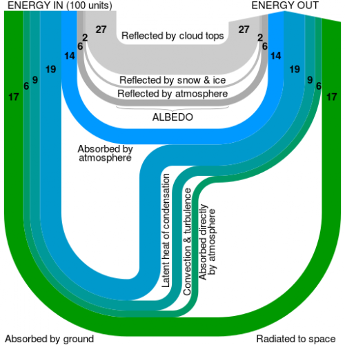
Earth’s Energy Balance

The Wikipedia article on ‘Earth’s energy balance’ has recently been updated with another figure by user ‘Cmglee’.

It shows energy “in” from solar radiation, reflection, and energy “out” as heat into space.

This is a more abstract, yet at the same time brillant and beautiful representation of the greenhouse effect figure, that appears twice in the same Wikipedia article, and that I have presented in posts some years ago (here and here). These more infographic-ish figures are all derived from the original Kiehl and Trenberth (1997) work, if I am not mistaken.

Cmglee’s visualization reminded me of a bundle of ropes suspended at two points. Ropes of different diameter, of course, as it is common in Sankey diagrams. See more of Cmglee’s artwork here.