A comparison of different Ammonia production technologies is made in a post on ‘Comparative studies of ammonia production, combining renewable hydrogen with Haber-Bosch’ by Trevor Brown on the Ammonia Industry blog.
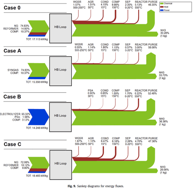
It also features this these Sankey diagrams from an Italian research study by Fratelli et.al.
(published under CC BY 4.0)
All diagrams relate to the production of 1 kg of ammonia (NH3). The authors in their “research examined three cases for renewable hydrogen production, including biomass gasification (Case A), electrolysis of water using solar or wind power (Case B), and biogas reforming (Case C), and compared these sustainable hydrogen sources against the traditional steam methane reformation of natural gas (Case 0)”.
Blue flows represent electrical energy, red flows are heat energy, including the losses (off-heat). Green flows show chemical energy embodied in the product and the feedstock.
For the original study check Fratelli et al: A system approach in energy evaluation of different renewable energies sources integration in ammonia production plants. In: Renewable Energy, Volume 99, December 2016, Pages 472-482.

